This page includes the most frequently referenced visualization specifications as well as information for selecting the best chart and map types for your data. Use the subsequent pages to find more detailed specifications.
Charts Quick Reference
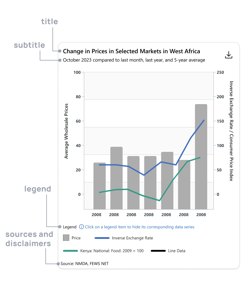
Anatomy of a chart
Formatting
-
General typography
-
Use Segoe UI (or Open Sans) for all text
-
Specifications are listed by by element in subsequent pages
-
-
Titles and subtitles
-
Use titles to describe the topic and geographic context
-
Use subtitles to describe time-relevant information
-
Use sentence case (see Capitalization)
-
-
Axes
-
Use descriptive labels including units of measure on both axes. Labels on the x-axis can be omitted when it represents units of time
-
Use consistent and standard intervals to properly describe the data without overcrowding the chart
-
-
Colors
-
Use no more than 6 line/bar colors per chart in the following sequence:
-
Blue 600: #426FBC
-
Pine 500: #319B86
-
Charcoal 600: #3A454C
-
Orange 500: #BA6B55
-
Red 500: #7A5A5A
-
Steel 600: #55747E
-
-
See Specifications for more color options
-
-
Legends
-
Sources and disclaimers
-
Always include any necessary disclaimers and sources for data used in the chart
-
Chart types
Choosing the correct chart type is crucial for effective data visualization because it directly impacts how well your audience can understand and interpret the information presented. The right chart highlights patterns, relationships, and key insights in your data, making complex information easier to grasp. A poorly chosen chart, however, can confuse or mislead viewers, obscuring the message and diminishing the value of the data. By selecting the appropriate chart type, you ensure that your data is both accurate and accessible, enabling informed decision-making and clear communication.
-
Use a line chart when:
-
Showing trends over time or other continuous data.
-
Comparing time-series data across multiple categories.
-
Emphasizing smooth progressions or fluctuations.
-
-
Use a bar chart when:
-
Comparing discrete categories or groups.
-
Emphasizing the magnitude of values in each category.
-
Showing non-continuous data or ranking items.
-
-
Use a box plot when:
-
Showing the distribution of data.
-
Comparing multiple data sets or groups.
-
Identifying outliers.
-
Displaying the spread of data.
-
Displaying the spread of data.
-
When you have large data sets.
-
-
Use a combine bar and line graph when:
-
Highlighting the interaction between two related variables.
-
Visualizing data with different scales, such as quantities and percentages.
-
Tracking progress toward goals or targets, where bars represent actual values and a line shows a target or threshold.
-
Maps Quick Reference
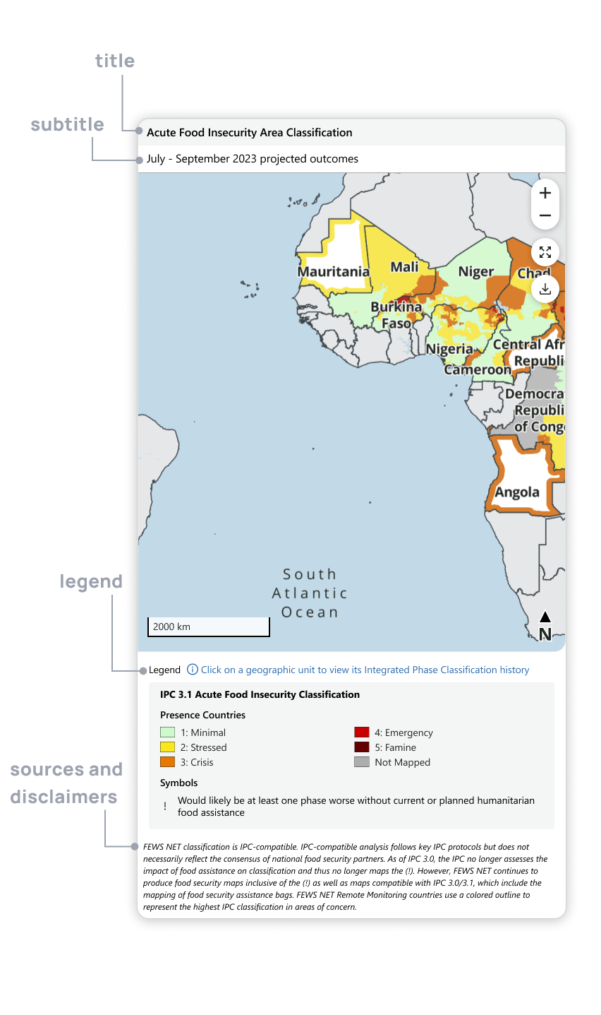
Anatomy of a map
Formatting quick reference
-
General typography
-
Use Segoe UI (or Open Sans) for all text
-
Specifications are listed by by element under Technical Specifications
-
-
Titles and subtitles
-
Use titles to describe the topic and geographic context
-
Use subtitles to describe time-relevant information
-
Use sentence case (see Capitalization)
-
-
Colors
-
Legends
-
Sources and disclaimers
-
Always include any necessary disclaimers and sources for data used in the chart.
-
Map types
Choosing the correct map type to visualize data for a famine early warning system is critical for conveying timely and actionable insights to decision-makers. The right map enables users to clearly interpret complex geographic patterns, assess areas of vulnerability, and make informed decisions about resource allocation and intervention. Different map types can highlight various aspects of the data, such as population density, crop conditions, or weather patterns, ensuring that key details aren’t overlooked. A well-chosen map type ensures that data is not only accessible but also effectively communicates urgency, helping stakeholders respond promptly to prevent or mitigate a famine crisis.
-
Use a choropleth map when:
-
Visualizing variations in data values across geographic regions (ex., countries, regions, livelihood zones) using color gradients or patterns.
-
You need to compare data across predefined geographic boundaries or regions and the data is continuous and quantitative (e.g., population density, income, unemployment rates)
-
-
Use a heat map when:
-
Showing the density or intensity of data points across a geographic area, using color to indicate areas of high and low concentration.
-
When data is concentrated or clustered in specific areas (ex., population clusters, disease outbreaks, temperature extremes).
-
-
Use a dot/point map when:
-
Representing individual occurrences or specific data points in geographic locations.
-
When you need to show discrete events or phenomena (ex., locations of aid centers, natural disaster occurrences, hospitals, or population counts).
-
-
Use a symbol map when:
-
Visualizing quantitative data by using symbols that vary in size according to the magnitude of the data at each location.
-
When comparing data magnitude at specific points (ex., crop production by location, population of cities, levels of water availability).
-
-
Use a density map when:
-
Showing the concentration of data points in an area, summarizing how densely data points are distributed across space.
-
When you want to emphasize data concentration rather than individual occurrences (ex. displaying the density of famine-related issues, such as concentrations of vulnerable populations or areas with high levels of food insecurity.)
-
-
When featuring trade routes & migration routes:
-
Layer travel patterns in the form of lines, shapes or arrows onto the appropriate map type.
-
Allow for enough contrast to be able to differentiate the layers.
-
Use line patterns in the map technical specifications.
-
Creating clear and effective data visualizations is key to communicating information in a way that people can easily understand and use. Whether you're designing charts, graphs, or maps, following best practices helps ensure that your message comes across clearly and accurately. This document will walk you through the dos and don’ts of making high-quality visuals, focusing on simple standards to improve the clarity, readability, and impact of your work.
Along with following general best practices, it’s important that all visuals align with FEWS NET’s brand standards. Consistency in design helps maintain a professional look and feel while supporting the organization's goal of providing reliable information about food security. This guide will help you create visuals that are not only accurate and easy to understand but also stay true to FEWS NET’s brand.
By following these recommendations, you’ll be able to produce charts and maps that communicate data effectively and maintain a consistent, professional presentation across all of FEWS NET’s platforms.
Contact us if you have an application question or recommended addition to these standards.