The CMS can generate various interactive maps and charts from published data in the FDW and display them on the website.
Each food security report will always include an AFI map data visualization (and HFA/wheat bag map data visualization, as applicable). Detailed guidance for building an AFI map for food security reports can be found in the example FSOU report in this guidance.
For all other data visualizations, please reference tailored guidance on these pages.
* = typically required for reports
+ = typically required for country and region pages
Standard visualization fields
Internal Title: This field is optional and will not show up in the report. You may use it to help you quickly identify a specific visualization in your report in the CMS.
*+Alt Text: Provide a brief description of what the visualization shows. Learn more about writing alt text for FEWS NET visualizations.
*Show Figure Label: If the visualization is referred to in the text of the report and needs a figure number (i.e. Figure 1), make sure this toggle is turned on. Keep this toggle off for visualizations being used in country and region pages.
*+Pick a visualization type: Choose a visualization type.
Note: Ignore the “Display USAID and FEWS NET logos” check box. This determination is made automatically by the system.
Examples
Click on the name of a visualization below to learn more about the visualization and available parameters.
Food insecurity maps
Global Home Page Map
Map used only on the home page that contains FIC, FIPE and Peak Needs data.
Acute Food Insecurity Map
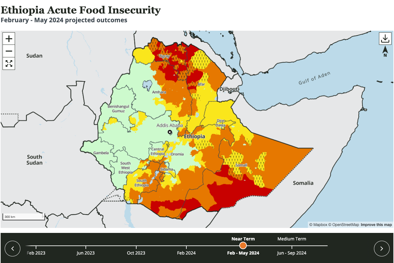
Map with timeline that displays food security outcomes together with the near and medium term projections. Normally the first (standard FEWS NET) and last item (to show HFA data) on all Food Security reports (FSO, FSOU, KMU).
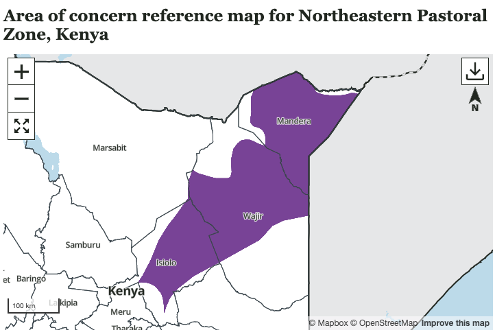
Area of Concern Map
Map that displays areas on concern in a specified country or region.
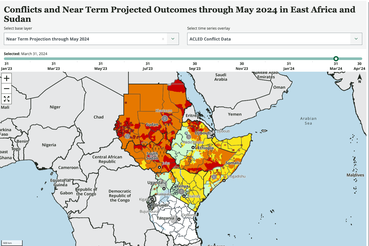
Key Risk Drivers Map
Map that is able to display a number of layers, each displaying a factor that may lead to acute food insecurity.
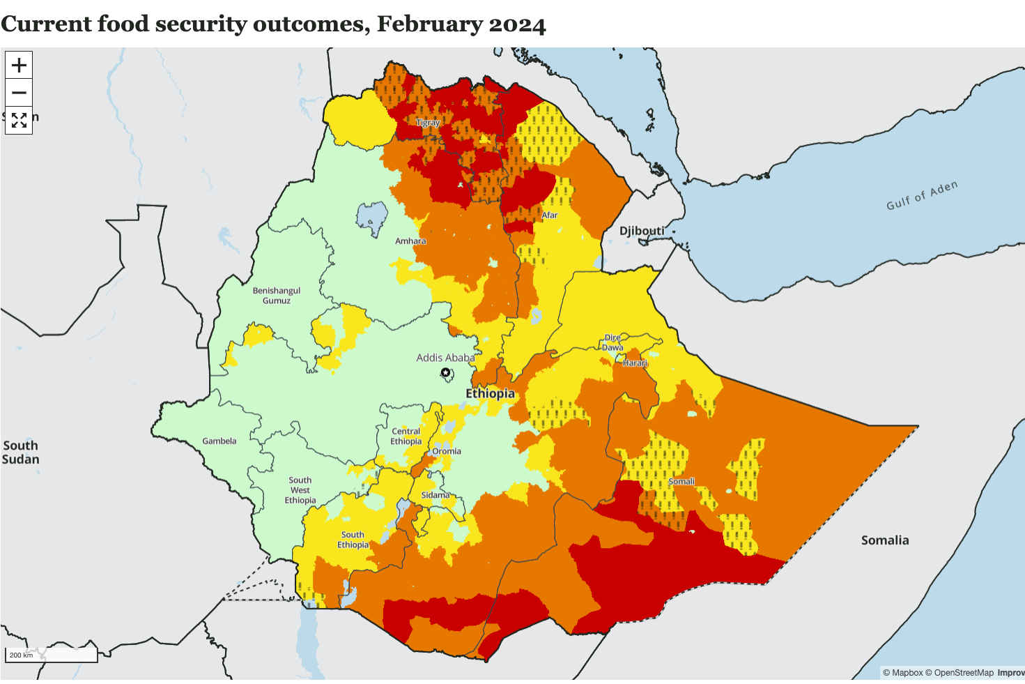
Static Acute Food Insecurity Map
Map that displays a single scenario (current food security outcomes, near term projection, or medium term projection).
Markets and trade visualizations
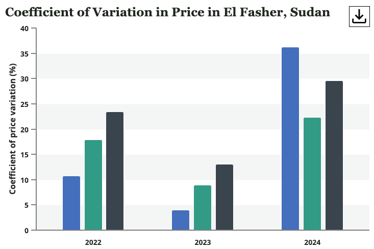
Annual Coefficient of Price Variation Bar Chart for multiple market products
Bar chart with annual coefficient of variability of prices for selected data series.
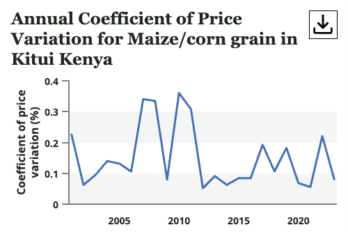
Annual Coefficient of Price Variation Line Chart for a single market product
Line chart with annual coefficient of variability for the selected Market Product.
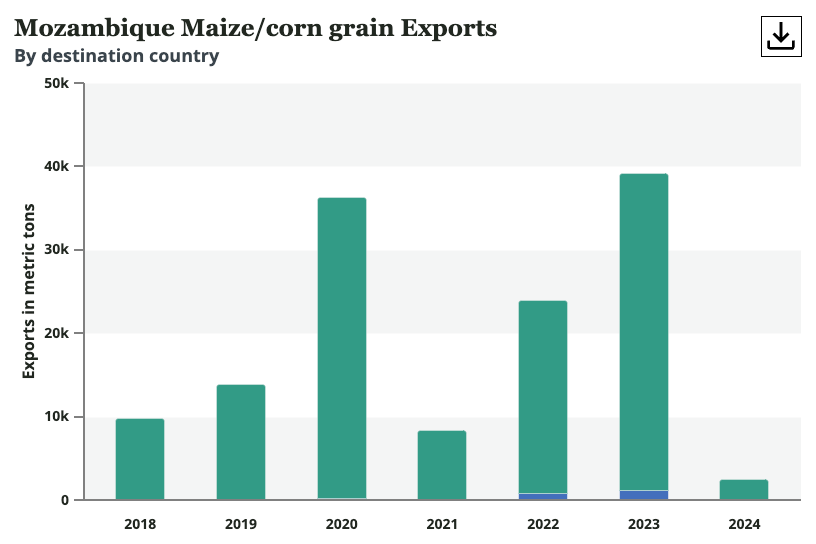
Commodity Import Export Annual Bar Chart
Bar chart of annual exports or imports for a specific country and product.
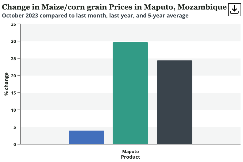
Commodity Price Change Bar Chart
Bar chart with price trends for selected data series.
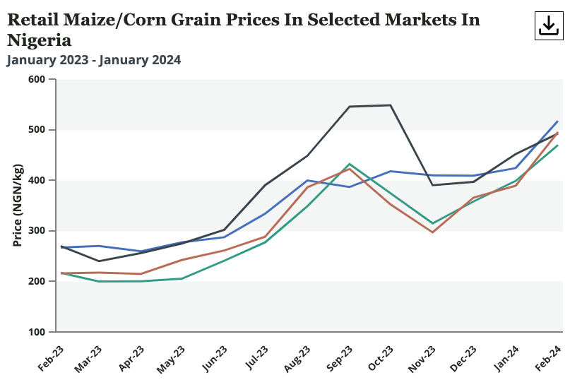
Commodity Price Change Line Chart
Line chart comparing multiple Market Prices.
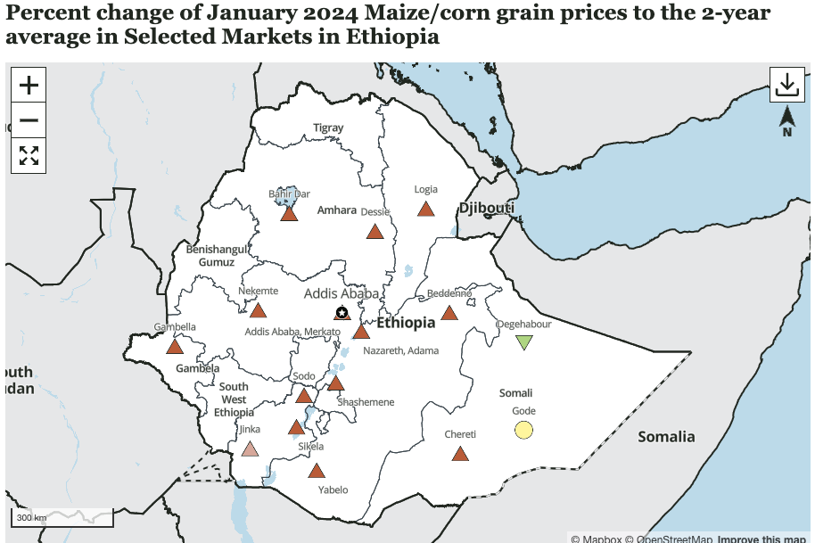
Commodity Price Change Map
Map of markets with the price change of specified products over the selected period for each market.
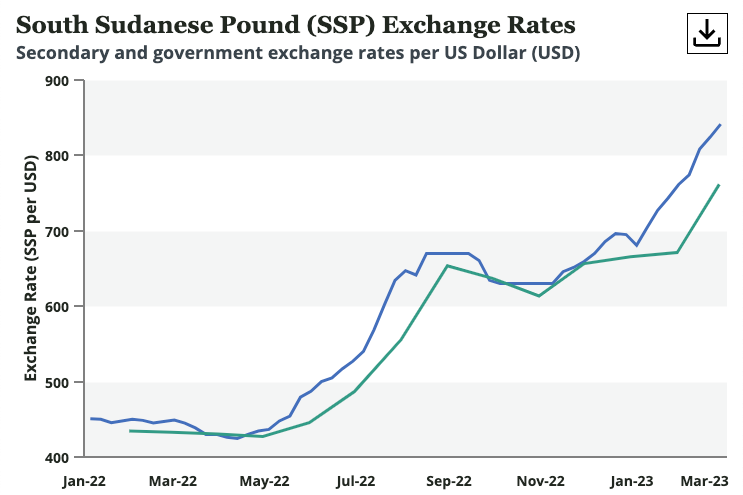
Exchange Rate Comparison Chart
Line chart comparing Exchange Rate values with each other.
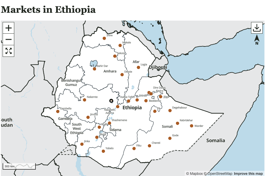
Markets Map
Map that displays key markets in a country or region.
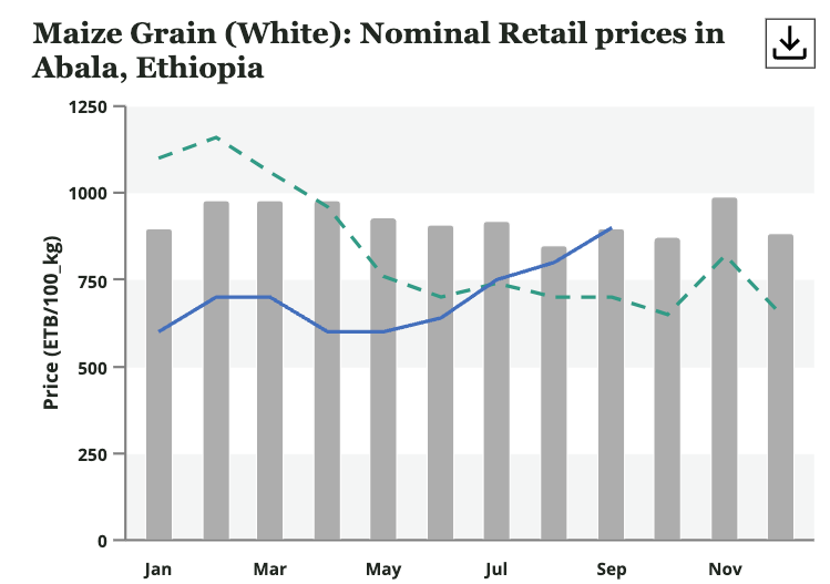
Single Price Bulletin Chart
Combination line and bar chart showing commodity prices in the current year, the previous year, and a historic range (2-year or 5-year average).
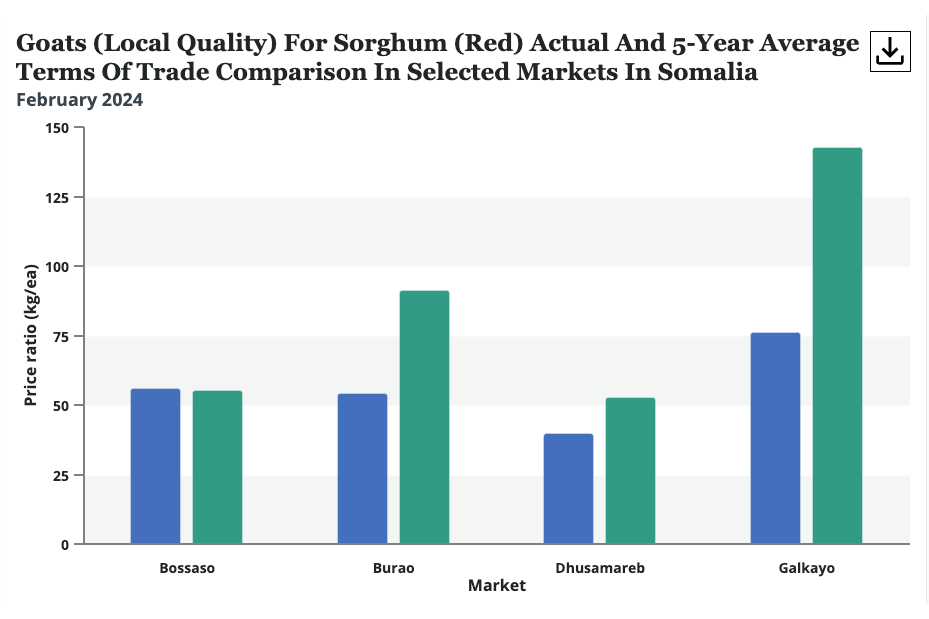
Terms of Trade Bar Chart
Bar chart comparing the actual and 2- or 5-year average Price Ratios for selected product in selected markets on selected date.
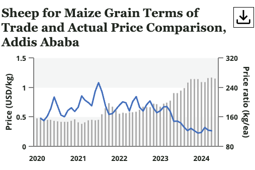
Terms of Trade vs Price Combined Chart
Combined bar/line chart with the market price of a selected product as bars and a price ratio for that product as lines.
Agroclimatology
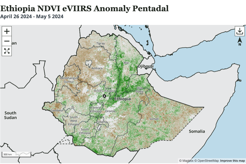
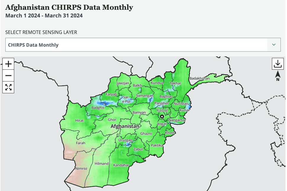
Remote Sensing Map
Map with remote sensing data from the USGS GeoEngine API.
User Selected Remote Sensing Map
Map with remote sensing data from the USGS GeoEngine API that allows the user to toggle between map layers.
Other
Countries We Monitor Map
Map only used on the About Us page that shows the countries FEWS NET monitors.