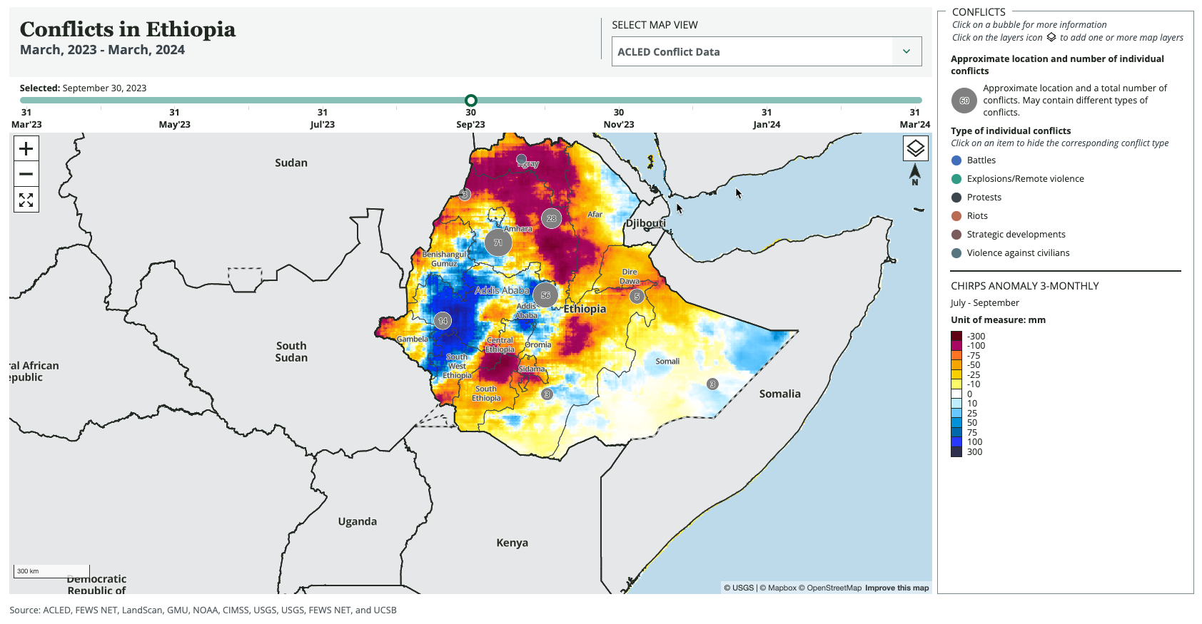
The Key Risk Drivers visualization is a map that is able to display a number of layers, each displaying a factor that may lead to acute food insecurity. Data options include conflict, migration, weather, and trade flow in addition to near term projections and population.
Use the following guidelines to create a Key Risk Drivers visualization.
* = typically required for reports
Standard visualization fields
Internal Title: This field is optional and will not show up in the report. You may use it to help you quickly identify a specific visualization in your report in the CMS.
*Alt Text: Provide a brief description of what the visualization shows. Learn more about writing alt text for FEWS NET visualizations.
*Show Figure Label: If the visualization is referred to in the text of the report and needs a figure number (i.e. Figure 1), make sure this toggle is turned on. Keep this toggle off for visualizations being used in country and region pages.
*Pick a visualization type: Choose Key Risk Drivers Map.
Visualization specific fields
*Country/region fields
Select an item from one of these dropdown boxes. Do not select both a country and a geographic group.
Select a country: Select a country if you are creating a country report.
Select a geographic group: Select a geographic group if you are creating a regional report.
Data layers
Select data layers: Select one or more of the following options. Only one of these layers will show up on the map at a time. The user can control the layer shown via a drop down menu. Data in these layers will change when the timeline slider is moved.
-
ACLED Conflict Data
-
IOM Migration Flow Data (Migration flows internal to a country)
-
IOM Cross Border Movement (Migration flows across countries)
-
No Data Selected (No data will be shown and the map will have no title.)
Select base layers: Select one or more of the following options. A user can select and view any number of these layers at the same time. The user can control the layers shown via a button on the map. These are called base layers because the data in these layers will NOT change when the timeline slider is moved.
-
Near Term Projection (Most recent FEWS NET Acute Food Insecurity Near Term Projection)
-
Population (LandScan, 2022)
-
Flood Detection (Shows floodwater amounts and moisture types)
-
CHIRPS Anomaly 2023 (3 month precipitation anomaly in July - Sept 2023)
-
CHIRPS Anomaly 2015 (3 month precipitation anomaly in July - Sept 2015)
-
NDVI eVIIRS PCTM 2023 (Percent of mean NDVI over a pentad in 2023)
-
NDVI eVIIRS PCTM 2015 (Percent of mean NDVI over a pentad in 2015)
-
Trade Flow Layers (Shows staple crop trade flows within and across countries)
-
Observed Heat Exposure 2000 - 2016 (The average number of million-person extreme heat days per year in 2000 - 2016. Learn more about our Heat Exposure layers.)
-
SSP245 Heat Exposure 2050 (Represents the medium pathway of future greenhouse gas emissions. This scenario assumes that climate protection measures are being taken. Learn more about our Heat Exposure layers.)
-
SSP585 Heat Exposure 2050 (Represents the upper boundary of the range of climate change scenarios described in the literature. Learn more about our Heat Exposure layers.)
Select displayed data layer: Select the data layer that will be shown by default when the map loads.
Select displayed base layer: Select the base layer that will be shown by default when the map loads.
Auto-generated fields
All of these fields will be automatically generated but can be overridden if desired.
Visualization title: The auto-generated title will be formatted as follows:
|
|
Formula |
Example |
|---|---|---|
|
Title |
{Conflicts/Migration of Internally Displaced People/Cross-Border Movement} in {Country or Region} |
Cross-Border Movement in Sudan Conflicts in East Africa |
|
Subtitle |
{Next month, Previous year} - {Current month, year} |
April 2023 - March 2024 |
Disclaimer: This is blank by default for this chart. However, it can be used to add a custom disclaimer when required (e.g., to explain missing data).
Source Attribution: The auto-generated source attribution is a compilation of the data source organization names stored in FDW for the data used to create the map.
Generate the visualization
*+Generate URL: Click this button once you have filled out the fields above to generate the visualization. The system will provide a thumbnail of the visualization and a URL where you can preview the visualization. Note: It may take a minute to generate the thumbnail image. Make sure you allow the thumbnail to load before saving the visualization.
The system will automatically populate the remaining fields: Data Visualization Type, Primary URL, Image URL, and JSON Configuration. These SHOULD NOT be edited.
PDF formatting options
Show full width in PDF: By default, this toggle should be turned off. You may want to show a visualization in full width if you have a very detailed chart that needs to be larger than 50% of the page width.
Float Position: Sets the orientation data visualizations that are not full width. Defaults to Right. For side-by-side images, set the first image to Left. For full width images, set to None.