Alt text, or alternative text, is a written description added to an image so that people using assistive technologies can understand what is being conveyed.
Alt text is necessary for compliance with government accessibility standards and makes content available to a larger number of people. For these reasons, alt text is required for all data visualizations in the FEWS NET website.
General tips for writing alt text
-
Add alt text to all images unless they are decorative (that is, they do not add information to a page).
-
Keep it short and descriptive.
-
Don’t include “image of” or “photo of.”
-
If the image is a chart, diagram, or illustration, consider how to convey the information contained in the image using both the alt-text and the adjacent page text.
Alt text for visualizations
The best practice is to describe the information contained in all visualizations in your report text. This means including a reference to the figure number, what data is being shown, and a short summary of the key takeaways or important information displayed in the visualization.
An easy formula for writing alt text for visualizations is “{1} showing {2}. {3}.” where 1, 2, and 3 are as follows:
-
The type of visualization (e.g., map, line graph, bar chart)
-
The data being shown (e.g., the change of price in maize in selected markets in Kenya in November 2022 compared to last month, last year, and 5 years ago)
-
The key point being shown by the visualization (e.g., maize prices have doubled in the last year) or the section in your web page/report that contains a description of the visualization.
For AFI and HFA maps, provide alternative text summarizing the CS and projected acute food insecurity.
Example: {1} Bar chart showing {2} the change of price in maize in selected markets in Kenya in November 2022 compared to last month, last year, and 5 years ago. {3} Maize prices have doubled in the last year.
Examples
Each example below contains two possible options for alt text. The first option describes key takeaways. The second option tells the user where they can find a description in the text.
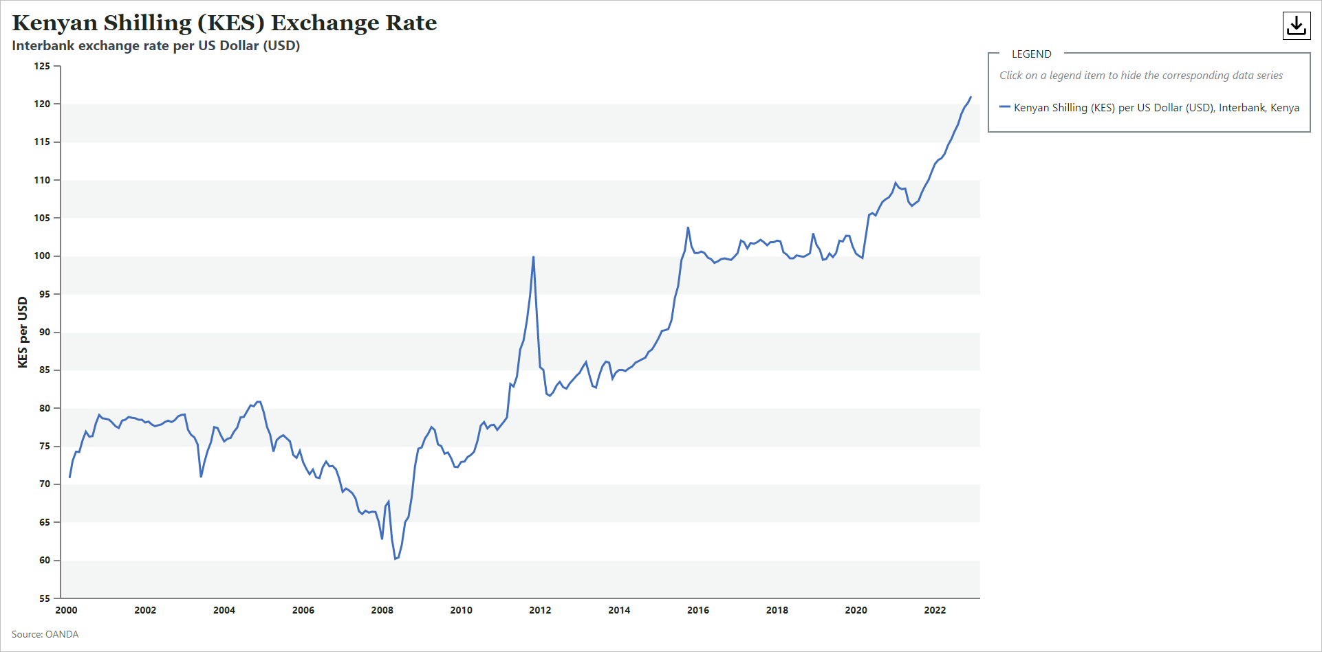
Example 1: Exchange Rate Chart
-
Line chart showing the Interbank Exchange Rate for Kenyan Shilling per US Dollar from the year 2000 to now. Exchange rates have risen about 50% in the last decade.
-
Line chart showing the Interbank Exchange Rate for Kenyan Shilling per US Dollar from the year 2000 to now. Described under the heading Current Situation.
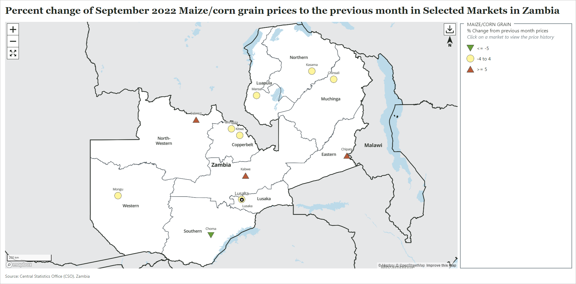
Example 2: Commodity Price Change Map
-
Map showing the percent change in maize/corn grain prices in Zambia from September 2022 to the previous month. Prices have gone up more than 5 percent in Chipata, Kabwe, and Solwezi.
-
Map showing the percent change in maize/corn grain prices in Zambia from September 2022 to the previous month. Described in the Current Market Trends section.
Previous: Add Report Image
Next: Add Automatic Citation