FEWS NET visualizations use different header styles depending on the visualization type and context.
Usage
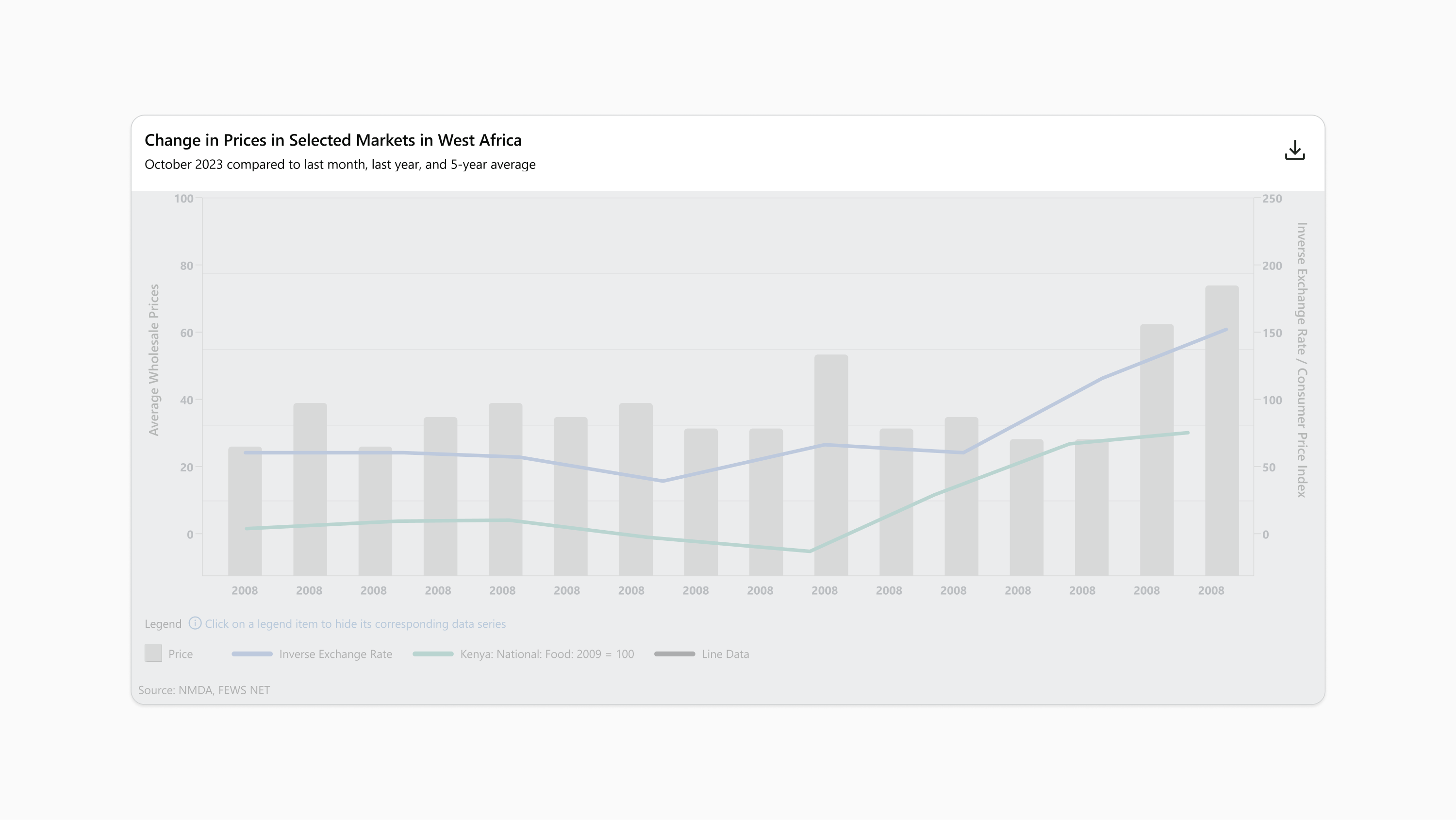
The primary purpose of the header is to contain the title of a visualization.
Titles and Subtitles
Be clear and descriptive. The title should convey the key message or insight the chart is meant to highlight. Avoid vague or overly technical language.
Keep it concise. A title should be short but informative. Ideally, it should be no longer 15 words, which would limit it to about one or two lines.
Use active voice. Where possible, frame the title to emphasize the takeaway or trend being shown.
Align with the data. The title should reflect the main point of the data, summarizing what the viewer will understand after seeing the chart.
Describe the intent of the chosen timeframe. Use subtitles and other time-related text to make it clear why a timeframe was chosen, such as the time period for a projected outcome, the collection date for mapped data, or detail about the nature of a time comparison.
Use consistent formatting. Ensure the font size, style, and placement of subtitles are consistent with FEWS NET visualization technical specifications.
Use the right tone. The tone of your titles and subtitles should be neutral and objective, especially when dealing with sensitive data.
Don’t be verbose. Don’t use titles that are unnecessarily lengthy or repeat details in the chart
Don’t use titles in title case. Don’t use inconsistent capitalization, and don’t capitalize everything. Instead, sentence case is preferred for titles.
Avoid overloading information. While subtitles can be more detailed, avoid cramming too much information that could distract or confuse the viewer.
Global
Use the global header for all charts and static maps.
Components
The header contains:
-
Title
-
Subtitle, if needed
-
Download button, for live charts
Padding and spacing
-
16px on top and sides
-
24px vertical between the last line of text and the bottom
-
8px vertical between the title and subtitle, when a subtitle is present
-
40px minimum horizontal space between the longest text line and the download button, when the button is present
-
8px vertical between the title and download button, when the button is wrapped below the title
Layout and responsiveness
-
Header width fills the visualization frame
-
Header height hugs the enclosed components
-
Title hugs the left margin and the top, subtitle when present falls directly below the title and behaves identically
-
On live charts:
-
download button hugs the right margin and is vertically centered to the text
-
download button wraps below text and hugs the left margin after reaching the minimum space between the text and button
-
text lines wrap to additional lines when the visualization frame width is shorter than the text line length
-
Background
The header background uses Brand White (#FFFFFF).
Buttons
For live charts, the download button is a 40px square with transparent background enclosing a centered 24px square download icon that uses Brand Black Dark (#090B09). For the hover state, the icon fill changes to Brand Primary (#096640).
Typography
FEWS NET visualizations use the Segoe UI typeface unless specified otherwise. Use Open Sans if Segoe UI is not available.
|
Style name |
Font |
Line height |
Color |
Additional specifications |
|---|---|---|---|---|
|
Title |
20px (15pt) Semibold |
120% |
Brand Black Dark (#090B09) |
|
|
Subtitle |
16px (12pt) Regular |
120% |
Brand Black Dark (#090B09) |
|
Interactive - Primary
Use the primary interactive header at the top of live maps and live combined charts. For live combined charts, the primary interactive header is placed above the global header.
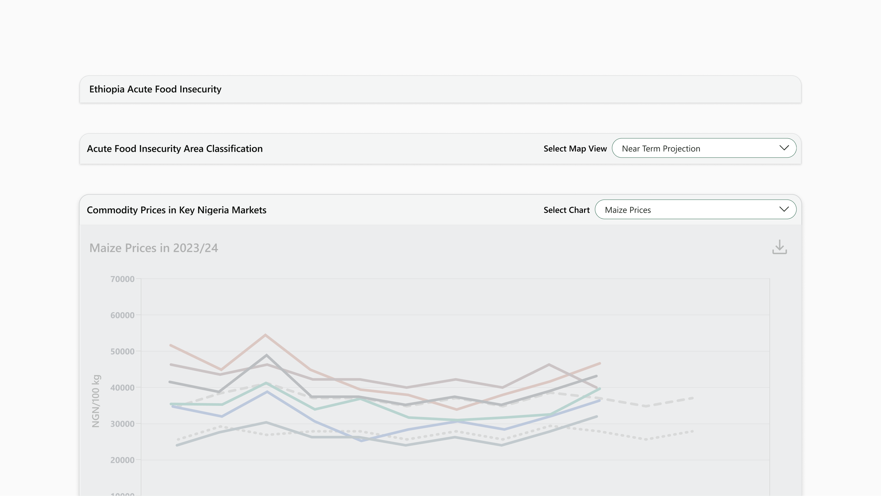
Components
The header contains:
-
Title
-
Input, for live maps with multiple views and combined charts
Padding and Spacing
-
12px on top, or 8px when input is present
-
14px on bottom, or 10px when input is present
-
12px on left margin
-
16px on right margin, or 8px when input is present
-
40px minimum horizontal space between the title and input, when input is present
-
16px vertical between the title and input, when input is wrapped below the title
Layout and Responsiveness
-
For live maps, header width fills the user-interactive zone. For live combined charts, header width fills the visualization frame.
-
Header height hugs the enclosed components
-
Title hugs the left margin and is vertically centered
-
Input hugs the right margin and is vertically centered
-
Input wraps below text and hugs the left margin after the minimum space between the title and input is reached
-
Title wraps to additional lines when the visualization frame width is shorter than the title line length
Background
The header background uses Gray 200 (#F4F5F5).
Typography
FEWS NET visualizations use the Segoe UI typeface unless specified otherwise. Use Open Sans if Segoe UI is not available.
|
Style name |
Font |
Line height |
Color |
Additional specifications |
|---|---|---|---|---|
|
Title |
20px (15pt) Semibold |
120% |
Brand Black Dark (#090B09) |
|
Interactive - Secondary
Use the secondary interactive header for live maps that have layers with time-relevant information or interactivity. The secondary interactive header is always placed directly below the primary interactive header.
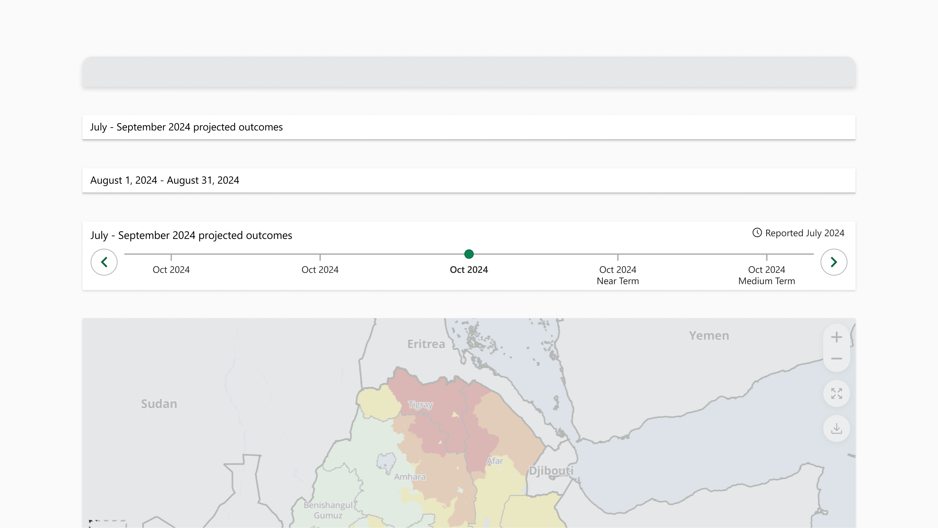
Components
The header contains:
-
Subtitle
-
Reported date, if applicable
-
Time slider, if applicable
Padding and spacing
-
8px on top
-
12px on sides
-
14px on bottom, or 0px when time slider is present
-
40px minimum horizontal space between subtitle and reported date, when reported date is present
-
4px horizontal between reported date icon and text
-
8px additional horizontal padding between the reported date and the right edge of the header
-
14px vertical between the last line of text and the time slider, when time slider is present
-
8px vertical between the subtitle and reported date, when the reported date is wrapped below the title
Layout and responsiveness
-
Header width fills the user-interactive zone
-
Header height hugs the enclosed components
-
Title hugs the left margin and is vertically centered
-
Reported date hugs the right margin and is vertically centered to align with title
-
Time slider falls directly below text row, when present
-
Reported date wraps below subtitle and hugs the left margin after the minimum space between the title and reported date is reached
Background
The header background uses Brand White (#FFFFFF).
Border
The header uses a 1px border, Gray 500 (#ADADAD), on the bottom edge
Typography
FEWS NET visualizations use the Segoe UI typeface unless specified otherwise. Use Open Sans if Segoe UI is not available.
|
Style name |
Font |
Line height |
Color |
Additional specifications |
|---|---|---|---|---|
|
Subtitle |
16px (12pt) Regular |
120% |
Brand Black Dark (#090B09) |
|
|
Reported date |
14px (10.5pt) Regular |
120% |
Brand Black (#212721) |
|
Contact us if you have an application question or recommended addition to these standards.