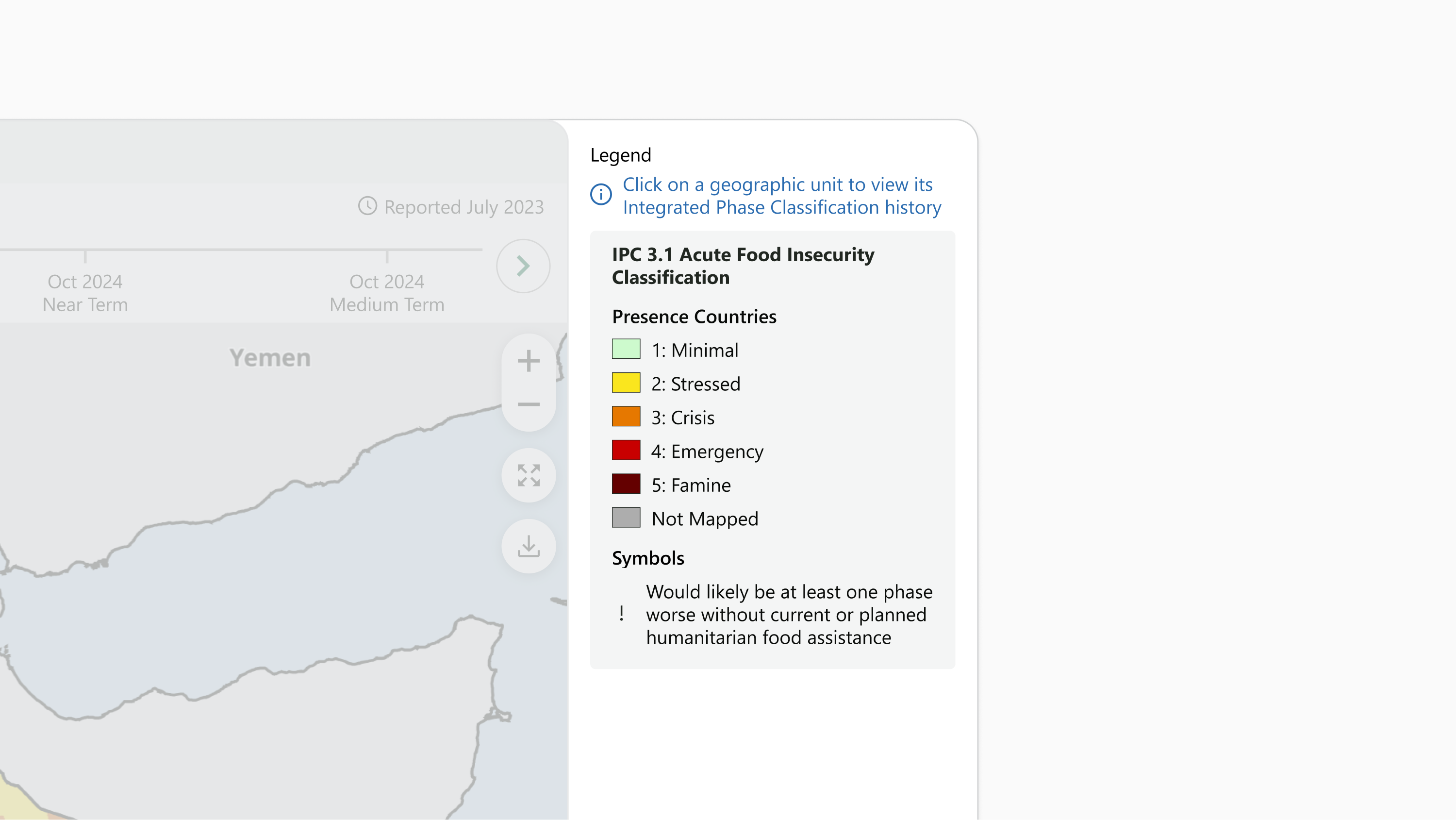
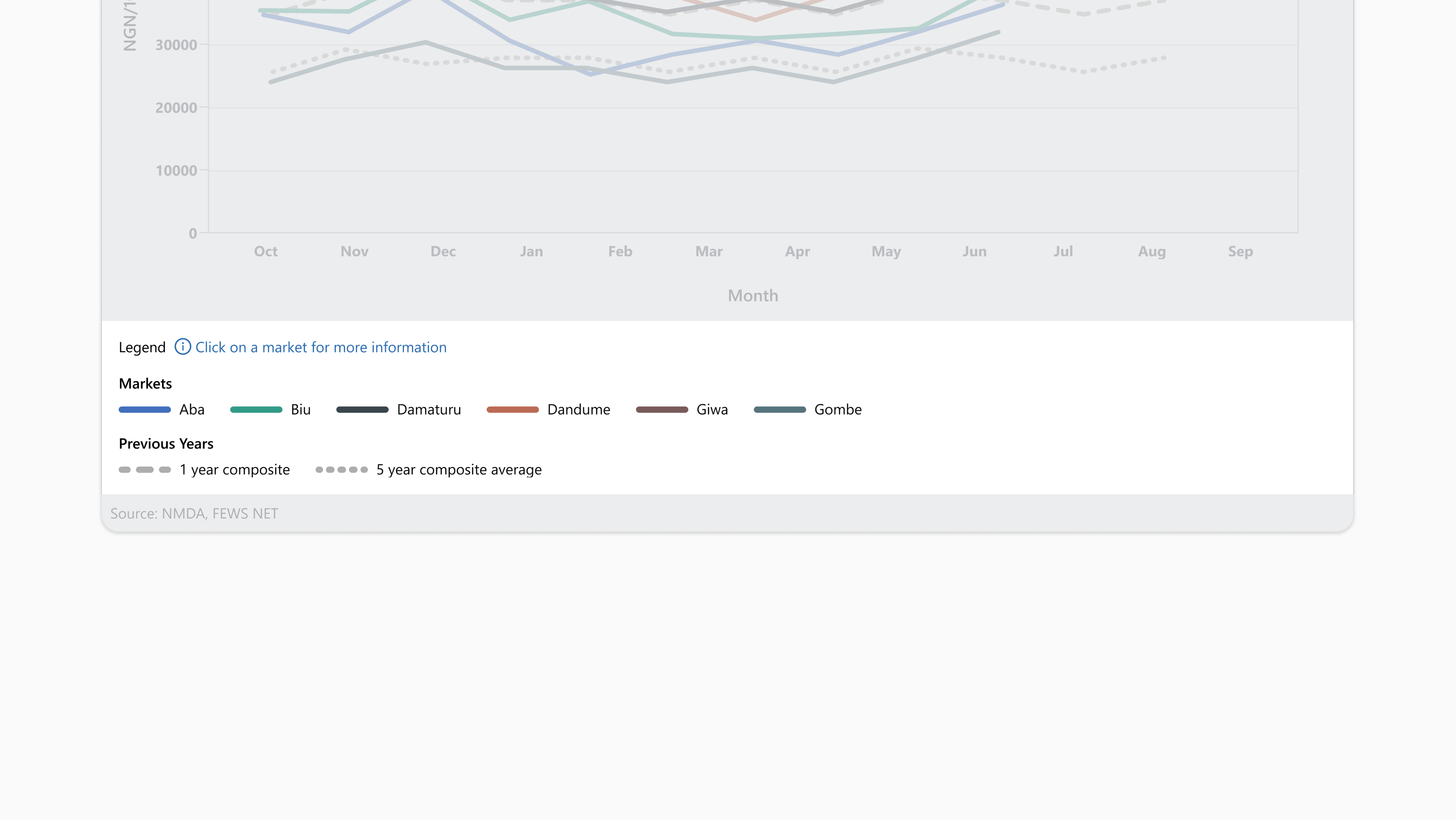
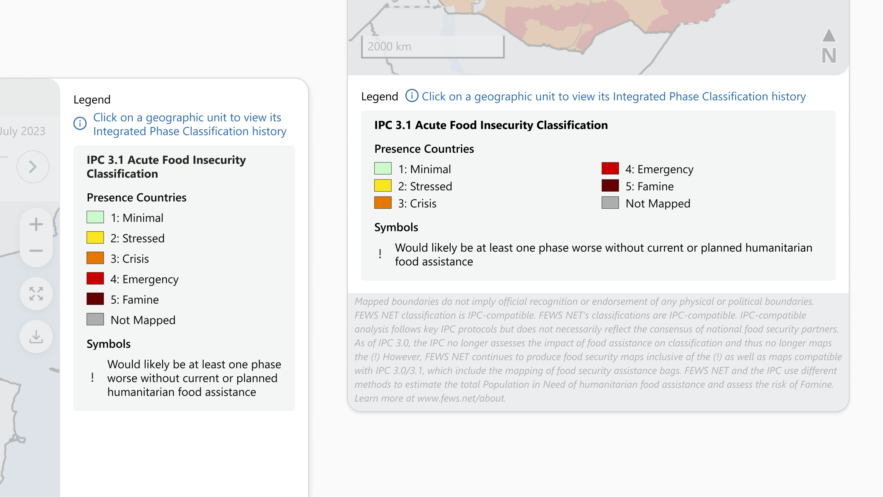
Legends help users navigate a visualization by describing the relevant visual properties, such as fills, patterns, and symbols. For live visualizations, legends also explain any available interactivity that isn’t obvious in the visualization interface.
FEWS NET visualizations always use legends, but the legend format varies depending on the type of visualization.

Usage
Use strategic placement. Place the legend in a location that doesn’t obstruct important data, typically to the right or below the chart.
Give the legend a title. Title the legend, “Legend” for clarity
Group related items together. If applicable, categorize using a bar or gray boxes for separation to help viewers understand the data more intuitively. See following specifications for more details.
Ensure clear separation. Make sure the legend does not overlap with the data being represented; this helps prevent confusion. Avoid describing redundant details in the chart that are already apparent in the title, subtitle, or elsewhere
Don’t include instructions. Don’t instruct the user where to click or look for details in the chart. Details should be apparent through labeling, titles, and callouts alone.
Keep it focused. Don’t include verbose language or describe redundant details in the chart that are already apparent in the title, subtitle, or elsewhere
Chart
Use the chart legend for all charts.

Components
The legend contains:
-
Title, for live maps
-
Instructions, for live maps if needed
-
Sections, if needed:
-
Section titles
-
Items
-
-
Items
Padding and spacing
-
16px on all sides
-
8px horizontal between title and instructions
-
4px horizontal between instructions icon and text
-
18px vertical between bottom line of title text (or instruction text, if present and wrapped) and items (or first section title, if present) (margin)
-
8px vertical between section title and items in section
-
16px vertical between sections, if present
-
8px horizontal between item symbol and text
-
24px horizontal between items
-
24px vertical between items when wrapped
-
40px minimum space between the longest text line and the download button, when the button is present
-
8px between the title and download button, when the button is wrapped below the title
Layout and responsiveness
-
Legend width fills the visualization frame
-
Legend height hugs the enclosed components
-
Item symbols sit left of item text and are vertically centered to text
-
Item text wraps below to additional lines if needed
-
Items hug left and wrap to additional lines if needed
-
For live charts:
-
Title hugs left, instructions sit to the right of the title and hug left
-
Instruction icon and title are vertically centered to instruction text
-
Instruction text wraps below to additional lines if needed
-
Background
The legend background uses Brand White (#FFFFFF).
Symbols
-
The item symbol for items describing data represented as a bar is a 20px square with background fill matching the bar color and .45px border line, Brand Black (#212721).
-
The item symbol for items describing data represented as a line is a 50px wide horizontal line with 6px stroke weight, round cap, with fill matching the line color. Dotted or dashed lines should use the same pattern in the symbol. Dotted or dashed symbols may be modified to better represent the line pattern. (Will likely be too long for png images, symbol width is defined by line width. Might consider a separate set of values for pngs.)
Icons
-
The instructions icon is 16px square enclosing a circle with a lowercase “i” inside centered, Cobalt 600 (#2B6CB0).
Typography
FEWS NET visualizations use the Segoe UI typeface unless specified otherwise. Use Open Sans if Segoe UI is not available.
|
Style name |
Application notes |
Font |
Line height |
Color |
|---|---|---|---|---|
|
Legend title |
|
14px (10.5pt) Regular |
120% |
USAID Black Dark (#090B09) |
|
Legend section subtitle |
|
14px (10.5pt) Semibold |
120% |
USAID Black Dark (#090B09) |
|
Legend text |
|
14px (10.5pt) Regular |
120% |
USAID Black Dark (#090B09) |
|
Legend instructions |
|
14px (10.5pt) Regular |
120% |
Info Blue (#2B6CB0) |
Map
Use the map legend for all maps.

Components
The legend contains:
-
Title, for live maps
-
Instructions, for live maps if needed
-
Section boxes:
-
Section title
-
Descriptive text
-
Subsections, if needed:
-
Section subtitle
-
Items
-
-
Items
-
Padding and spacing
-
16px on top and sides
-
8px on bottom
-
8px horizontal between title and instructions
-
8px vertical between title and instructions, when wrapped
-
4px horizontal between instructions icon and text
-
8px vertical between bottom line of title text (or instruction text, if present and wrapped) and first section box
-
Inside section boxes:
-
8px on top
-
16px on sides and bottom
-
12px vertical between bottom line of section title text and items, or first subsection title if present
-
For subsections:
-
8px vertical between subsection title and items
-
12px vertical between subsections
-
-
-
8px vertical between section boxes
-
120px minimum width for each item
-
8px horizontal between item symbol and text
-
8px minimum horizontal space between items
-
8px vertical between items when stacked in single column
-
4px vertical between items when stacked in multiple columns
Layout and responsiveness
-
For static maps:
-
Legend falls below the map body
-
Legend width fills the visualization frame
-
Legend height hugs the enclosed components
-
-
For live maps:
-
Title hugs top left, instructions sit to the right of the title and hug left
-
Instruction icon and title are vertically centered to instruction text
-
Instruction text wraps below to additional lines if needed
-
-
For live maps 1200px wide or wider:
-
Legend sits to the right of the user-interactive zone
-
Legend width and components fill available space
-
Legend becomes narrower, to minimum width of 252px, before wrapping
-
-
Legend height fills available space
-
-
For live maps 1199px wide or narrower:
-
Legend falls below the user-interactive zone
-
Legend width and components fill the visualization frame
-
Legend height hugs the enclosed components
-
-
Section boxes stack vertically, below title and instruction text if present
-
Item symbols sit left of item text and are vertically centered to text
-
Item text wraps below to additional lines if needed
-
Items sit in a single horizontal line hugging left
-
If available horizontal space is narrower than can fit all items on one line with minimum horizontal spacing, items wrap into two equal width columns that fill the available horizontal space. Items stack vertically and hug left within these columns. If minimum space between any two vertically aligned items in these columns is not available, items wrap into a single column.
-
Background
-
Legend background uses Brand White (#FFFFFF)
-
Section box background uses Gray 200 (#F4F5F5), except Remote Sensing maps, which use Brand White (#FFFFFF)
Border
-
Section boxes of Remote Sensing maps use a 1px, Gray 400 (#D1D3D4) border
Corners
-
Section boxes use a rounded corner with 4px radius
Symbols
-
The item symbol for items describing data represented as a fill is a 20px wide, 14px high rectangle with background fill matching the fill color and texture and .45px border line, Brand Black (#212721).
-
The item symbol for items describing data represented as a bubble is a []
Icons
-
The instructions icon for live maps is 16px square enclosing a circle with a lowercase “i” inside centered, Cobalt 600 (#2B6CB0).
Typography
FEWS NET visualizations use the Segoe UI typeface unless specified otherwise. Use Open Sans if Segoe UI is not available.
|
Style name |
Application notes |
Font |
Line height |
Color |
|---|---|---|---|---|
|
Legend title |
|
14px (10.5pt) Regular |
120% |
Brand Black Dark (#090B09) |
|
Legend section title |
|
14px (10.5pt) Bold |
120% |
Brand Black Dark (#090B09) |
|
Legend section subtitle |
|
14px (10.5pt) Semibold |
120% |
Brand Black Dark (#090B09) |
|
Legend text |
|
14px (10.5pt) Regular |
120% |
Brand Black Dark (#090B09) |
|
Legend instructions |
|
14px (10.5pt) Regular |
120% |
Cobalt 600 (#2B6CB0) |
Contact us if you have an application question or recommended addition to these standards.
