Popover
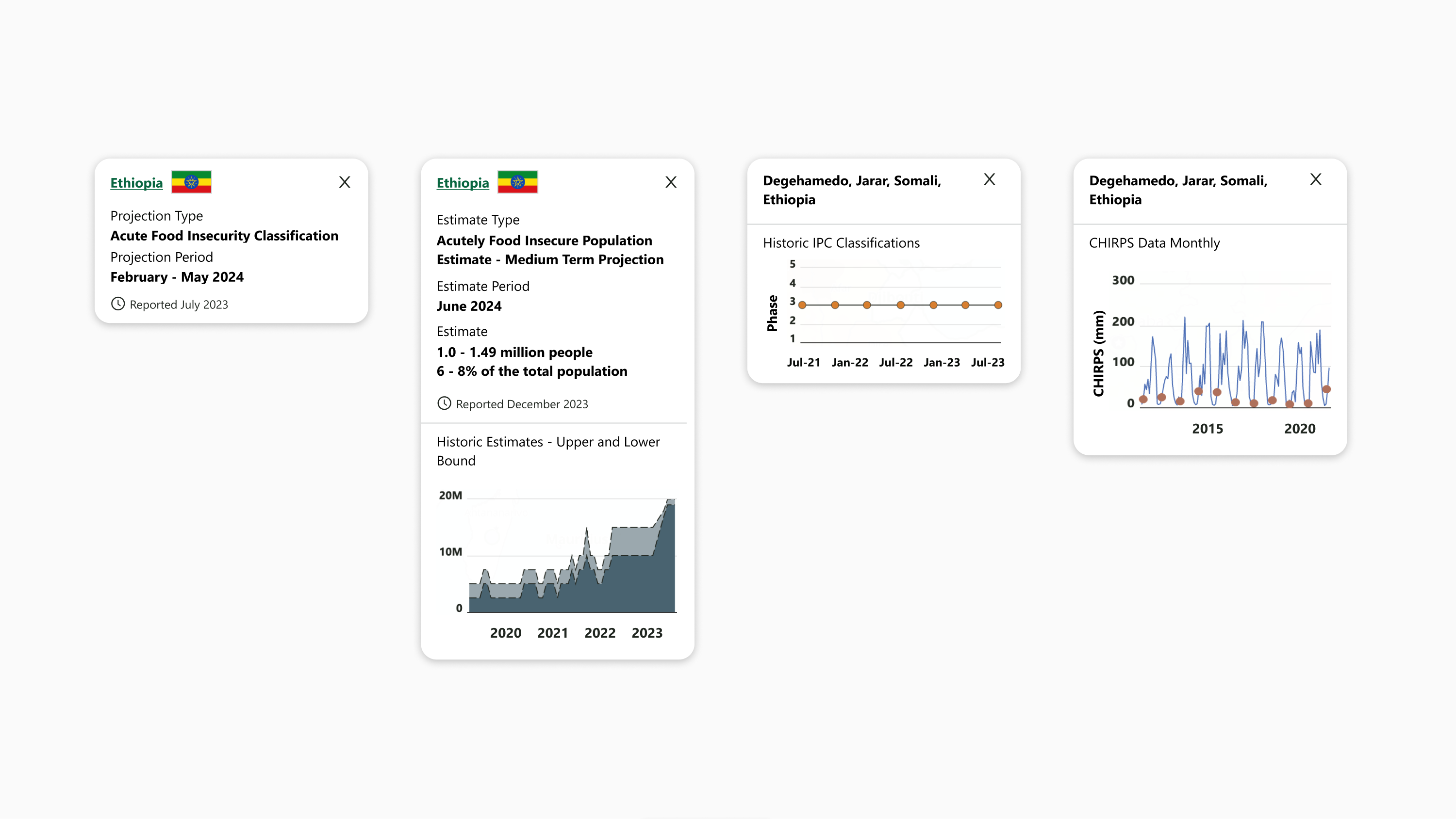
Use popovers to expose additional context when a user clicks on part of a live visualization.
When popovers use inlay charts, visit Chart Body to see chart specifications and best practices not addressed here.
Developers: Figma component
Components
The popover contains:
-
Title
-
Sections, if needed:
-
Section title
-
Section content
-
-
Reported date, if needed
-
Horizontal divider, if inlay chart is present
-
Inlay chart, if needed:
-
Title
-
Chart body
-
Padding and spacing
-
12px on top
-
16px on sides
-
Excluding horizontal divider, when present
-
-
8px on bottom
-
4px extra vertical padding between bottom and reported date, when present
-
-
8px horizontal between title text and flag, if present
-
16px vertical between title and sections, if present
-
2px vertical between section title and section content
-
8px vertical between sections
-
16px vertical between title (or last text, if present) and reported date
-
4px horizontal space between reported date icon and text
-
If inlay chart is present:
-
8px vertical between title (or last section, if present) and horizontal divider
-
4px extra vertical padding between horizontal divider and reported date, when present
-
-
8px vertical between horizontal divider and inlay chart title
-
24px vertical between inlay chart title and chart body
-
4px horizontal space between Y axis labels and chart body
-
Chart body fills available width
-
170px max chart body height, shorter if appropriate to chart content
-
8px vertical space between chart body bottom and X axis labels
-
12px vertical space between chart X axis labels and inlay chart bottom
-
Layout and responsiveness
-
Popover width is fixed at 280px wide
-
Components hug left and stack vertically
-
Excluding “X” close icon, which hugs top right
-
-
Popover height hugs the enclosed components
-
Title text is vertically centered to flag, when present
-
Popovers should appear above and to the right of the user click or hover position
-
Popovers respect the edges of map body / chart body and adjust position to fall within the body if a user makes a selection near the edge. Next preferences after above right are above left, followed by below right and below left
-
Background
The popover background uses Brand White (#FFFFFF).
Inlay chart Y axis segments do not use alternating background fills, unlike chart body in other contexts.
Border
The horizontal divider, if present, is 1px, Gray 400 (#D1D3D4).
Corners
Popovers use a rounded corner with 16px radius.
Shadows
Popovers cast a shadow on the body of the visualization.
|
Style name |
Color |
Blur |
X offset |
Y offset |
Spread |
|---|---|---|---|---|---|
|
Viz On-Map Shadow |
#000000, 25% opacity |
10px |
0px |
1.87px |
0px |
Icons
-
Flags are 40px wide and 22px high, with 1px outside border, Gray 400 (#D1D3D4).
-
The “X” close icon is 16px square enclosing an X, Brand Black (#212721).
Typography
FEWS NET visualizations use the Segoe UI typeface unless specified otherwise. Use Open Sans if Segoe UI is not available.
|
Style name |
Font |
Line height |
Color |
Additional specifications |
|---|---|---|---|---|
|
Popover Title |
14px (10.5pt) Bold |
140% |
Brand Black Dark (#090B09) |
|
|
Popover Title (Link) |
14px (10.5pt) Bold Underlined |
140% |
Brand Primary (#096640) |
|
|
Popover Section Title |
14px (10.5pt) Regular |
140% |
Brand Black Dark (#090B09) |
|
|
Popover Text |
14px (10.5pt) Bold |
140% |
Brand Black Dark (#090B09) |
|
|
Popover Reported Date |
12px (9pt) Bold Should be Regular? |
120% |
Brand Black (#212721) |
|
|
Popover Inlay Chart Axis Label |
14px (10.5pt) Regular |
140% |
Brand Black Dark (#090B09) |
|
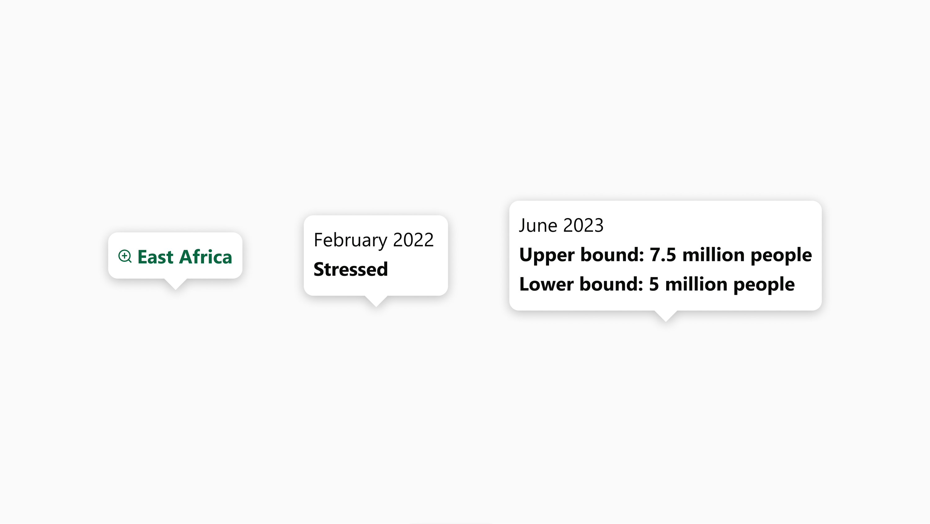
Tooltip
Use tooltips to add additional layers of context when a user hovers over part of a live visualization. Tooltips may appear to expose a global layer, such as to show regional groupings, or to provide more detail when a user hovers over a specific chart or geography, including on an inlay chart inside a popover.
Developers: Figma component
Components
The tooltip contains:
-
Clickable title, if needed
-
Section, if needed:
-
Section title
-
Section content
-
Padding and spacing
-
8px on all sides
-
4px extra bottom spacing if clickable title is the lowest component
-
4px horizontal between clickable title icon and text, when present
-
2px vertical between section title and section content
Layout and responsiveness
-
Components hug left and stack vertically
-
Popover width and height hugs the enclosed components
-
Clickable text is vertically centered to flag, when present
-
Tooltips that appear globally should appear for the entire time a users' cursor is present on the visualization body content
-
Tooltips that appear at specific points should appear directly above and horizontally centered on the cursor hover position so the bottom triangular caret appears to be emanating out of the cursor
-
Tooltips respect the edges of map body / chart body and adjust position to fall within the body if a user hovers near the edge. Next preference after directly above the hover point is directly below. This doesn’t apply to tooltips appearing inside popover inlay charts.
-
Background
The tooltip background uses Brand White (#FFFFFF).
Corners
Tooltips use a rounded corner with 8px radius.
Shadows
Tooltips cast a shadow on the body of the visualization or popover from which they emanate.
|
Style name |
Color |
Blur |
X offset |
Y offset |
Spread |
|---|---|---|---|---|---|
|
Viz On-Map Shadow |
#000000, 25% opacity |
10px |
0px |
1.87px |
0px |
Icons
-
Clickable title icons are 12px square and match the color of clickable title text.
Typography
FEWS NET visualizations use the Segoe UI typeface unless specified otherwise. Use Open Sans if Segoe UI is not available.
|
Style name |
Font |
Line height |
Color |
Additional specifications |
|---|---|---|---|---|
|
Clickable Title |
16px (12pt) Bold |
140% |
Brand Primary (#096640) |
|
|
Tooltip Section Title |
14px (10.5pt) Regular |
140% |
Brand Black Dark (#090B09) |
|
|
Tooltip Text |
14px (10.5pt) Bold |
140% |
Brand Black Dark (#090B09) |
|
Time slider
Use the time slider to allow users to navigate time series data on a live map.
Developers: Figma component
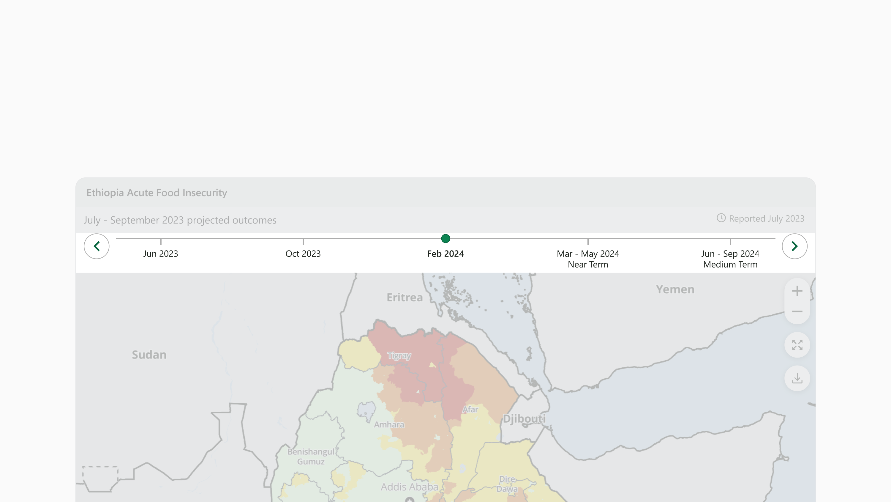
Components
The tooltip contains:
-
Back button
-
Timeline
-
Line
-
Items
-
Tick mark
-
Item text
-
-
Active pin
-
-
Forward button
Padding and Spacing
-
2px on top
-
12px on sides
-
6px on bottom
-
10px horizontal between buttons and timeline
-
140px minimum item width
-
4px vertical between item tick mark and item text
Layout and Responsiveness
-
Time slider width fills available horizontal space in the user-interactive zone
-
Time slider height hugs enclosed components
-
Components lie horizontally from left to right
-
Components hug the top
-
Timeline item tick marks and text fall vertically below the timeline line
-
Active pin indicates the selected item and falls directly above the intersection of the selected item tick and the timeline line
-
Timeline item text is horizontally centered to timeline item tick
-
Timeline items fill evenly across available horizontal space
-
When timeline items run out of available space, older items overlap off of the left edge of the timeline component, leaving the future or most recent items visible
-
Background
The time slider background uses Brand White (#FFFFFF).
Lines
Timeline line and item tick marks are 2px, Gray 500 (#ADADAD)
Borders
The time slider has a 1px, Gray 500 (#ADADAD) border on bottom.
Icons
Active pin is a 12px diameter circle using Brand Primary Light (#0B8351) background fill with an outer border 1px, Brand Primary (#096640)
Buttons
-
The left and right buttons are circles of 40px diameter enclosing 16px square icons.
-
Buttons use Brand White (#FFFFFF) background fill and icons use Brand Primary (#096640). Buttons have an inner border 1px, Gray 500 (#ADADAD)
-
For hover state, background fill uses Brand Secondary Light (#E4F1EF) and icons use Brand Black Dark (#096640).
-
Typography
FEWS NET visualizations use the Segoe UI typeface unless specified otherwise. Use Open Sans if Segoe UI is not available.
|
Style name |
Font |
Line height |
Color |
Additional specifications |
|---|---|---|---|---|
|
Timeline item text |
14px (10.5pt) Regular |
120% |
Brand Black Dark (#090B09) |
|
|
Timeline item text active |
14px (10.5pt) Semibold |
120% |
Brand Black Dark (#090B09) |
|
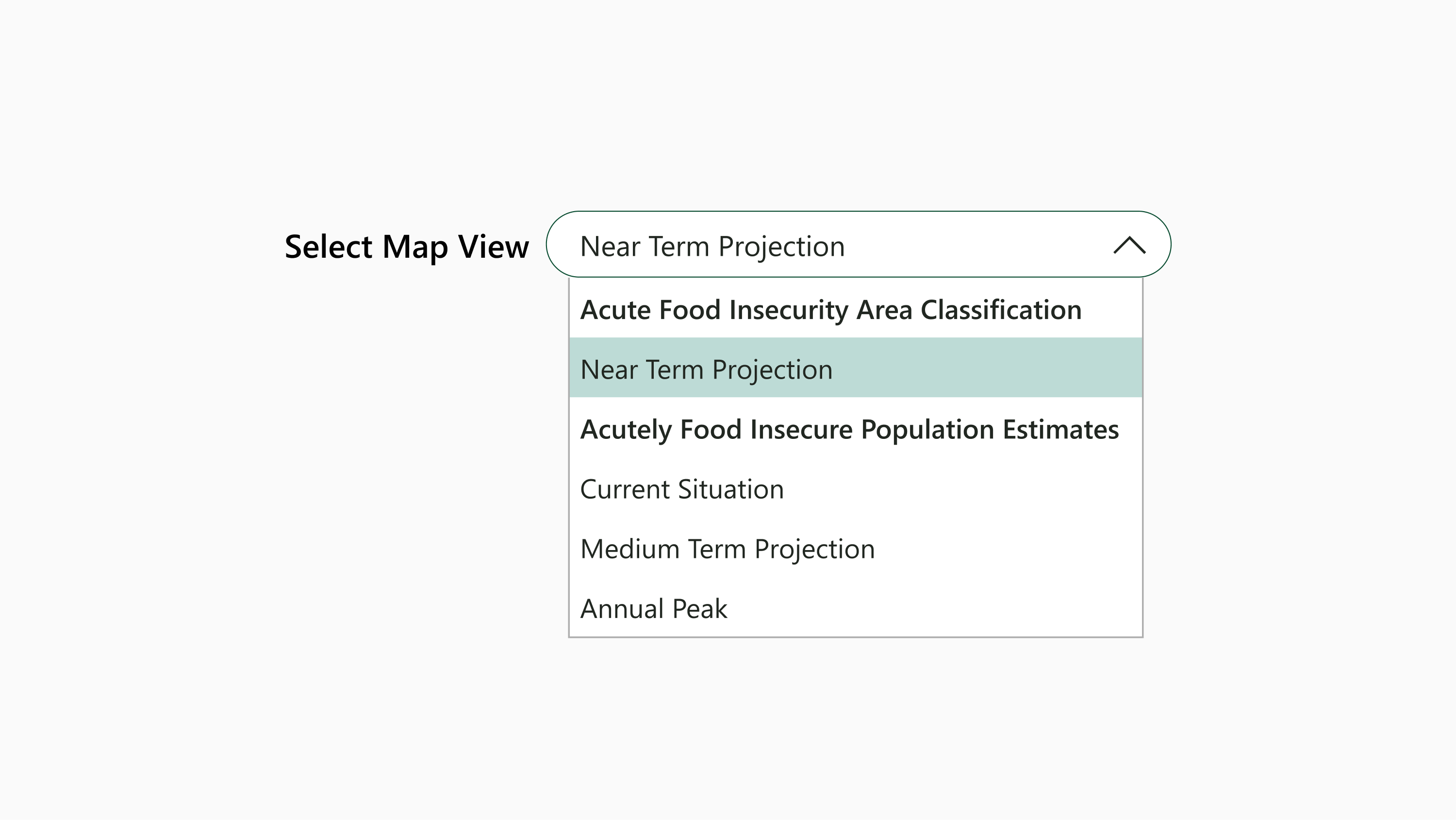
Input
Use the input to allow users to select a view on a live map with multiple views or to select a chart on a multi-layer chart.
Developers: Figma component
Components
The input contains:
-
Input title
-
Input field
-
Selected item text
-
Dropdown icon
-
Dropdown
-
Dropdown section titles, if needed
-
Dropdown items
-
-
Dropdown items
-
-
Padding and spacing
-
0px on sides
-
8px horizontal between input title and input field
-
8px vertical, when wrapped
-
-
Input field:
-
6px on top and bottom
-
16px on left side
-
12px on right side
-
-
Dropdown:
-
0px vertical between items
-
Dropdown item:
-
8px on top and bottom
-
6px on sides
-
-
Layout and responsiveness
-
Input height hugs components
-
Components hug left, including text inside input field and dropdown items
-
Components sit horizontally until visualization width is 607px or narrower, after which input field wraps below input title
-
Input title:
-
Input title size varies depending on visualization width (see Typography)
-
-
Input field:
-
Fixed width of 434px, unless wrapped, in which case fills available horizontal space
-
-
Dropdown:
-
Appears below and directly adjoins input field so dropdown item text is vertically aligned with field text
-
Fills horizontal space to appear visually centered to input field width
-
Background
-
The input field background uses Brand White (#FFFFFF).
-
The dropdown item uses Brand White (#FFFFFF) background fill.
-
Hover state uses Brand Secondary Light (#E4F1EF) and selected state uses Brand Secondary (#BDDBD6).
-
Borders
-
The input field has a .5px, Brand Primary Dark (#074B2F) outer border.
-
The dropdown field has a 1px, Gray 500 (#ADADAD) outer border.
Icons
Dropdown icon is 16px square and uses Brand Black Dark (#096640).
Typography
FEWS NET visualizations use the Segoe UI typeface unless specified otherwise. Use Open Sans if Segoe UI is not available.
|
Style name |
Font |
Line height |
Color |
Additional specifications |
|---|---|---|---|---|
|
Input title XL |
16px (12pt) Semibold |
140% |
Brand Black Dark (#090B09) |
|
|
Input title LG-MD |
14px (10.5pt) Semibold |
140% |
Brand Black Dark (#090B09) |
|
|
Input title SM-XS |
14px (10.5pt) Regular |
140% |
Brand Black Dark (#090B09) |
|
|
Input field text |
14px (10.5pt) Regular |
140% |
Brand Black Dark (#090B09) |
|
|
Dropdown section title |
14px (10.5pt) Semibold |
140% |
Brand Black Dark (#090B09) |
|
|
Dropdown item |
14px (10.5pt) Regular |
140% |
Brand Black Dark (#090B09) |
|
Contact us if you have an application question or recommended addition to these standards.