Usage
General
Avoid featuring missing data. To the extent possible, try to use maps that include data for all the locations included in the scope of the map.
Choose a meaningful timeframe that isn’t arbitrary. To the extent possible, when selecting a timeframe for a chart, choose one that best illustrates the key message or trend you want to highlight.
Use brand styles. In general, use Sego UI or Open Sans for all text throughout the chart. Pay attention to font weight (for example, use Semibold for subtitles). Specifications are available below.
Use branded symbols. For symbol maps, use symbols outlined in the following specifications. In general, choose symbols with adequate differentiation.
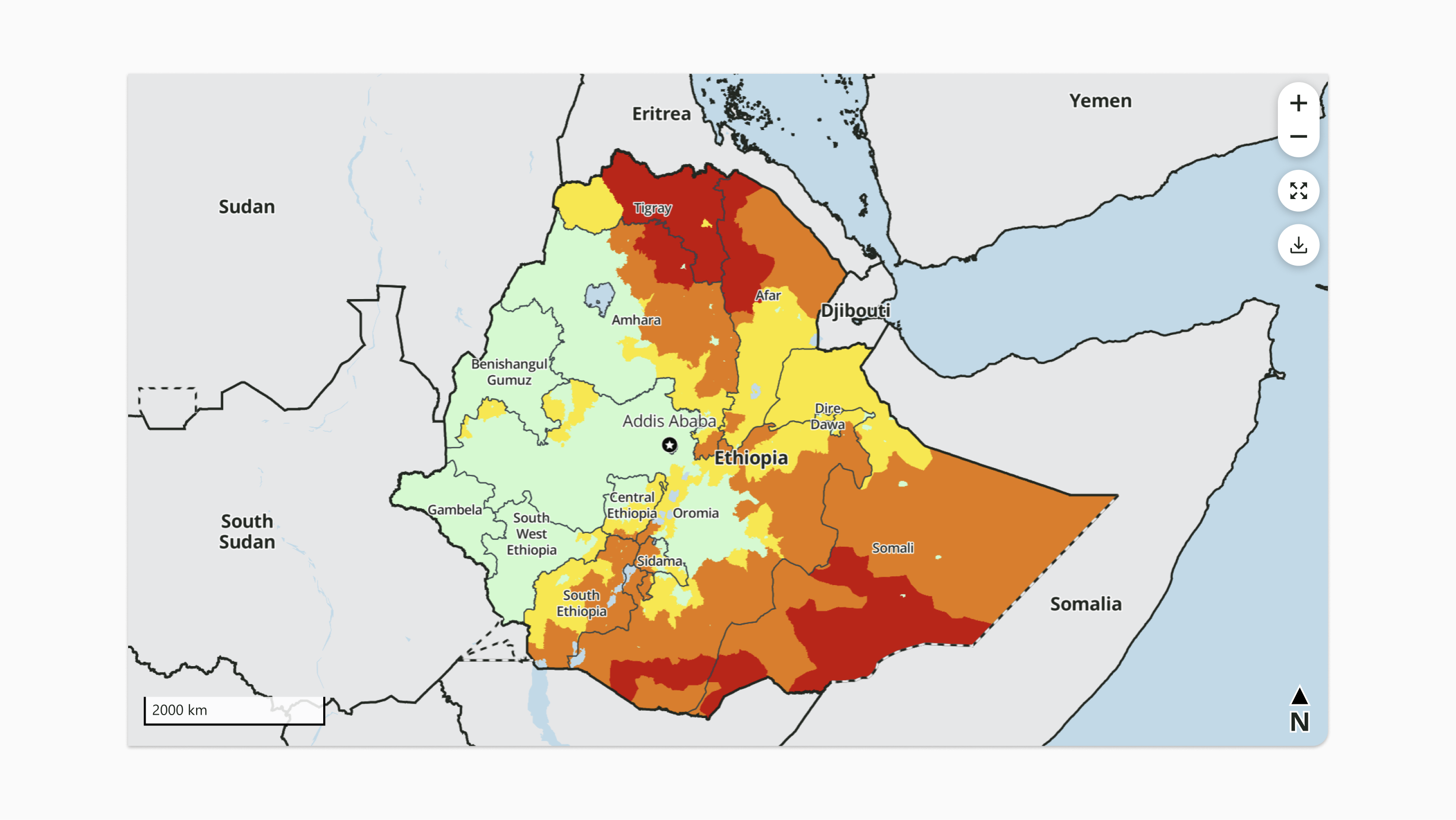
Provide geographic context. Always provide sufficient padding around the main areas of concern on the map to give context and help viewers understand the region within its broader geographic setting.
Do not include descriptive text or text boxes. The footer may be used to include footnotes with clarifications or additional explanation that need to accompany the visualization. If the visualization appears in context of narrative text, consider including a note in the surrounding text instead of in the visualization itself.
Colors
Confirm 508 compliance. Ensure that colors have sufficient color contrast to meet 508 compliance standards. Section 508 a federal law that requires federal agencies to make their communication accessible to people with disabilities. Meeting the color contrast requirement ensures the visual presentation of text and images of text has a contrast ratio of at least 4.5:1. Tools such as webaim.org are helpful for checking color contrast. See Color safety and recommended combinations.
Use shapes and patterns. Instead of just colors, consider using shapes or patterns to differentiate items, especially for colorblind accessibility.
Don’t use similar shades of color. Avoid using shades of the same color that are too difficult to distinguish
Avoid using more than 5–7 data colors per map. Consider using symbols, dashed lines, and other techniques rather than using more colors than needed.
Components
-
Map content
-
Fills
-
Lines
-
Labels
-
Symbols
-
-
Scale
-
North arrow
-
Map inset for focus area, for static maps, if needed
-
Buttons, for live maps
Padding and spacing
-
Map content reaches the edges of the frame
-
For enclosed components:
-
12px top and bottom padding
-
16px side padding, except buttons when present
-
For buttons, when present:
-
12px side padding
-
12px between buttons
-
-
Layout and responsiveness
-
Scale hugs bottom left
-
North arrow hugs bottom right
-
For live maps:
-
Map content crops with center focus as width decreases until 609px width is reached, after which map content width and height scale down proportionally
-
Buttons hug top right
-
Buttons stack vertically
-
Fills
Basic colors
|
Type |
Fill color |
Additional specifications |
|---|---|---|
|
Geographic default |
Gray 300 (#E6E7E8) |
|
|
Geographic default with part focused |
Gray 400 (#D1D3D4) |
|
|
Geographic focused |
Brand White (#FFFFFF) |
|
|
Water |
Ocean 400 (#BCDAE9) |
|
IPC colors
Use for maps that display IPC-compatible analysis.
For Remote Monitoring countries, use the appropriate fill color as a thick inner border that hugs the country boundary. The un-filled center area of the country should use Brand White (#FFFFFF) as a background fill.
|
Type |
Phase |
Fill color |
Additional specifications |
|---|---|---|---|
|
Acute Food Insecurity and Acute Malnutrition |
None / Minimal |
#CDFACD; RGB: 205, 250, 205
|
|
|
Stressed |
#FAE61E; RGB: 250, 230, 030 |
|
|
|
Crisis |
#E67800, RGB: 230, 120, 000 |
|
|
|
Emergency |
#C80000, RGB: 200, 0, 0 |
|
|
|
Catastrophe / Famine |
#640000, RGB: 100, 0, 0 |
|
|
|
Famine Likely |
#640000, RGB: 100, 0, 0 |
|
|
|
Chronic Food Insecurity |
None / Minimal |
#CDFACD; RGB: 205, 250, 205 |
|
|
Mild |
#CBC9E2; RGB: 203, 201, 226 |
|
|
|
Moderate |
#9E9AC8; RGB: 158, 154, 200 |
|
|
|
Severe |
#6A51A3; RGB: 106, 81, 163 |
|
|
|
All types |
Areas not analyzed |
#BDBDBD; RGB: 189, 189, 189 |
|
Diverging colors
Use these colors for non-IPC maps with a 3 to 7 point diverging scale used as a country fill for a variable (e.g. self sufficiency status). These colors ensure good differentiation for color blindness and grayscale printing.
|
Color |
7 point scale |
6 point scale #1 |
6 point scale #2 |
5 point scale |
4 point scale #1 |
4 point scale #2 |
3 point scale |
|---|---|---|---|---|---|---|---|
|
Lime 600: #689F38, RGB: 104, 159, 56 |
x |
x |
x |
x |
x |
x |
x |
|
Lime 500: #8BC34A, RGB: 139, 195, 74 |
x |
x |
x |
x |
x |
|
|
|
Lime 400: #AED581; RGB: 174, 213, 129 |
x |
|
x |
|
|
|
|
|
Yellow 400: #FFF59D; RGB: 255, 245, 157 |
x |
x |
x |
x |
x |
x |
x |
|
Orange 500: #BA6B55; RGB: 186, 107, 85 |
x |
x |
|
|
|
|
|
|
Orange 600: #B95A38; RGB: 185, 90, 56 |
|
|
x |
x |
|
x |
|
|
Orange 700: #AB4B1E; RGB: 171, 75, 30 |
x |
x |
|
|
|
|
|
|
Red 600: #6D4140; RGB: 109, 65, 64 |
x |
x |
x |
x |
x |
x |
x |
|
Gray 400: #D1D3D4; RGB: 209, 211, 212 |
No data |
||||||
Sequential colors
This sequence of colors is a neutral option for sequential scales and can be used either as a fill or as symbols. These colors were selected to ensure good differentiation for color blindness and grayscale printing. Other brand colors may be used for sequential scales as long as they achieve good differentiation for color blindness and greyscale display.
|
Color |
|---|
|
|
|
|
|
|
|
|
|
|
|
|


Patterns
Data texture
There are 15 data texture patterns available to overlay on color fills to provide additional distinction between fills. Download the .svg files in the data texture patterns folder.
IPC
IPC fill patterns may be found in the data visualizations > IPC folder, including:
-
Humanitarian assistance layer (exclamation points)
-
Insufficient evidence layer (hexagons)
-
Famine likely (diagonal white stripes)
Additional options
Refer to the full data visualization colors to find fill options for non-scale maps (e.g. livelihoods attributes and zones). The 400 shades and lighter have greatest contrast with boundary lines, roads, and other map labels and markings. Using a mix of colors across columns will ensure best contrast for color blindness and grayscale printing.
For livelihood zone maps, use the following colors for livelihood zone types:
-
Cropping: Greens
-
Agro-pastoral: Olive greens
-
Pastoral: Oranges
-
Riverine/coastal: Purples
Lines
Styles in this section are for lines that map directly onto geography. For styles associated with symbols and arrows, see those categories.
|
Type |
Thickness |
Color |
Additional Specifications |
|---|---|---|---|
|
Administrative Unit 0 boundary (static) |
2px (2pt) |
Brand Black (#212721) |
|
|
Administrative Unit 0 boundary (live, Administrative Unit 1 boundaries showing) |
2px (2pt) |
Brand Black (#212721) |
|
|
Administrative Unit 0 boundary (Live, Administrative Unit 1 boundaries not showing) |
1px (1pt) |
Charcoal 600 (#3A454C) |
|
|
Administrative Unit 1 boundary |
1px (1pt) |
Charcoal 600 (#3A454C) |
|
|
Administrative Unit 2 or below boundary |
1px (1pt) |
Charcoal 400 (#7C888D) |
|
|
Major road |
2px (2pt) |
Charcoal 600 (#3A454C) |
|
|
Minor road |
1px (1pt) |
Charcoal 500 (#555E62) |
|
Symbols
Interface
|
Marker Name |
Icon |
Specifications |
|---|---|---|
|
North arrow |
|
|
Content
Geographic markers
Files for the symbols for capitals, a north arrow, national parks, and IPC maps can be found in the data visualizations folder.
|
Marker Name |
Icon |
Specifications |
|---|---|---|
|
Capital city (country and regional map) |
|
|
|
Capital city (global map) |
★ |
|
|
City |
|
Dot, Brand Black (#212721) |
|
Market |
|
Square, Brand Black (#212721) |
|
IDP Camp |
|
|
|
National park |
|
See data visualizations folder for pattern |
|
Humanitarian Food Assistance ( ≥25% of households met 25-50% of their kcal needs through HFA) |
|
|
|
Humanitarian Food Assistance ( ≥25% of households met >50% of their kcal needs through HFA) |
|
|
Diverging scale markers
Use these symbol and color combinations for non-IPC maps with a 3 to 7 point diverging scale (e.g. commodity price maps and price change maps). All symbols use the fill colors listed in the Right hand column and are outlined in a 1 pt/1 px line using Brand Black (#212721). The up and down direction of the triangles can be switched if that makes sense for the data. Since the symbols aid in differentiation, these colors are as visually different as possible in both color and grayscale within each shape group on a small scale.
|
Color |
7 point scale |
5 point scale |
4 point scale #1 |
4 point scale #2 |
3 point scale |
|---|---|---|---|---|---|
|
Pine 800: #0C5D40; RGB: 12, 93, 64
|
|
|
|
|
|
|
Lime 600: #689F38, RGB: 104, 159, 56 |
|
|
|
|
|
|
Lime 400: #AED581; RGB: 174, 213, 129 |
|
|
|
|
|
|
Yellow 400: #FFF59D; RGB: 255, 245, 157 |
|
|
|
|
|
|
Orange 400: #D6A79A; RGB: 214, 167, 154 |
|
|
|
|
|
|
Orange 600: #B95A38; RGB: 185, 90, 56 |
|
|
|
|
|
|
Red 600: #6D4140; RGB: 109, 65, 64 |
|
|
|
|
|
Arrows
Use arrows to represent flows. All arrows should be rendered in Brand Black (#212721).
|
Type |
Specifications |
|---|---|
|
Large flow
|
|
|
Medium flow |
|
|
Small flow |
|
Bubbles
Use bubble layers to represent a variable numerical quantity associated with specific locations (e.g., number of conflicts). Use the following formatting for bubbles:
-
Shape: circle
-
Size: Use a size-graduated range with diameters between 4pt minimum and 18pt maximum
-
Fill: See full data visualization colors for options. Use any color from the 500 column.
-
Border: 1pt outer border using the color from the 600 column that corresponds with the fill color.
Buttons
The on-map zoom buttons are combined into a single visual unit of two vertically adjoined buttons of 36px height each and 40px width. Buttons have 80px corner rounding on the non-adjoined corners.
The on-map expand and download buttons are circles of 40px diameter.
All buttons use Brand White (#FFFFFF) background fill and icons use Brand Black Dark (#090B09). For hover state, icons change to Brand Primary (#096640). Buttons cast the on-map shadow:
|
Style name |
Color |
Blur |
X offset |
Y offset |
Spread |
|---|---|---|---|---|---|
|
Viz On-Map Shadow |
#000000, 25% opacity |
10px |
0px |
1.87px |
0px |
Wordmark and Logos
-
FEWS NET maps that are not presented inside a FEWS NET web property or official report should always include the FEWS NET wordmark on the left (horizontal, 0.5 inch, PNG) and the U.S. Department of State logo on the right (horizontal, RGB, 294, PNG). Both should be equal size on the map. Both should also have a transparent background. If a map is embedded in a report that is branded with both the FEWS NET wordmark and U.S. Department of State logo, these maps should not include any wordmarks or logos. Wordmark and logo guidance and links to files can be found on Wordmark and Partner Logos.
Map inset for focus area
Use inside the map body on static maps when there is a focus area that includes an entire country or countries.
-
Country fill: Steel 400 (#98A9AE)
-
Highlight box border: 1px (1pt), Orange 700 (#AB4B1E)
-
Inset map border: 1px (1pt), Brand Black (#212721)
Typography
FEWS NET visualizations use the Segoe UI typeface unless specified otherwise. Use Open Sans if Segoe UI is not available.
All text for maps uses Brand Black (#212721) with a 1px (1pt) outer stroke in Brand White (#FFFFFF).
|
Style name |
Font |
|---|---|
|
City / Market |
9px (7pt) Regular |
|
Capital city |
14px (10pt) Regular |
|
Administrative Unit 0 |
16px (12pt) Bold |
|
Administrative Unit 1 |
14px (10pt) Semibold |
|
Administrative Unit 2 |
12px (9pt) Semibold |
|
Administrative Unit 3 |
10px (8pt) Semibold |
Contact us if you have an application question or recommended addition to these standards.