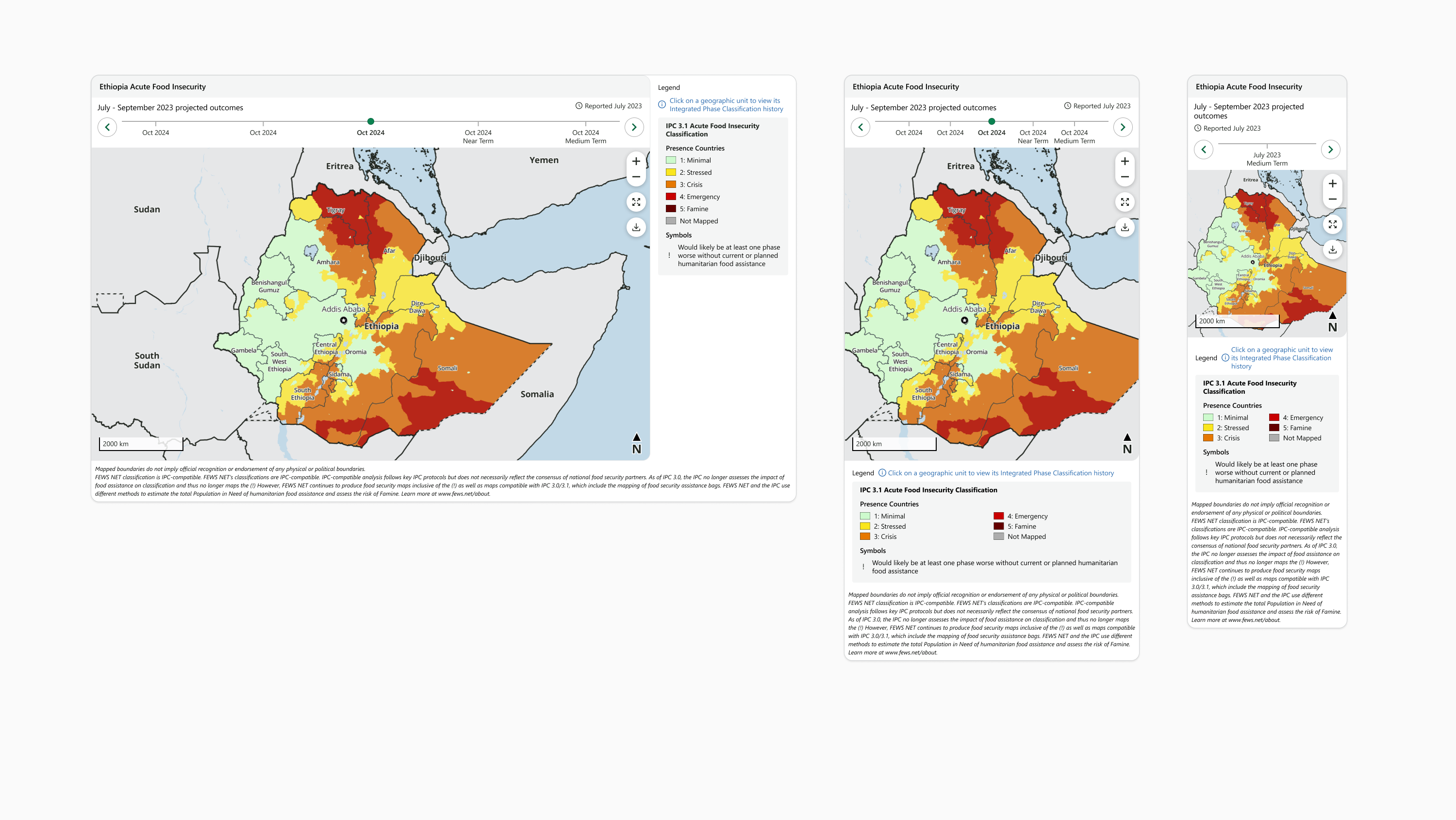
This page includes layout principles and frame styles used by all FEWS NET visualizations.
For details about responsive behavior of live visualizations based on the width of the visualization frame, see Frame Responsiveness.

Components and Layout
Visualizations are made up of components organized inside a visualization frame. Static visualizations and live charts include components in the following order, from top to bottom:
-
Header
-
Body
-
Legend
-
Footer
These components all fill the width of the visualization frame.
The layout of a live map changes depending on the map’s width. Each map has a user-interactive zone containing components in the following order, from top to bottom:
-
Header
-
Map Body

On wide maps, the legend forms a column to the right of the user-interactive zone that fills the same vertical space. On narrow maps, the legend wraps beneath the user-interactive zone and both components fill the width of the visualization frame.
The footer is always present at the bottom of the visualization and fills the width of the visualization frame.
Padding and Spacing
Visualizations use minimum padding and spacing in order to provide maximum area for visualization content.
-
No padding is used between the edge of the visualization frame and enclosed components. For example, the left edge of a live map contained inside the user interactive zone should touch the left edge of the visualization frame.
-
No spacing is used between the components contained inside the visualization frame. Visual space is provided by padding inside individual components. For example, on a wide live map, the left edge of the legend component should touch the right edge of the user-interactive zone.

Borders
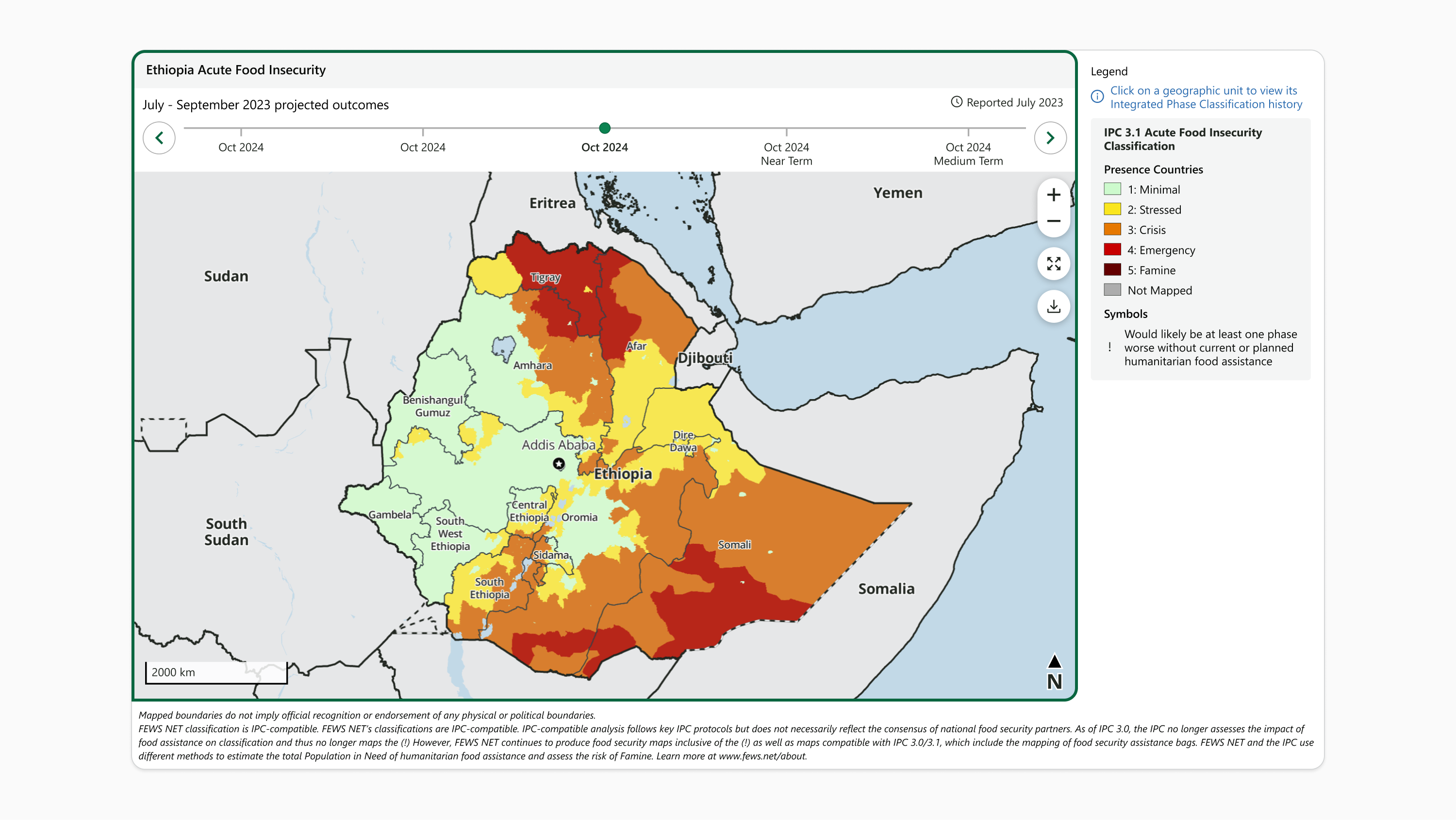
Visualizations use minimal borders to outline key volumes.
-
All visualizations use a 1px wide, Gray 400 (#D1D3D4) border around the visualization frame
-
Live maps use a 1px wide, Gray 300 (#E6E7E8) border around the user-interactive zone
Corners
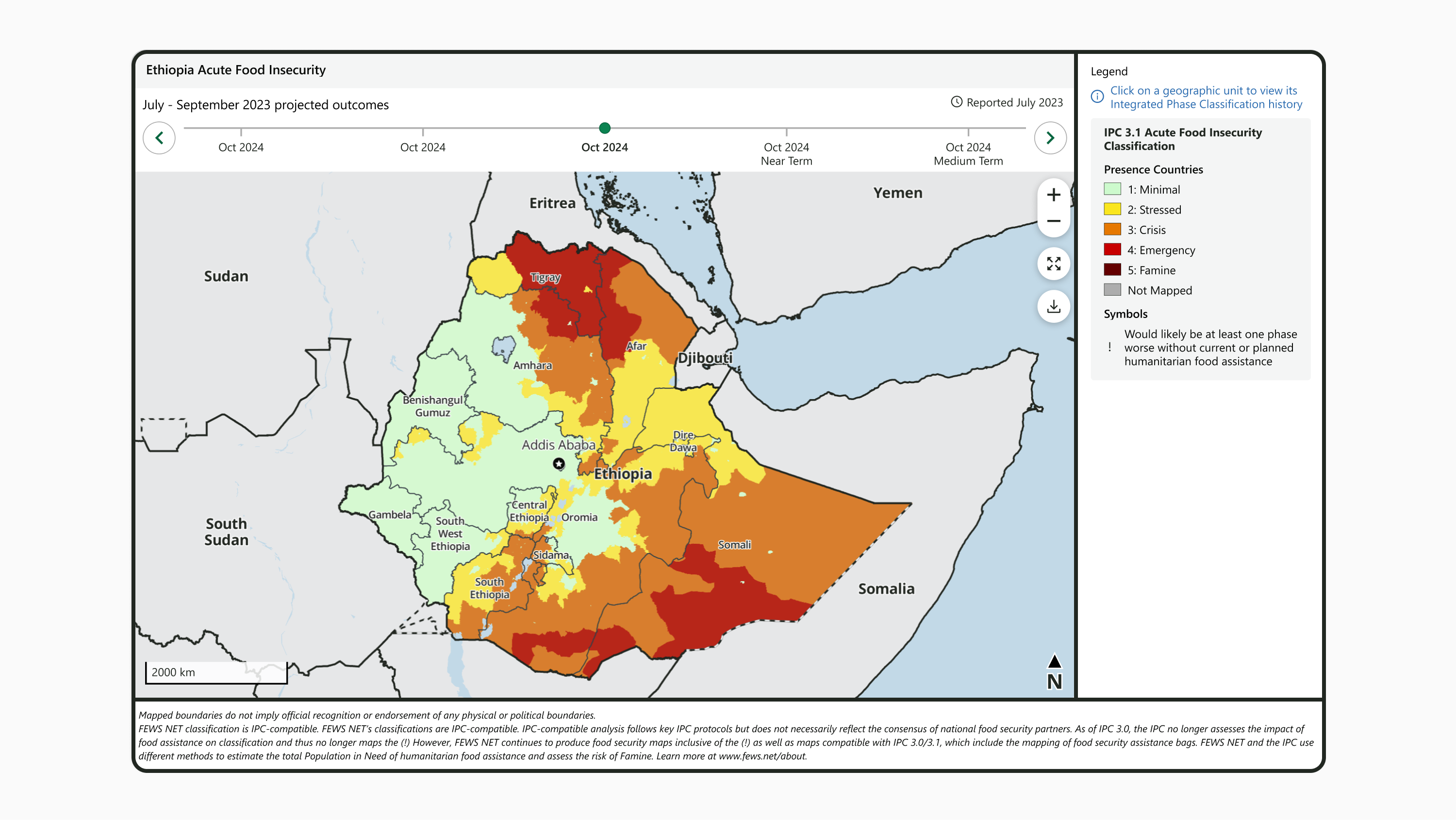
Visualizations use rounded corners for interface components. This conveys an attitude of approachability that invites user interaction and provides subtle contrast with the rectangular volumes of text paragraphs and presentation slides where visualizations typically appear.
|
Component |
Style |
Additional specifications |
|---|---|---|
|
Visualization frame |
16px radius, all corners |
|
|
User-interactive zone |
15px radius, all corners except bottom left |
|
|
Legend section |
4px radius, all corners |
|
|
Popover |
16px radius, all corners |
|
|
Tooltip |
8px radius, all corners |
|
Shadows
Where possible, visualizations cast a shadow to create visual interest and highlight interactivity. For non-web contexts, it is acceptable to omit shadows so long as the no-shadow treatment is applied consistently to all visualizations.
|
Style name |
Color |
Blur |
X offset |
Y offset |
Spread |
Additional specifications |
|---|---|---|---|---|---|---|
|
Global Shadow |
#000000, 10% opacity |
4px |
0px |
2px |
0px |
|
|
Viz Highlight Shadow |
#000000, 25% opacity |
20px |
0px |
6px |
0px |
|
Contact us if you have an application question or recommended addition to these standards.
