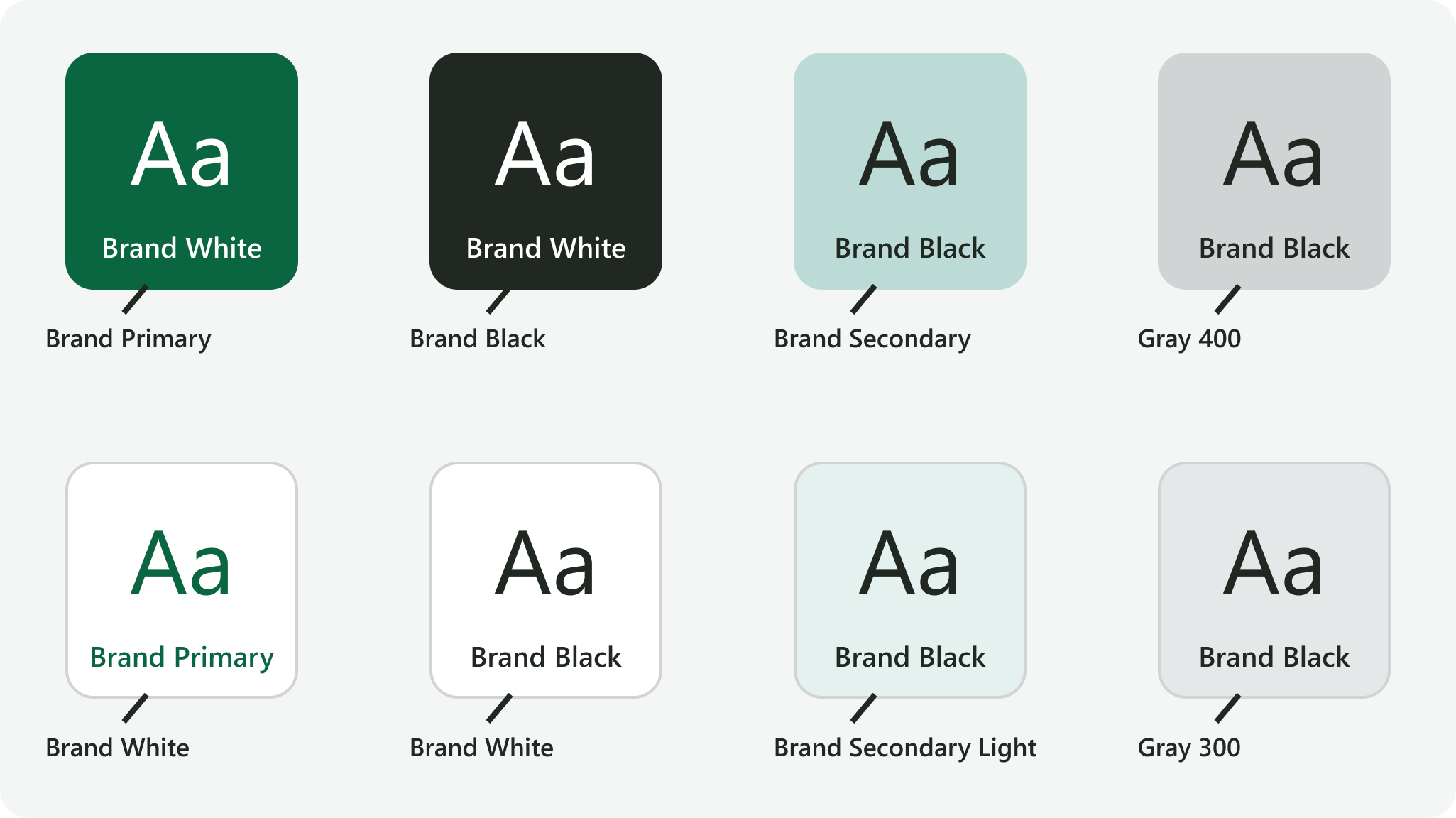
Only specific combinations of brand colors have high enough color contrast to be recommended for use in text or graphics. See the color contrast quick reference sheet for a table of all recommended brand color combinations and uses.
For text, aim to choose a text color that has a minimum 7:1 contrast ratio with its background color. Meaningful graphics like icons, shapes, and user interface elements should aim to achieve a minimum 4.5:1 contrast ratio with their background color. Online tools are available to check the contrast ratio between two colors.
These recommendations are meant to comfortably exceed the minimum color contrast requirements set by the Web Content Accessibility Guidelines (WCAG). Always aim for the highest possible contrast ratio between colors.
Recommended color combinations for text and graphics
Values
|
Background color |
Hex value |
Foreground color |
Hex value |
|---|---|---|---|
|
|
#096640 |
|
#FFFFFF |
|
|
#212721 |
|
#FFFFFF |
|
|
#BDDBD6 |
|
#212721 |
|
|
#E4F1EF |
|
#212721 |
|
|
#88BFB6 |
|
#212721 |
|
|
#FFFFFF |
|
#096640 |
|
|
#D1D3D4 |
|
#212721 |
|
|
#E6E7E8 |
|
#212721 |


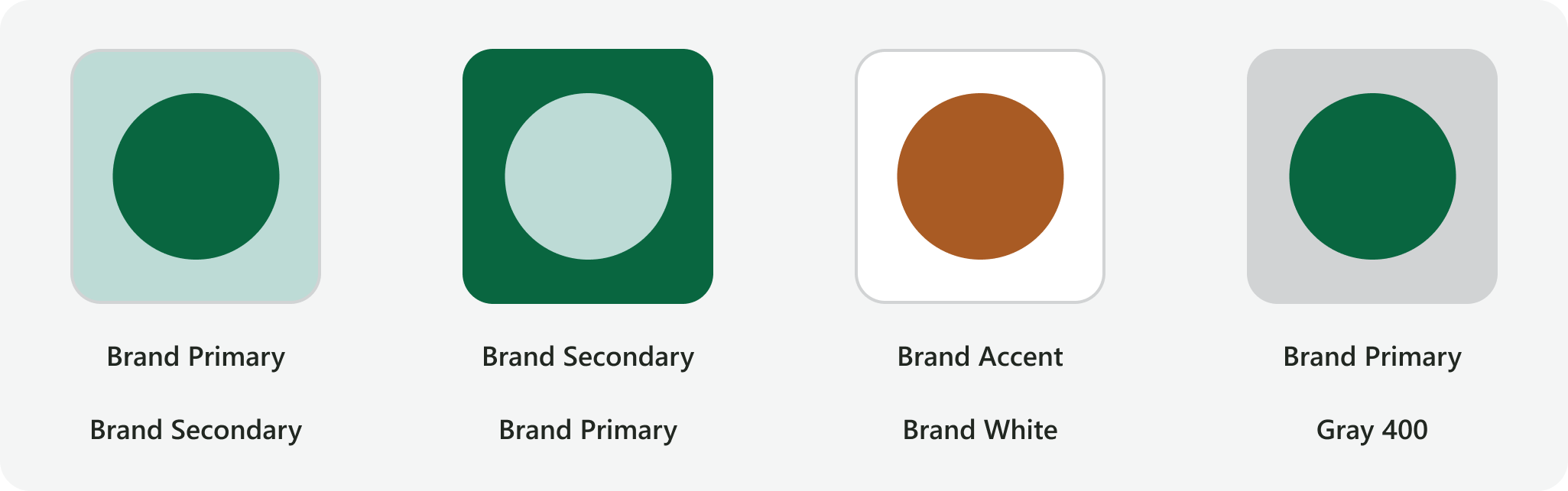
Recommended color combinations for graphics only
Brand color combinations with contrast ratios that are 4.5:1 or greater but less than 7:1 are recommended for graphics only. Any color combinations listed as “Graphics only” on the color contrast quick reference sheet fall into this category.
For example, Brand Primary and Brand Secondary may be used against each other for graphics. Brand Accent may be used against white, and Brand Primary may be used against lighter shades of gray such as Gray 400.
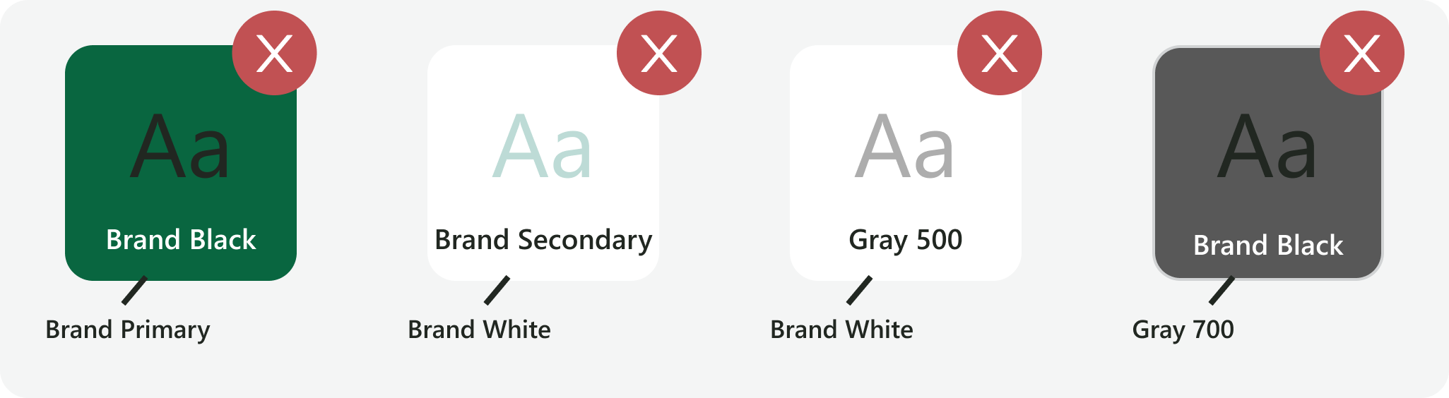
Minimum requirements and prohibited color combinations
The WCAG 2.0 level AA accessibility standard requires a contrast ratio of at least 4.5:1 for normal text and 3:1 for large text. WCAG 2.1 requires a contrast ratio of at least 3:1 for meaningful graphics and user interface elements. These are the minimum color contrast requirements for combinations of FEWS NET brand colors, and any color combinations that fall below these standards are prohibited.
Some examples of foreground / background color combinations that are prohibited for both text and graphics include: Brand Black / Brand Primary; Brand Secondary / Brand White; Gray 500 / Brand White; Brand Black / Gray 500.
Contact us if you have an application question or recommended addition to these standards.