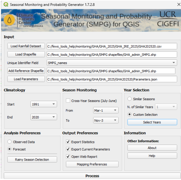
Complete the form
Once you have prepared the shapefile and have organized the data in the correct format, you can complete the form. An example of a completed form is provided below. For more details on completing each section, see SMPG Interface Overview.
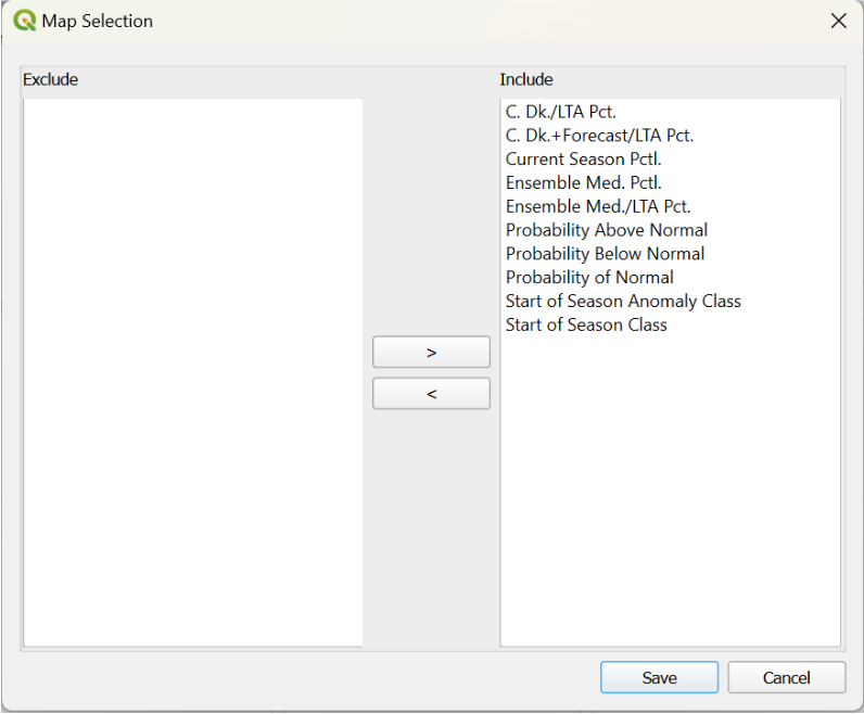
Mapping Preferences
In the Output Preferences section, select the Mapping Preferences button to select the maps to be generated.
Process and save results
-
Execute the tool by clicking the Process button.
-
Select a folder to save the results.
-
The SMPG tool will generate a folder containing all the results. By default, this folder will be named after the input table unless you choose a different name. Navigate to the folder where you want to save the results.
-
Click Yes to generate the new folder.
-
-
A confirmation message will appear, indicating that the task has been successfully completed.
View web report
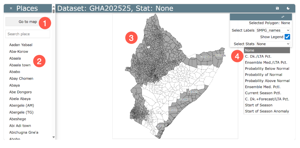
Once the task has completed, a new browser window opens (see figure below). This window displays the web-based report with the following options:
-
Select Go to Map to return to the main map window (as shown in the image below).
-
Search and select from a list of available polygons to open the polygon-specific plots, described in detail below.
-
Hover over the map to preview polygons. The polygon under the cursor is outlined in red and its name appears.
-
Click a polygon to open the polygon-specific plots.
-
-
View and select Map Options, including the following fields:
-
Selected Polygon: Shows the name of the polygon under your cursor. Hover to preview the name; click to select the polygon.
-
Select Labels: Select an attribute to identify the polygons on the map, such as name or ID. If the text for an attribute is too large for the polygon, it may not be displayed
-
Show Legend: Check the box to display or hide the legend. The legend reflects the currently selected stat/map and updates automatically when you change the selection.
-
Select Stats: Use the dropdown to choose which SMPG output map to display. The options reflect the maps you selected during the SMPG run. When you change the selection, the map and legend (classes, units, color ramp) update automatically.
-
SMPG output map types
The following section describes the types of maps available in the Select Stats dropdown.
Percent of Average (climatology) maps
Baseline is the long-term climatology (mean or median, per config). Use these maps for a quick check of whether rainfall is tracking below, near, or above the climatological expectation. Choose from the following options:
-
C. Dk./LTA Pct. → Season-to-date % of LTA
Observed accumulation from Start of Season → current dekad, expressed as a percent of the LTA for the same window. -
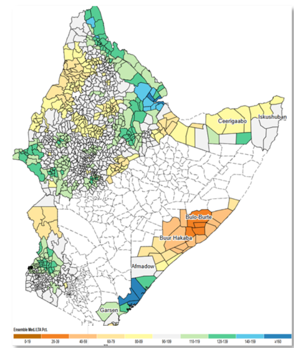
Ensemble Med./LTA Pct. → End-of-season outlook: % of LTA (ensemble median)
Projected full-season total (SOS→EOS) from the ensemble median scenario, as a percent of the full-season LTA. -
C. Dk.+Forecast/LTA Pct. → Season-to-date + Forecast % of LTA
Season-to-date plus the available + next-dekad forecast as a percent of the LTA for that same partial-season window.
Percentiles
These maps show the percentile rank of rainfall either season-to-date (SOS→current dekad) for the end-of-season median scenario. Percentiles indicate how unusual conditions are relative to history (e.g., <20th = unusually dry; >80th = unusually wet). Choose from the following options:
-
Ensemble Med. Pctl. → End-of-season percentile (ensemble median)
Percentile of the ensemble-median EOS total versus historical full-season totals. -
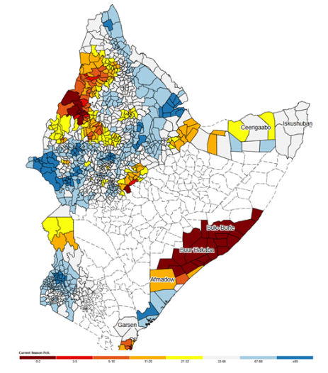
Current Season Pctl. → Season-to-date percentile
Percentile of the SOS→current-dekad accumulation versus the historical distribution for that window.
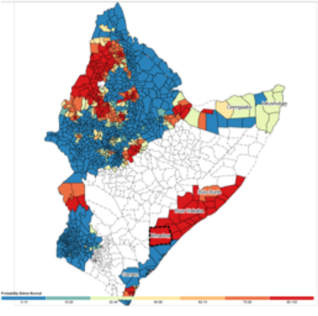
Probabilities (terciles)
These maps present the chance (%) that the end-of-season total will finish below normal (<33rd), near normal (33rd–67th), or above normal (>67th). For each polygon, the three probabilities sum to 100%; uncertainty decreases as the season progresses.
Categories: Below normal <33rd, Near normal 33rd–67th, Above normal >67th.
-
Probability Below Normal: Chance (%) the EOS total finishes below the 33rd percentile.
-
Probability of Normal: Chance (%) the EOS total falls in the 33rd–67th percentile.
-
Probability Above Normal: Chance (%) the EOS total exceeds the 67th percentile.
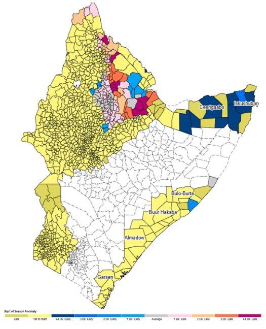
Start of season
The SOS map shows the dekad/date when the season starts for each polygon. A companion SOS Anomaly map compares the current SOS to the climatological median SOS (negative = early, positive = late). Use these layers to understand season timing and to anchor season-to-date calculations.
-
Start of Season: Detected SOS dekad for the current year.
-
Start of Season Anomaly: Difference (in dekads) between the current SOS and the climatological median SOS (negative = early, positive = late).
Polygon-specific plots
When you hover over a polygon on the map, its outline turns red, and its name appears in the upper right window. Clicking on a polygon displays four plots that show the current conditions for that specific region. See the four plots below.
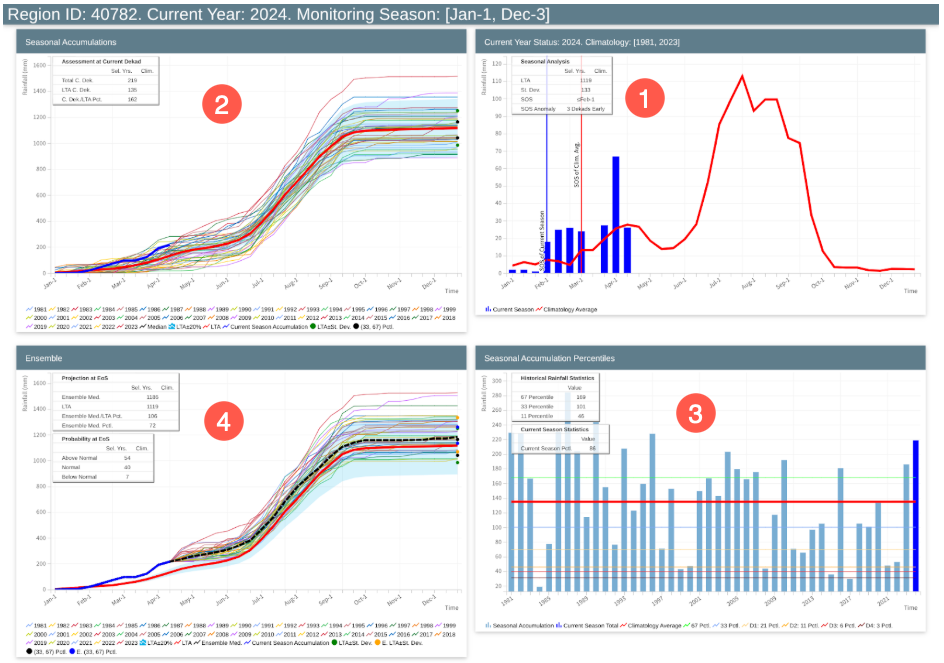
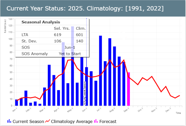
Plot 1: Current Rainfall Status (current year) Climatology [1991, 2020]
The Current Rainfall Status plot compares current dekadal rainfall (blue bars) with the long-term average (red line) over the course of the current year, plus the forecast for the following dekad (pink bar).
-
Blue bars represent the observed rainfall for the current year.
-
Red line represents the climatological average over the selected historical period.
-
Pink bar highlights the forecasted dekad.
The statistics table includes:
-
LTA (Long-Term Average): The historical average rainfall for the selected season.
-
Standard Deviation: A measure of variability in historical rainfall.
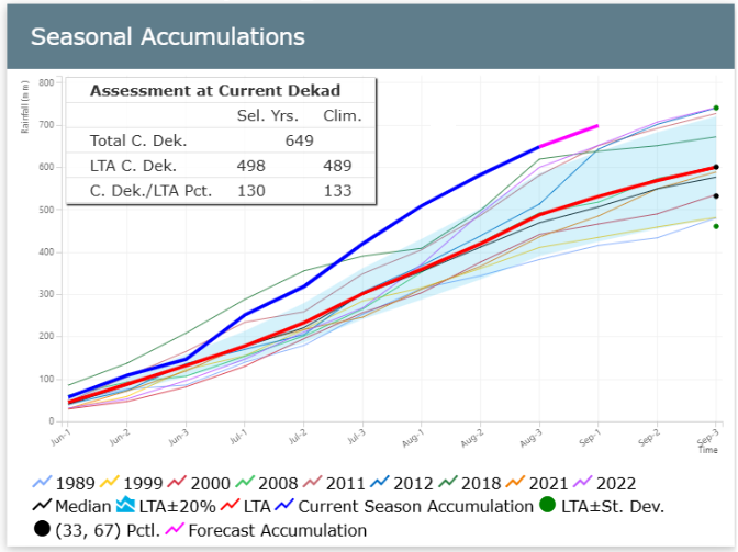
Plot 2. Season Accumulations
The Seasonal Accumulations plot displays cumulative rainfall across selected years, with the current season highlighted.
The Assessment at Current Dekad (CD) table contains the following rows:
-
Total C. Dek.: The accumulation from the start of season (defined in the tool) to current dekad - this calculation uses only the current-season values.
-
LTA C. Dek.: The accumulation of the long-term average from the SOS to current dekad. In the image above, this is the accumulation of the bold red line from the 1st of March to the 3rd dekad of June.
-
C. Dek./LTA Pct.: The percent of average for the accumulated precipitation from the Start of Season (SOS) up to the current period.
Another feature of the plot visualization includes reference markers on the right margin that help interpret the seasonal rainfall distribution:
-
The lower black circle indicates the 33rd percentile, representing a lower bound of what's considered a typical range for the climatological period.
-
The upper black circle marks the 67th percentile, serving as the upper bound of the typical range.
-
The green circles represent the average +- a standard deviation.
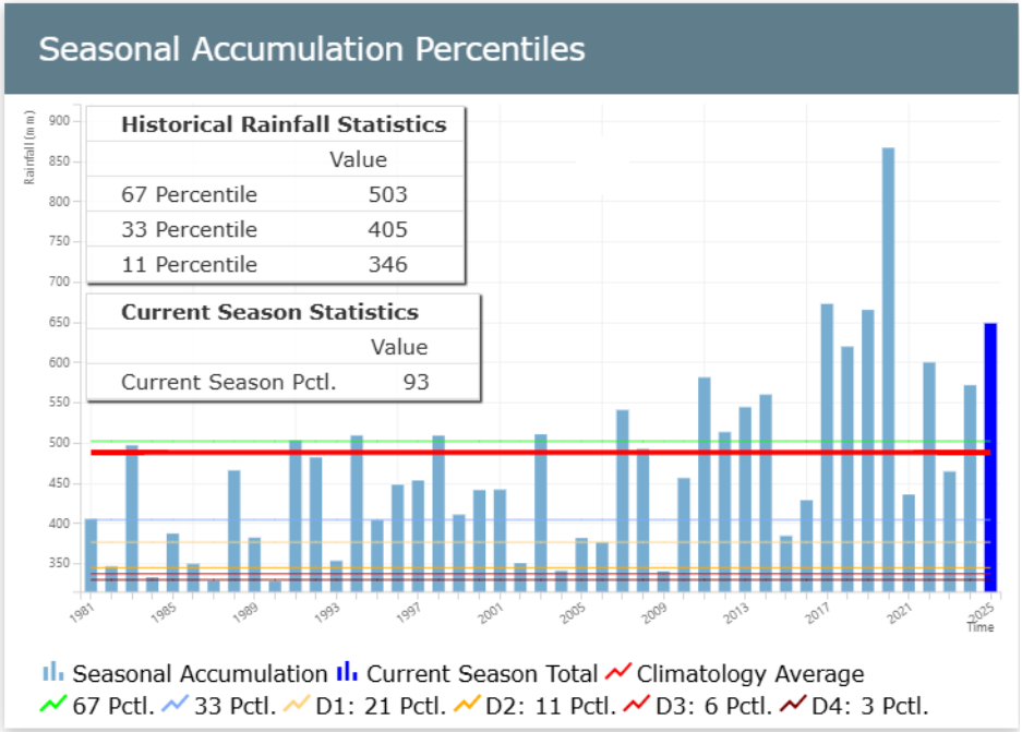
Plot 3. Seasonal Rainfall Accumulation up to Current Dekad plot
The Seasonal Rainfall Accumulation plot shows current cumulative rainfall (rightmost blue bar) compared to historical rainfall statistics such as the median and percentiles.
This plot includes the following lines:
-
LTM-CD (red line): the average accumulation, using the climatological period defined
-
10 pct (yellow line): 10th percentile using the climatological period defined
-
33 pct (blue line): 33rd percentile using the climatological period defined
-
67 pct (green line): 67th percentile using the climatological period defined
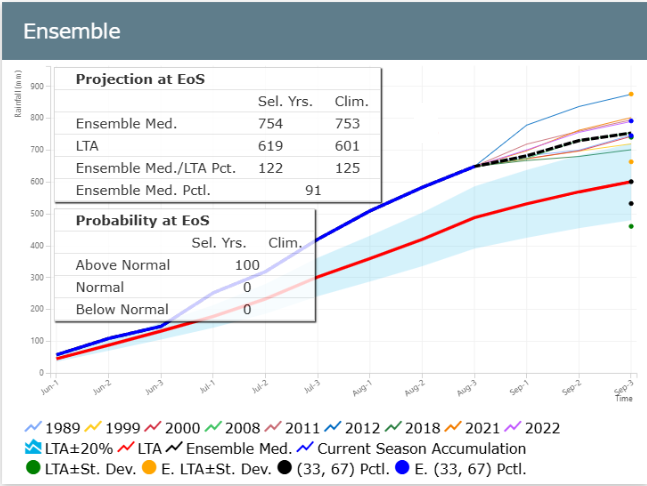
Plot 4. Ensemble plot
The SMPG tool uses historical data from selected analog years to simulate the remainder of the current season, generating a range of possible scenarios. Based on these simulations, the SMPG calculates the probability of the season ending above-normal, normal, or below-normal. By determining the median of all scenarios, the tool identifies the most likely outcome for the season's end. The percentile rank of this most likely scenario indicates whether the season is expected to end above-normal (>67th percentile), normal (33rd-67th percentile), or below-normal (<33rd percentile).
This Ensemble plot illustrates the range of possible scenarios derived by using data from each of the selected years to complete the current season. The dotted line represents the median scenario or the most likely outcome.
Two tables are included with the Ensemble plot:
1. Projection at EoS (upper table)
This table describes the outlook at the end of the season. The table includes the following rows:
-
Ensemble Med: the median of all the scenarios at the end of the season.
-
LTA: the average at the end of the season calculated using the climatological period selected.
-
Ensemble Med./LTA Pct.:the percent of the most likely scenario (dotted line) with respect to the long term average (red line) at the end of the season.
-
Ensemble Med. Pctl.: the percent of the most likely scenario at the end of the season
2. Probability at EOS (lower table)
This table shows the probability of the season ending below normal (<33rd percentile), normal (between the 33rd and 67th percentiles) or above (>67th percentile) normal. The calculation is done by counting the number of scenarios in each range and dividing it by the total number of scenarios.
Video: Running the SMPG
(26:02, includes captions)