The Sudan Conflict Map uses data from ACLED and IOM to visualize conflict and migration flow in Sudan beginning in April 2023. Users can layer the conflict and migration flow map views onto Visualizations of FIC near term projected outcomes, population data, remote sensing data, and trade flow data for the country.
Options
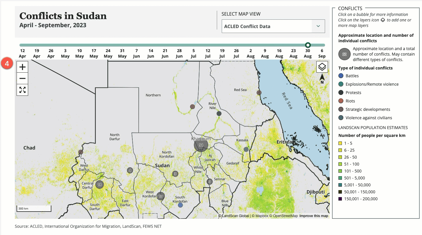
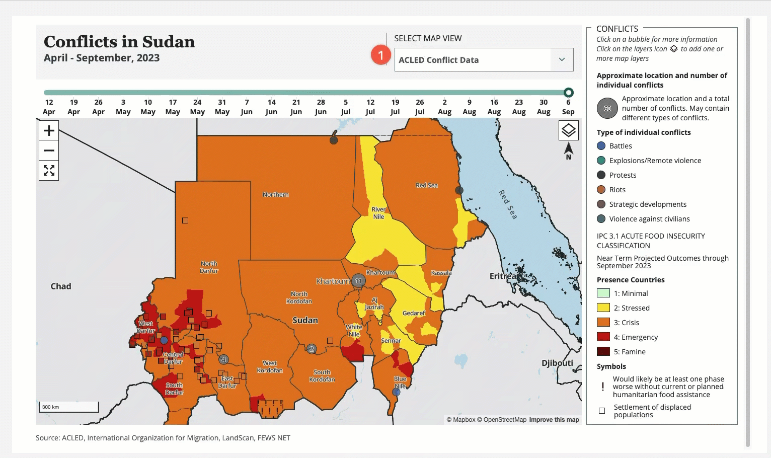
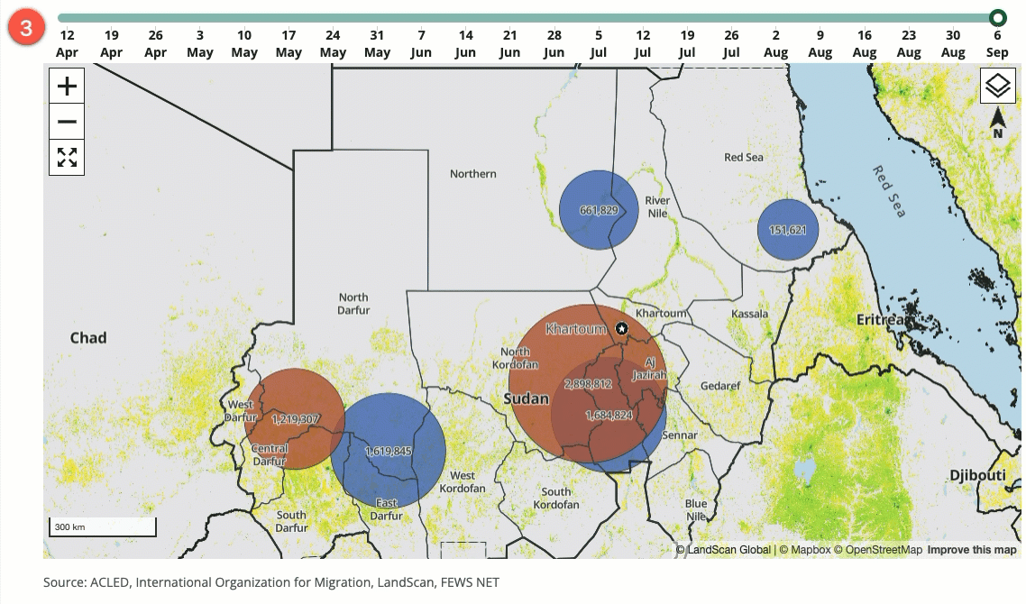
1. Select map view
Three data layers are available for the map using the Select map view dropdown list:
-
ACLED conflict data: Numbers and types of individual conflicts by approximate location
-
Migration flow: Numbers of internally displaced people by their approximate location of origin and current location
-
Cross border movement: Numbers of individuals who have migrated by their approximate location of origin and current country location
2. Select base layer
The base layers visualize the most recently available data, and are not tied to the migration and conflict data set selections made from the timeline. Click the button at the top right of the map to select one or more of the base layers from the dropdown list:
To deselect a layer, click its name again from the dropdown list.
-
Near term projection: FEWS NET’s IPC 3.1 Acute Food Insecurity Classification near term projected outcomes; selected by default
-
Population: LANDSCAN estimated population ranges per square kilometer
-
Flood detection: 5 day VIIRS composite data for inferred moisture type and floodwater fraction
-
CHIRPS Anomaly 2023: CHIRPS 3-monthly anomaly data in millimeters
-
NDVI eVIIRS PCTM 2023: NDVI pentad percent of mean data
-
Wheat grain trade flow: The flow of wheat grain trade between key market centers
-
Sorghum grain Trade Flow: The flow of sorghum grain trade between key market centers
-
Millet grain Trade Flow: The flow of millet grain trade between key market centers
3. Select a Dataset
Choose a date on the timeline at the top of the map to change the Dataset displayed on the map.
4. Interact with the map
a. Zoom in and out using your mouse scroll wheel, touchpad, or the zoom buttons located at the top left of the map.
b. Click a bubble to display more information (note: for bubbles covering multiple conflicts or areas of displacement, you must first zoom in until the smallest available point displays).
c. Select migration flow direction (Migration Flow map view only):
• Click on a red bubble to display arrows indicating the migration flow from that location of origin.
• Click on a blue bubble to display arrows indicating the migration flow to that location of displacement.
• Click on an arrow to view the number of displaced individuals and number of households for a particular migration flow.