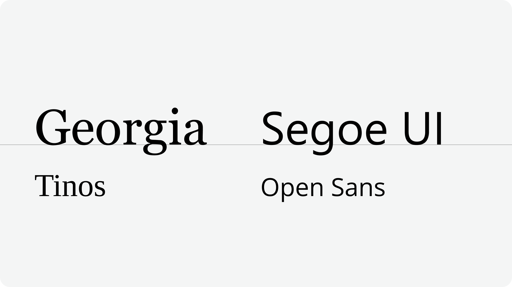
FEWS NET uses the Segoe UI and Open Sans typefaces for most text. Segoe UI is preferred when available, while Open Sans is used in Google Suite products and elsewhere as a fallback for Segoe UI.
FEWS NET uses the Georgia typeface for official headlines only. Tinos may be used as a fallback for Georgia.
Segoe UI and Open Sans
FEWS NET uses Segoe UI (or Open Sans as a fallback) for most text, including normal body text, titles of internal documents, page headings and subheadings, technical user interface elements, and graphics and social media products.
Bold (700 weight) and Semibold (600 weight) may be used for titles, headings and subheadings, and other cases where text emphasis is appropriate. See Text Emphasis for details.
Regular (400) may be used for text in all other cases. Regular Italic may be used where appropriate (see Italics for details).
Size
Minimums
The minimum allowable size for print body text (such as for a written report) is 10/9 pt for Segoe UI / Open Sans. No print text should be smaller than 8/7 pt for Segoe UI / Open Sans.
Size conversion between fonts
Open Sans is visually larger than Segoe UI by a factor of approximately 1.09x. Precise visual size conversions from Segoe UI to Open Sans adjust the point size by this factor.
For example, a conversion from Segoe UI to Open Sans should divide the Segoe UI point size by 1.09 and round to the nearest tenth (or whole point in Google Suite) to achieve analogous visual size for Open Sans.
Don’t
-
Use font classes other than Bold, Semibold, Regular, or Regular Italic
-
Use Segoe UI for headlines of official web pages, report documents, or presentation slides
-
Make text smaller than the specified minimums to fit more content on a page
Georgia
FEWS NET only uses the Georgia Regular (400 weight) font for headlines of official web pages, report documents, and presentation slides. Preserving use of Georgia for these cases provides FEWS NET audiences with a reliable visual signal of formal materials that are backed by FEWS NET’s expertise.
Size
Text that uses Georgia should be the most visually prominent text in any context where it is used, and should therefore have the largest point size. Size specifications are available for documents and presentations.
Don’t
-
Use Georgia Bold, Georgia Italic, or Georgia Bold Italic
-
Use Georgia in any color other than Brand Black or Brand White
-
Use Georgia for headings or subheadings below the page, document, or slide title
-
Use Georgia in social media or promotional graphics
-
Use Georgia in documentation or technical user interfaces
These standards apply equally to Tinos when Georgia is not available. Because headlines in Georgia are a key visual aspect of the FEWS NET brand, avoid use of Tinos to the extent possible.
Contact us if you have an application question or recommended addition to these standards.
