Using the template
-
A link to the FEWS NET presentation template may be found on the FEWS NET Exchange Intranet (staff only).
-
Always use the FEWS NET presentation template and do not modify the styles in any way. Upholding consistent presentation standards helps advance FEWS NET’s global credibility and maintains compliance with branding and marking requirements.
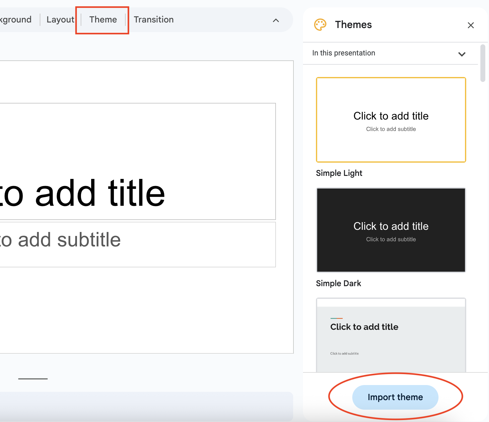
If you have already started to create a slide deck and need to apply the FEWS NET theme, open your slide deck and click Theme > Import Theme > Slide deck template. The correct source template will have the “Belongs to a shared drive” indicator next to its name.


Slide layouts
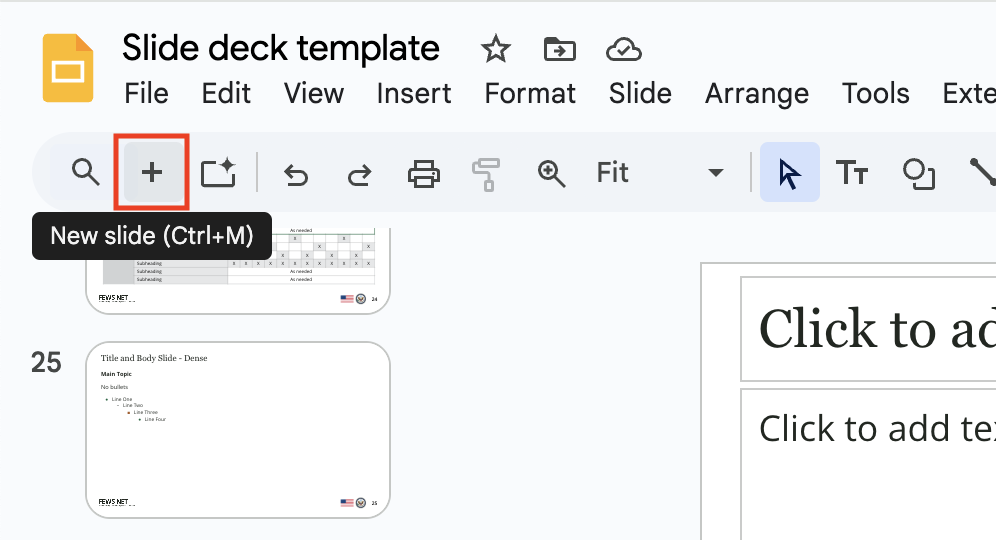
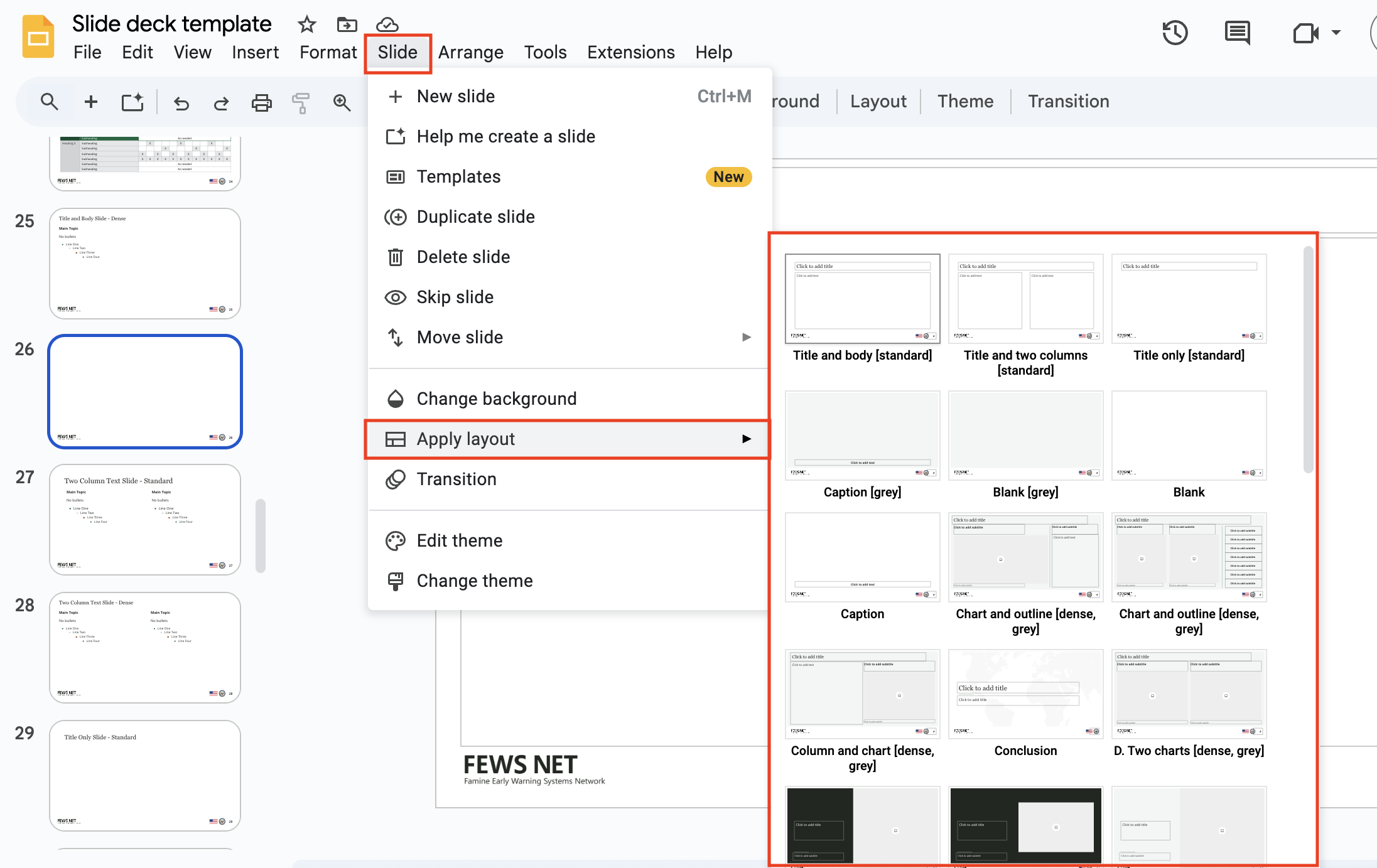
The FEWS NET slide deck theme has pre-formatted slide layouts. Layouts are always applied to an existing slide, so add a new slide using the plus sign on the left of the toolbar if you want to create a new slide with a particular layout. To use the layouts, select the Slide menu, and then select Apply layout. The slide layout can be changed at any time using the Slide menu. To ensure consistency:
-
Do not move the built-in text boxes or other elements. If you need to build a custom layout to convey specific information, use the Title only, Caption, or Blank slide formats.
-
Note that there are “standard” and “dense” slide layout options (e.g., “Title only standard” vs. “Title only dense”). The standard option provides a cleaner look with more white space and the dense options allows more room for content. Choose one of these options consistently for all of your slides.


Design resources
In addition, the FEWS NET slide template contains a slide with copy and paste design resources (slide 11). These resources can be used to create brand compliant tables, captions, graphic organizers, and other visuals. Note that importing the theme, rather than starting a new slide deck from the template, will not give you access to these design resources.
Best practices
Keep it simple.
-
Slides should contain 1-2 images or limited (clear and specific) text.
-
Images should be high quality; don’t use clip art.
-
Use the presenter notes to help you remember your key points.
-
Use animations and transitions sparingly.
Ensure accessibility.
-
Include alt-text for all images to ensure your presentation slides are ADA accessible if they are to be disseminated in a PDF format. To access alt-text, hit Ctrl+Alt+Y or right click on your image and choose Alt text.
-
Use the text boxes included in the layout rather than adding new text boxes. New text boxes should only be added for graphic organizers or other similar visual elements that are not already included in the layout formats.
-
When you present (Slideshow) with Google Slides, you can turn on automatic captions to display the speaker's words in real time at the bottom of the screen. Learn how to present slides with captions.
QA your presentation.
-
Run a spell check by going to Tools > Spelling in Google or Review > Spelling in PPT.
-
Preview your presentation in slideshow mode to make sure everything looks correct and is working as intended.
-
Practice giving your presentation, preferably to a colleague, to ensure the content flows and you have not missed any crucial information. Set a timer to ensure you won’t be rushed or end earlier than intended.
Contact us if you have an application question or recommended addition to these standards.
