Data from the FEWS NET Data Warehouse (FDW) can be used to create a variety of interactive charts and maps. The Data Visualization content block provides two options:
-
Build a Visualization in the FEWS NET Data Explorer (FDE) and paste the URL into the Data Visualization content block under Primary URL.
-
Build the Visualization from scratch using the fields in the Data Visualization content block.
Data in Submitted status can be used to create a Visualization in FDE, but the data must be published before adding a Visualization to your report.
Paste a Visualization URL from FDE
Building a Visualization in FDE and pasting the URL into the Data Visualization content block allows you to preview your data without having to rebuild the Visualization in the CMS.
Use the following steps to add Acute Food Insecurity Maps to your report. For detailed information on building Visualizations in FDE, visit the Data Explorer Knowledge Base.
-
From FDE, select Visualizations from the top menu.
-
Choose the Builder tab.
-
Find the Visualization type and select Create.
-
Use the Acute Food Insecurity Map Visualization type for the map included at the beginning of FSOs, KMUs, and FSOUs, and the HFA map if applicable.
-
Use the Single Scenario Acute Food Insecurity Map Visualization type for the second map in FSOs.
-
-
Select parameters:
-
Collection date: Use the first date of the report month.
-
Geography: Choose the country or region.
-
Select one or more scenarios for the static map:
-
Skip this to include all available scenarios in the Visualization and PDF (CS, ML1, and ML2), for instance in HFA maps.
-
For the first map in the FSOs and KMUs, select ML1 and ML2.
-
For the second map in the FSOs showing the Current Situation (using the Single Scenario Acute Food Insecurity Map Visualization type) select CS.
-
-
Select static maps layout type:
-
AFIC: Select Vertical.
-
HFA: Select Grid.
-
-
Show HFA data:
-
AFIC: Skip.
-
HFA: Check the box to display HFA data.
-
-
-
Once all parameters have been selected, click the Update button to generate the complete Visualization URL.
-
Click the link icon to the right of the Visualization title to copy the link to the Visualization.
-
Open your report in the CMS.
-
Select the Add Data Visualization content block.
-
In the Alt Text field, describe the Visualization for people using assistive technologies using the reference guidance.
-
Scroll down to the Primary URL field and paste the Visualization URL.
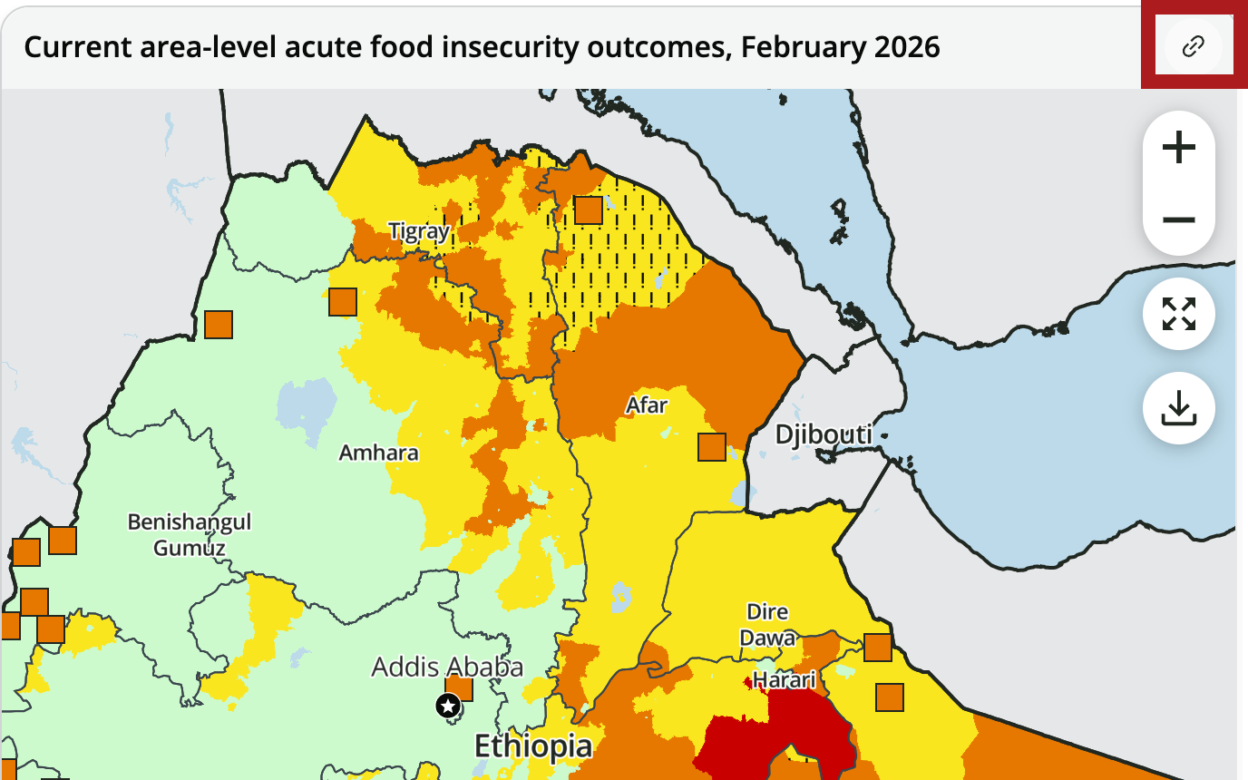
Example URLs for the Ethiopia February 2026 FSO:
-
Click outside the field or press the Enter/Return key on your keyboard. The Visualization fields will automatically populate using the URL.
-
Add or edit any settings or parameters if needed. Several options specific to the static image for the report PDF can only be selected in the CMS:
-
Show full width in PDF: The full width toggle must be turned on for HFA maps alongside the grid layout type. You can also use this option for any visualization that you want to include at full width in the PDF.
-
Float Position: Select -None- for HFA maps. If you want to place two side-by-side images in the PDF, set the first image to Float: Left.
-
If you edit parameters in the CMS, you must click the Generate URL button to apply your changes.
-
Click Save and Edit to continue working on your report, or Save and Preview to check the web page and PDF.
Video: Adding Acute Food Insecurity Maps to reports
Watch the below video for a walkthrough of building the three types Acute Food Insecurity Maps in FDE, then pasting the Visualization URLs into your report in the CMS (06:03, includes closed captions).
Build a Visualization in the CMS
Detailed guidance for building Acute Food Insecurity (AFI) and Humanitarian Food Assistance (HFA) maps in the CMS can be found below. For all other data visualizations, please reference tailored guidance in the Standard Visualizations section.
AFI and HFA Maps
Use the settings below to create AFI and HFA maps for reports.
AFI Map (with timeline)
Before building this data visualization, food security data must be uploaded and published in the FEWS NET Data Warehouse (FDW) or the maps will not generate. If the data is updated and republished in FDW, you may experience a delay in the data visualization updating. You can try viewing the visualization in an incognito window or another browser, and reach out to the Hub for assistance as needed.
-
Select the Add Data Visualization content button.
-
Internal Title: Set a title “AFI maps” for reference to help you identify the data visualization within the report builder. This title won’t show up on the report.
-
Alt Text: Provide alternative text summarizing the CS and projected AFI. Reference guidance on writing alt text here.
-
Show Figure Label: Skip (button is off by default and should appear gray).
-
Visualization type: Select Acute Food Insecurity Map from the drop-down menu.
-
Country: Select the appropriate option for a country report. Leave this blank for a regional report.
-
Geographic Group: Select the appropriate option for a regional report. Leave this blank for a country report.
-
Collection Date: Type in the first day of the reporting month as MM/01/YYYY (e.g., 09/01/2025 for a September KMU). The date must be set as the first day of the reporting month to ensure the map displays correct data.
-
Start Date: Skip (leave blank).
-
Select one or more scenarios: Skip this to include all available scenarios in the visualization and PDF (CS, ML1, and ML2), for instance in KMUs.
-
Skip this to include all available scenarios in the PDF (CS, ML1, and ML2), for instance in HFA maps.
-
For the first map in the FSOs and KMUs, select ML1 and ML2.
-
For the second map in the FSOs (only CS) use the Single Scenario Acute Food Insecurity Map visualization instead.
-
-
Select static maps layout type: This field affects how the maps display on the web-generated PDF.
-
For all reports: Select Vertical from the drop-down menu.
-
-
Show HFA data: Skip.
-
Visualization title: Skip (automatically generated).
-
Disclaimer: Skip (automatically generated).
-
Source attribution: Skip (automatically generated)
-
Display logos: Skip. This determination is made automatically by the system.
-
Click the Generate URL button and wait for the URL to populate the AFI map.
-
Click on the URL and review to confirm the maps are accurate. You can also share the link with anyone who has access to the FDW to review.
-
Show full-width in PDF: Skip (used for HFA maps only)
-
Float Position: Leave as Right for all reports.
Single Scenario AFI Map
Use the same process and settings as the AFI map above except for the following:
-
Select a scenario: Select one scenario (Current Situation, Near Term Projection, or Medium Term Projection) as applicable to the report type.
-
For all FSOs: Select Current Situation when building this visualization for the current acute food insecurity outcomes section.
-
HFA Map
Use the same process and settings as the AFI map above except for the following:
Layout and HFA Settings
-
Select static maps layout type: Choose Grid.
-
Show HFA data: Check the box to display HFA data.
Full Width and Float Position Settings
-
Show full-width in PDF: Click to toggle on (button should appear green).
-
Float Position: Choose None.
Previous: Add Report Content
Next: Add Key Messages