The Data Freshness Dashboard visualizes the status of Data Collections in the FEWS NET Data Platform.
This dashboard can be used to confirm the status of existing Data Collections across multiple Data Source Documents. The dashboard will also provide a missing status for Data Collections that are scheduled but not yet loaded.
Options
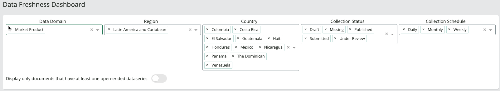
The available parameters for filtering Data Collections are:
Note: You can select the X to the left of any item in a filter to remove it from the chart.
-
Data Domain: Select a Data Domain to populate the Region and Country filter options.
-
Region: Select at least one Region or Country in order to populate the collection status and collection schedule filter options.
-
Country: Select at least one Country or Region in order to populate the collection status and collection schedule filter options.
-
Collection Status: The collection status options will automatically populate based on the available data for the parameters you have selected.
-
Collection Schedule: The collection schedule options will automatically populate based on the available data for the parameters you have selected.
-
Display only documents that have at least one open-ended Data Series: Turn this toggle on to include only Data Source Documents that have at least one Data Series without an end date in the chart.
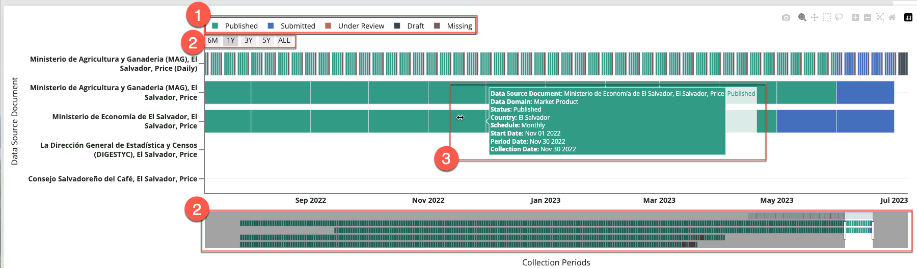
Data freshness chart
The information in the Data freshness chart is organized by Data Source Document (vertical axis) and date (horizontal axis). The legend at the top shows the included collection statuses.
You can interact with the chart in the following ways:
1. Collection status
Click on a collection status in the legend to remove data collections under that status from the chart. The removed collection status will appear grayed out in the legend. Click again to add Data Collections under that status back to the chart.
2. Time series selectors and range slider
You can zoom and pan the horizontal axis by selecting one of the options underneath the legend, or by using the slider located at the bottom of the dashboard. Click and drag the slider knobs to narrow or expand the selected time range. You can also click and drag the selected time range to explore different start and end points (e.g., move from July 2022-July 2023 to January 2022-January 2023).
3. Data Collection details
Hover your mouse over a horizontal bar to view additional details for a Data Collection.