The Crop Production Dashboard contains a collection of interactive graphs and maps you can use to analyze crop production data for a specified country or product over time. This dashboard is broken into three main parts:
-
Data overview
-
Product and country specific information
-
Indicator specific information
Data overview
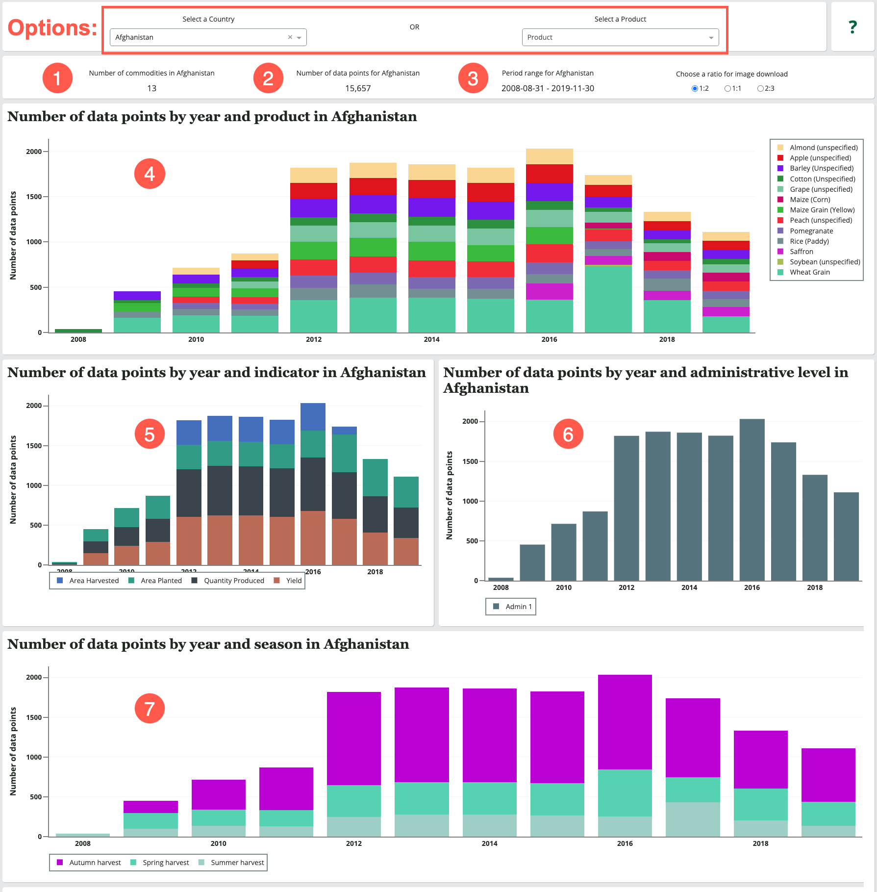
The first section shows an overview of the number of crop production data points available for a selected country or product.
Options
To get started, choose from the following options:
-
Select a country to filter by the available data for a specific country, or;
-
Select a product to filter by the available data for a specific product.
If you plan to download images of visualizations, you can also choose a ratio for image download at this point. To save visualizations as PNGs:
-
Select the desired image ratio in the country selection bar. Once chosen, the ratio is applied to all graphs in the dashboard.
-
Click on the camera icon in the toolbar at the top right of a visualization to save it.
Visualizations
Once a country is selected, the system will populate the following fields and graphs:
-
Selecting a country will populate a Number of commodities field with the number of crops for which there is data available for the selected country. Selecting a product will populate a Total number of countries field with the number of countries for which there is data available for the selected product.
-
Number of Data Points: This field shows the total number of data points for the selected country or product.
-
Period range: This field shows the period dates of the oldest and most recent crop data available for the selected country. This range is used as the x-axis for most of the graphs in the dashboard.
-
Number of Data Points by year graph: This stacked bar chart shows the number of Data Points in the system for each crop for the selected country or product, over the stated period range.
-
Number of Data Points by year and indicator graph: This stacked bar chart shows the number of Data Points in the system for each of the four crop Indicators (Area Harvested, Area Planted, Quantity Produced, Yield), over the stated period range.
-
Number of Data Points by year and administrative level graph: This stacked bar chart shows the number of Data Points in the system for each available administrative level, over the stated period range.
-
Number of Data Points by year and season graph: This stacked bar chart shows the number of Data Points in the system for each available season, over the stated period range.
Product and country specific visualizations
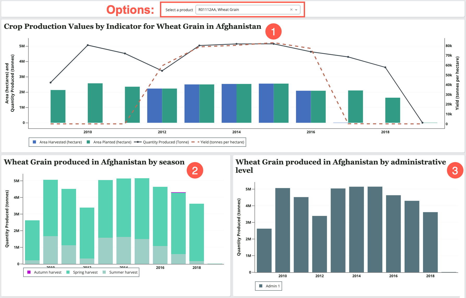
The second section contains graphs of production values for a specified crop and country, over the stated period range.
Options
-
If you initially filtered by a country, you can Select a product to view product-specific data for that country.
-
If you initially filtered by a product, you can Select a country to view country-specific data for that product.
By default, the system selects the crop listed last in the menu. To view information for a different crop, use the Select a product menu.
Visualizations
The system will populate the following graphs:
-
Crop production values by indicator graph: This stacked bar chart shows the available crop indicators (i.e., Area Harvested, Area Planted, Quantity Produced, Yield) for the selected crop, over the stated period range.
-
Quantity Produced by season graph: This stacked bar chart shows the quantity of the selected crop produced for each available season for the country, over the stated period range.
-
Quantity Produced by administrative level graph: This stacked bar chart shows the quantity of the selected crop produced for each available administrative level for the country, over the stated period range.
Indicator-specific visualizations
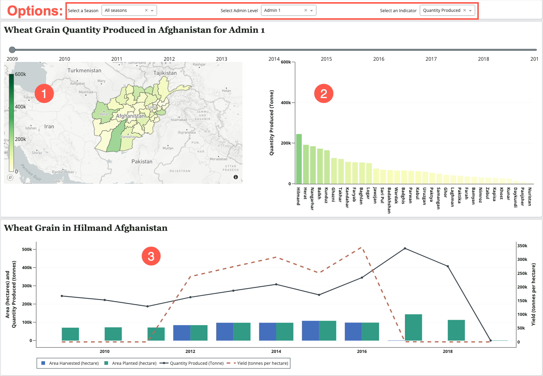
The third section contains visualizations of a specific Indicator for the country and crop previously selected, over the stated period range.
Options
There are three option menus available for this section:
-
Select a season: All seasons available for the selected country or product are listed in this menu. By default, All seasons is selected.
-
Select Admin Level: All administrative levels available for the selected country or product are listed in this menu. By default, the most granular admin level is selected. (e.g., Admin 2 is more granular than Admin 1.)
-
Select an Indicator: All crop indicators (i.e., Area harvested, Area planted, Quantity produced, Yield) available for the selected country or product are listed in this menu. By default, Quantity produced is selected.
-
Select production: All production systems (i.e., livelihood zone types such as Irrigated or Rainfed) available for the selected country or product are listed in this menu. By default, All systems is selected.
Visualizations
The system will populate the following visualizations:
-
Quantity Produced map (if geospatial data for the country is available)
-
Quantity Produced graph: This map and bar chart show the amount of the selected Indicator for the selected crop for each administrative unit at the selected admin level. The time slider above the map and graph can be used to view this information over the stated period range. The time slider will default to the earliest year on record.
-
Admin Unit graph: You can click on an individual admin unit from the map or chart (e.g., Balkh, Afghanistan) to view a graph of all indicators for the selected crop and admin unit over the stated period range.
Tips for interacting with visualizations
-
Hover over a line, bar, or area of a map to see a specific number value.
-
Single click on a legend item to exclude it from the graph.
-
Double click on a legend item to display only its trace.
-
Use your mouse to draw a box around any part of the graph to zoom in.
-
Double click on the graph background to return it to the initial zoom state.