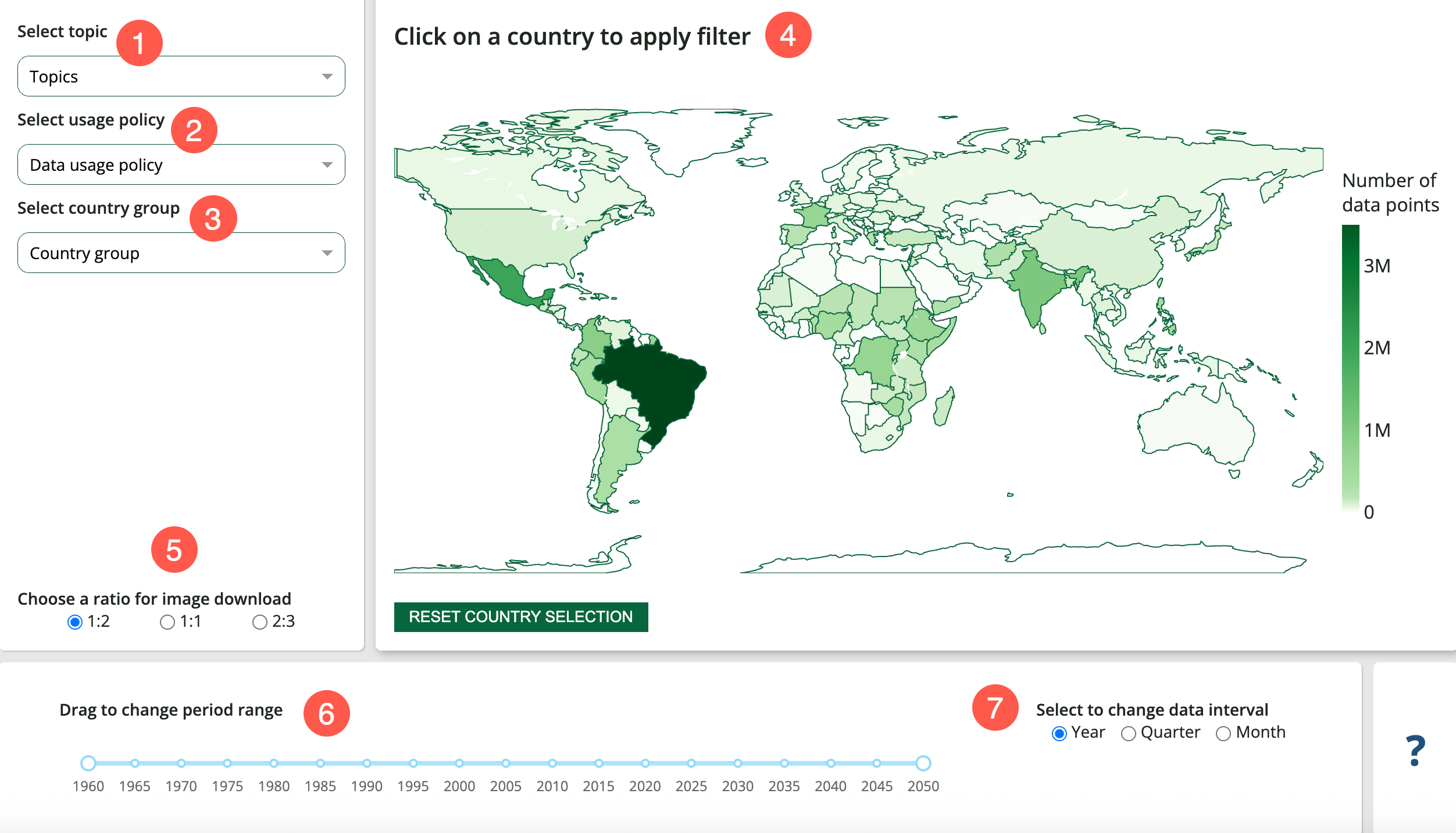
The Data Inventory Dashboard provides details on the number of Data Points available in the FEWS NET Data Warehouse. Users can explore the breakdown of Data Points added over time as well as the cumulative Data Point count for different Topics and Document Types, Data Usage Policies, and countries or country groups.
Options
-
Select Topic: Choose one or more Topics to adjust the data shown. Data for all Topics are included by default. Once a Topic is selected, the visualizations provide a breakdown by the Topic’s possible Document Types.
-
Select Data Usage Type: Choose one or more Data Usage Policy types to adjust the data shown. Data for all Data Usage Policy types are included by default.
-
Select Country Groups: Choose one or more country groups to adjust the data shown. Data for all countries are included by default.
-
Select Country: Choose a country on the map to adjust the data shown. Data for all countries are included by default.
-
Choose a ratio for image download: Adjust the aspect ratio of static images downloaded from Visualizations in the dashboard.
-
Change period range: Drag or click on the time slider to adjust the start and end dates of the period range.
-
Change data interval: Choose between a yearly, quarterly, or monthly interval. The yearly interval is selected by default. This option will update the Number of Data Points by period date bar chart.
Visualizations
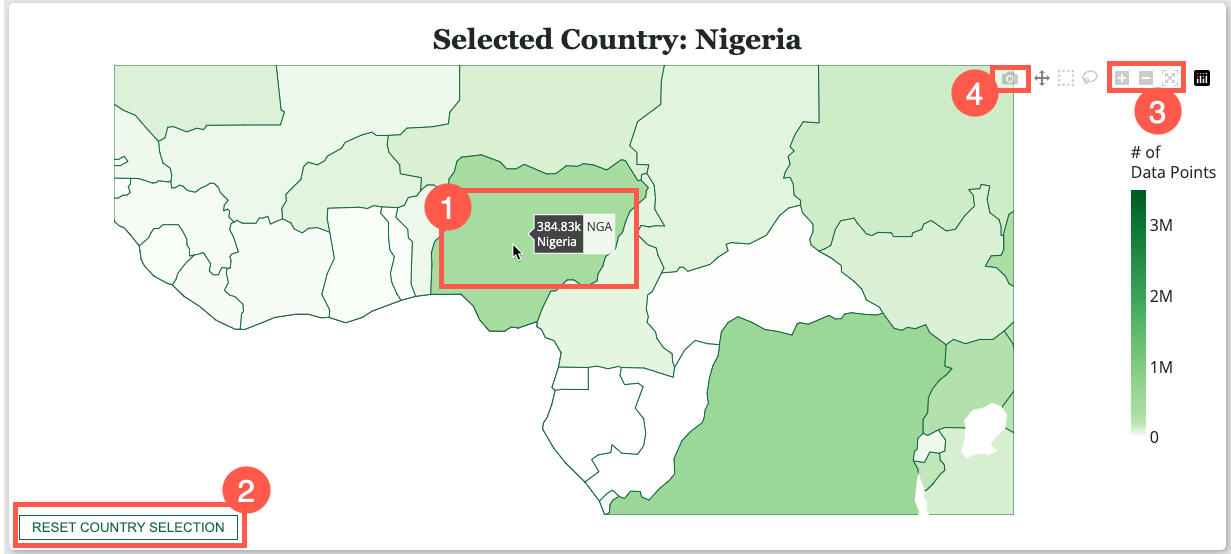
Map
The choropleth map shows countries that are shaded according to the total number of Data Points. Click on a country to update the data included in the dashboard.
You can also interact with the map in the following ways:
-
Hover over a country to display the number of data points.
-
Select the Reset country selection to reset the selected country.
-
Zoom in and out using your mouse scroll wheel, touchpad, or the zoom buttons located in the modebar at the top right of the map. Use the reset button, located next to the zoom out button, to zoom out to the map’s default view.
-
Download an image of the map as a PNG.
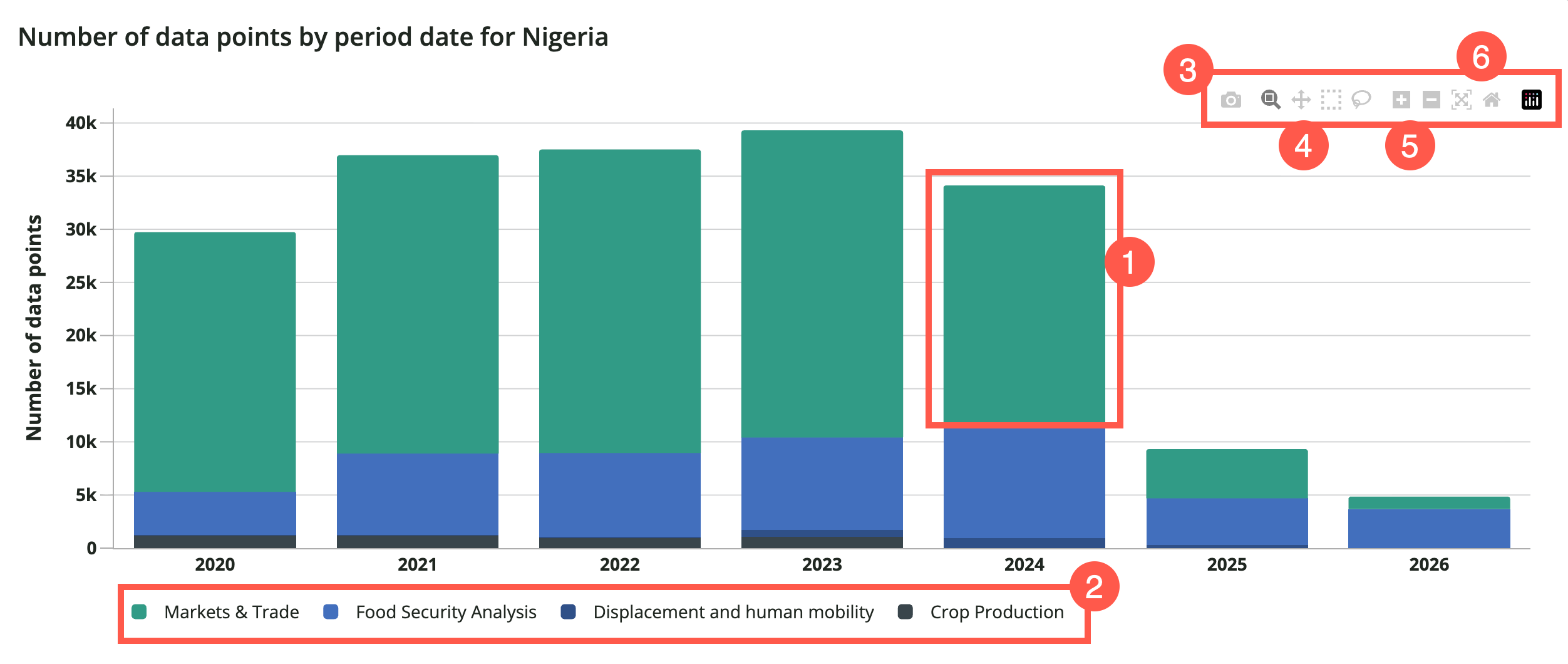
Number of Data Points by period date
This bar chart shows a breakdown of the number of Data Points by date for the selected criteria. If no Topic is selected, a breakdown by Topic is provided. Once a Topic is selected, a breakdown by Document Type is displayed.
You can interact with the chart in the following ways:
-
Hover over a section of the bar to view the Data Point count by date.
-
Single click on a legend item to exclude it from the chart. Click again to add the legend item back.
-
Select the Download button to save an image of the chart as a PNG.
-
Select the Pan button, then click and drag your cursor on the chart to pan along the x or y axis.
-
Zoom in and out using the buttons located in the modebar at the top right of the chart.
-
Use either the Autoscale or Reset axes button to return to the chart’s default view.
Number of Data Points
This pie chart shows the number and percentage of Data Points for the selected criteria. If no Topic is selected, a breakdown by Topic is provided. Once a Topic is selected, a breakdown by Document Type is displayed.
You can interact with the chart in the following ways:
-
Single click on a legend item to exclude it from the chart. Click again to add the legend item back.
-
Select the Download button to save an image of the chart as a PNG.
Data Coverage and Volume
This table shows the number of Data Points as well as the period’s start and end dates for the selected criteria. If no Topic is selected, a breakdown by Topic is provided. Once a Topic is selected, a breakdown by Document Type is displayed.
Breakdown by Data Usage Policy
This bar chart shows the number of Data Points by Data Usage Policy for the selected criteria.
You can interact with the chart in the following ways:
-
Hover over a section of the bar to view the Data Point count by date.
-
Single click on a legend item to exclude it from the chart. Click again to add the legend item back.
-
Zoom in and out using the buttons located in the modebar at the top right of the chart.
-
Select the Pan button, then click and drag your cursor on the chart to pan along the x or y axis.
-
Use either the Autoscale or Reset axes button to return to the chart’s default view.
-
Select the Download button to save an image of the chart as a PNG.
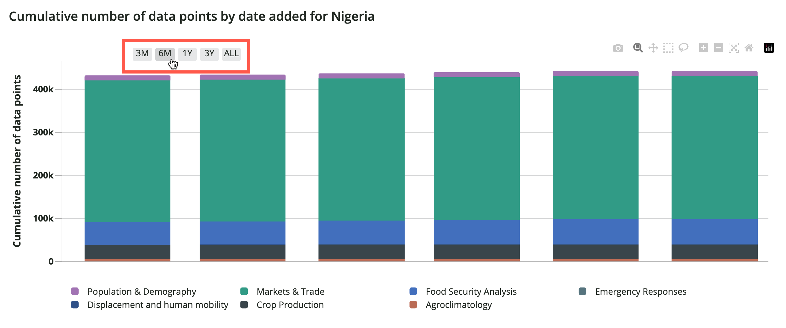
Cumulative Number of Data Points by date added
This bar chart shows the cumulative number of Data Points over time for the selected criteria.
You can interact with the chart in the following ways:
-
Hover over a section of the bar to view the Data Point count by date.
-
Single click on a legend item to exclude it from the chart. Click again to add the legend item back.
-
Select a time period from the options at the top of the chart.
-
Zoom in and out using the buttons located in the modebar at the top right of the chart.
-
Select the Pan button, then click and drag your cursor on the chart to pan along the x or y axis.
-
Use either the Autoscale or Reset axes button to return to the chart’s default view.
-
Select the Download button to save an image of the chart as a PNG.
Cumulative sum and total number of Data Points by date added
This table shows added Data Points by date as well as the cumulative sum of Data Points for the selected criteria.
Number of Data Points by month added
This bar chart shows the number of Data Points added by month for the selected criteria.
You can interact with the chart in the following ways:
-
Hover over a section of the bar to view the Data Point count by date.
-
Single click on a legend item to exclude it from the chart. Click again to add the legend item back.
-
Select a time period from the options at the top of the chart.
-
Zoom in and out using the buttons located in the modebar at the top right of the chart.
-
Select the Pan button, then click and drag your cursor on the chart to pan along the x or y axis.
-
Use either the Autoscale or Reset axes button to return to the chart’s default view.
-
Select the Download button to save an image of the chart as a PNG.
Number of Data Points by Data Source Document
This table shows the number of Data Points and Data Usage Policy for each Data Source Document for the selected criteria.