Using brand colors
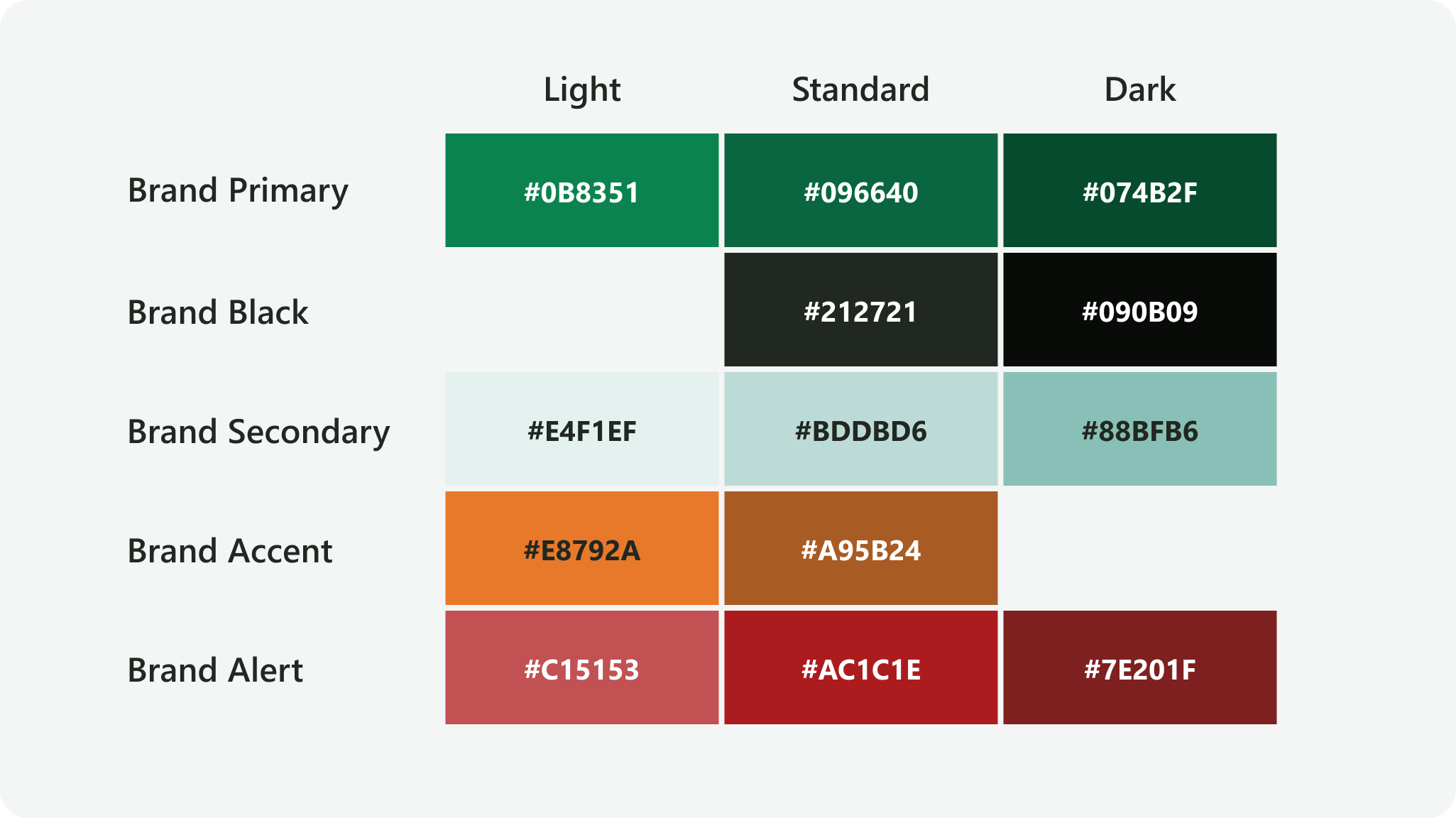
Brand colors are the only colors that should appear on FEWS NET products except where these standards specify otherwise.
Brand Primary and Brand Black are the two core brand colors and should appear on all FEWS NET branded materials. Brand Secondary may also be used in support of these two colors.
Brand Accent may be used sparingly for graphic elements that highlight or emphasize, while Brand Alert may be used sparingly to convey warnings or disallowed actions. Brand White is the general-use background for text and pages.
See Color Safety and Recommended Combinations for more usage guidance.

Brand Primary
#096640
R 9 G 102 B 64

Brand Black
#212721
R 33 G 39 B 33

Brand Secondary
#BDDBD6
R 189 G 219 B 214

Brand Accent
#A95B24
R 169 G 91 B 36

Brand Alert
#AC1C1E
R 172 G 28 B 30

Brand White
#FFFFFF
R 255 G 255 B 255
Darker and lighter shades of some brand colors are available. Always use the standard shade unless a different shade works better for a particular use case. Note that Brand Accent Light is sometimes used in existing brand assets but is not otherwise recommended for use.

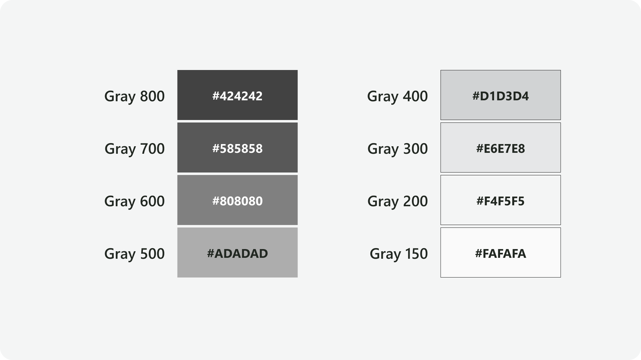
Finally, grays from FEWS NET’s base color palette are also included in the brand colors for use as lines, borders, background fills, and graphic elements.

Color values
|
Color style name |
Hex value |
RGB value |
Token name |
Base token |
|---|---|---|---|---|
|
|
#096640 |
9, 102, 64 |
brand-primary |
base-green-700 |
|
|
#0B8351 |
11, 131, 81 |
brand-primary-light |
base-green-600 |
|
|
#074B2F |
7, 75, 47 |
brand-primary-dark |
base-green-800 |
|
|
#212721 |
33, 39, 33 |
brand-black |
base-black-800 |
|
|
#090B09 |
9, 11, 9 |
brand-black-dark |
base-black-900 |
|
|
#BDDBD6 |
189, 219, 214 |
brand-secondary |
base-sky-400 |
|
|
#E4F1EF |
228, 241, 239 |
brand-secondary-light |
base-sky-200 |
|
|
#88BFB6 |
136, 191, 182 |
brand-secondary-dark |
base-sky-600 |
|
|
#A95B24 |
169, 91, 36 |
brand-accent |
base-rust-700 |
|
|
#E8792A |
232, 121, 42 |
brand-accent-light |
base-tangerine-600 |
|
|
#AC1C1E |
172, 28, 30 |
brand-alert |
base-brick-500 |
|
|
#C15153 |
193, 81, 83 |
brand-alert-light |
base-brick-600 |
|
|
#7E201F |
126, 32, 31 |
brand-alert-dark |
base-brick-700 |
|
|
#FFFFFF |
255, 255, 255 |
brand-white |
base-gray-100 |
|
|
#424242 |
66, 66, 66 |
- |
base-gray-800 |
|
|
#585858 |
88, 88, 88 |
- |
base-gray-700 |
|
|
#808080 |
128, 128, 128 |
- |
base-gray-600 |
|
|
#ADADAD |
173, 173, 173 |
- |
base-gray-500 |
|
|
#D1D3D4 |
209, 211, 212 |
- |
base-gray-400 |
|
|
#E6E7E8 |
230, 231, 232 |
- |
base-gray-300 |
|
|
#F4F5F5 |
244, 245, 245 |
- |
base-gray-200 |
|
|
#FAFAFA |
250, 250, 250 |
- |
base-gray-150 |
Contact us if you have an application question or recommended addition to these standards.


