The Population Sources Dashboard is designed to compare and analyze population data for Afghanistan from various sources. The goal is to provide a comprehensive overview of the country’s population, identify disparities and inconsistencies in the data, and gain insights into the factors that contribute to these differences.
The dashboard uses data from the following sources:
-
Global Human Settlement (GHS) Layer
-
WorldPop
-
WorldPop adjusted to match the UNPD estimate
-
Landscan
-
Gridded Population of the World (GPW)
-
National Statistic and Information Authority (NSIA) (Afghanistan)
-
FlowMinder
The dashboard is broken into 6 tabs containing the following information:
Description
The Description tab provides an overview of the data used for the dashboard, including external links to the Datasets that are used.
Population data overview
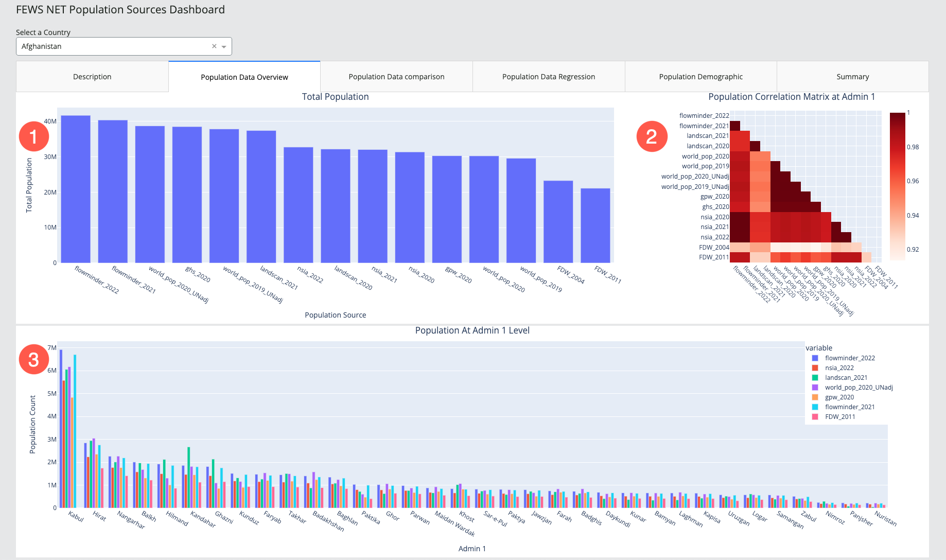
The Population data overview tab consists of three data Visualizations:
-
Total population chart: bar chart showing the total population from each population source.
-
Hover over a bar to view the total population count for the population source.
-
-
Population correlation matrix at Admin 1: correlation matrix showing the relationship between the various population sources, with 1 demonstrating the highest correlation.
-
Hover over a cell to view the color-coded value representing the correlation between the two population sources.
-
-
Population at Admin 1 level chart: bar chart showing the population count for Geographic Units at the Admin 1 level from each population source.
-
Hover over a bar to view the population count for the given Admin 1 Unit and population source.
-
Click on a legend item to exclude it from the chart.
-
Population data comparison
The Population data comparison tab contains four data Visualizations that allow for a side-by-side visual comparison of two population sources at the Admin 1 level, as well as the percent change between two population sources at the admin 1 level.
Use the two dropdowns for population sources, outlined in red in the screenshot below, to populate the Visualizations.
This tab includes the following Visualizations:
-
Selection 1 population count estimate choropleth map: choropleth map showing the population count estimate by Admin 1 Unit for the first population source you have selected.
-
Hover over an Admin 1 Unit to view its name and population count.
-
-
Selection 2 population count estimate choropleth map: choropleth map showing the population count estimate by Admin 1 Unit for the second population source you have selected .
-
Hover over an Admin 1 Unit to view its name and population count.
-
-
Percent change selection 1 to selection 2 chart: bar chart showing the percent change in population data from your first selection to your second selection, broken down by Admin 1 Units.
-
Hover over a bar to view the percent change for a given Admin 1 Unit.
-
-
Percent change from selection 1 to selection 2 choropleth map: choropleth map showing the percent change in population data from your first selection to your second selection, broken down by Admin 1 Units.
-
Hover over an Admin 1 Unit to view its name and percent change.
-
Population data regression
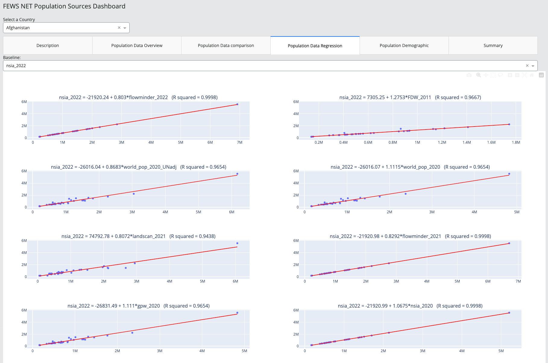
The Population data regression tab features regression charts that compare a baseline population source against other population sources in the dashboard. You can select a baseline using the dropdown menu.
The charts illustrate the predictability of differences between the selected baseline and the other population sources, and include the following:
-
The R squared value, included in the chart title, indicates the strength of the correlation.
-
The OLS trend line represents the overall trend of the data.
-
Each point represents data for the total population of a given admin 1 unit from the two population sources.
-
Hover over a point to view the admin 1 population count from both population sources.
-
Population demographic
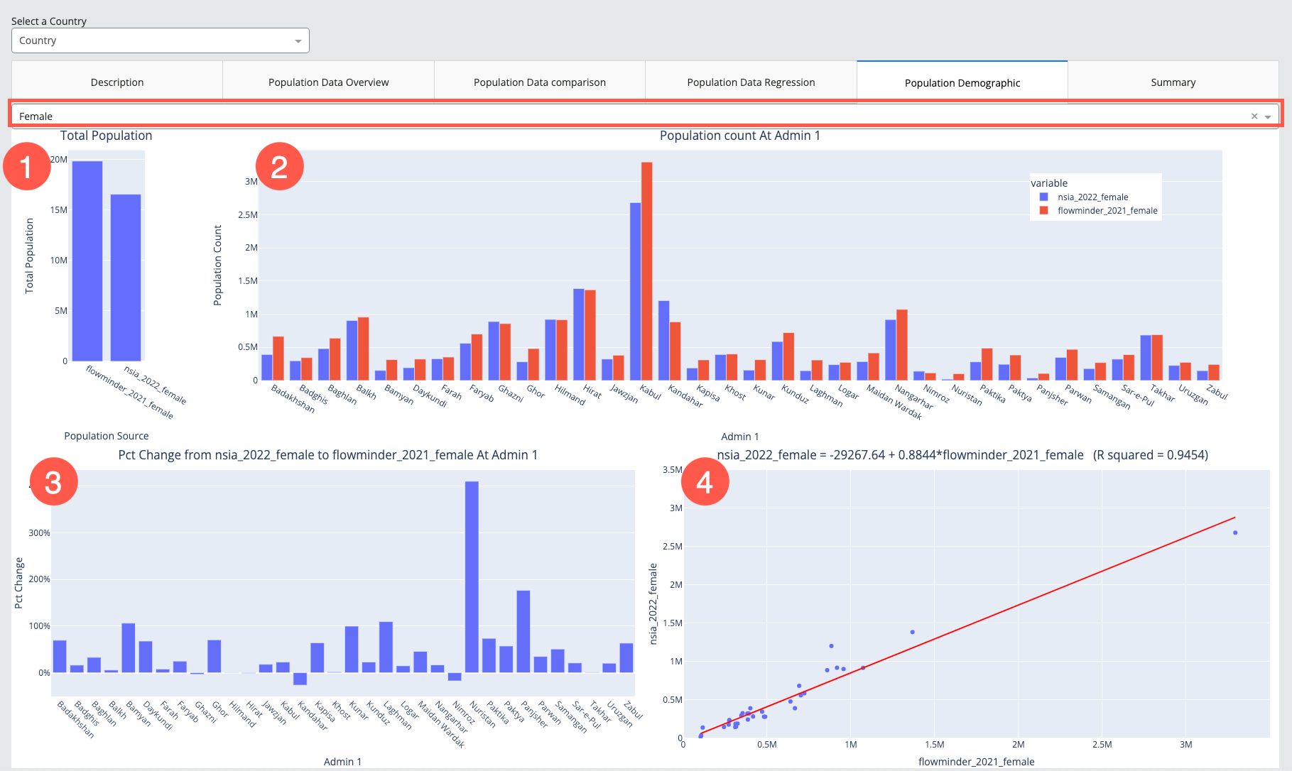
The Population Demographic tab contains four data Visualizations comparing the NSIA 2022 and Flowminder 2021 datasets. Use the dropdown selection, outlined in red in the screenshot below, to populate the Visualizations with either male or female demographic data.
This tab includes the following Visualizations:
-
Total Population: bar chart showing the total male or female population count by population source.
-
Hover over a bar to view to population count for the source.
-
-
Population Count at Admin 1: bar chart showing the breakdown of the total male or female population count by Admin 1 Unit.
-
Hover over a bar to view the population count for an Admin 1 Unit by population source.
-
Click on a legend item to exclude it from the chart.
-
-
Percent Change from NSIA 2022 to Flowminder 2021 at Admin 1: bar chart showing the percent change from NSIA 2022 to Flowminder 2021, broken down by Admin 1 Unit.
-
Hover over a bar to view the percentage change for an Admin 1 Unit.
-
-
NSIA 2022 to Flowminder 2021 Population Data Regression Chart: regression chart showing the predictability of difference between NSIA 2022 and Flowminder 2021.
-
Hover over a point to view the Admin 1 population count from both population sources.
-
Summary
The Summary tab includes four tables that provide quick references to the percent change and correlation between the datasets. The tab contains the following sections:
-
Data availability: as population data from Flowminder is only available at the admin level 1, this dashboard does not provide comparisons for population data at lower administrative levels.
-
Total Population Percentage Change: two tables provide a comparison of the total population percentage change:
-
Table 1: total population percentage change from NSIA 2022
-
Table 2: total population percentage change from Flowminder 2022
-
-
Population Correlation Matrix at Admin 1: two tables specify the correlation coefficients:
-
Table 3: correlation between NSIA 2022 and other population datasets
-
Table 4: correlation between Flowminder 2022 and other population datasets
-