
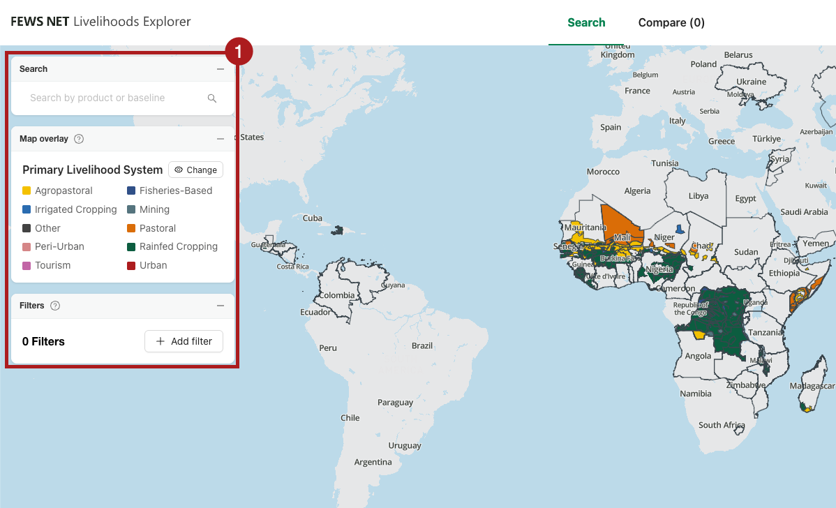
The Search tab in the Livelihoods Explorer (LEX) is the main interface for selecting and viewing Baseline data. This tab contains an interactive map and a sidebar that allows for searching and filtering. From this tab you can:
-
Search for Baselines, use a map overlay, or apply custom filters.
-
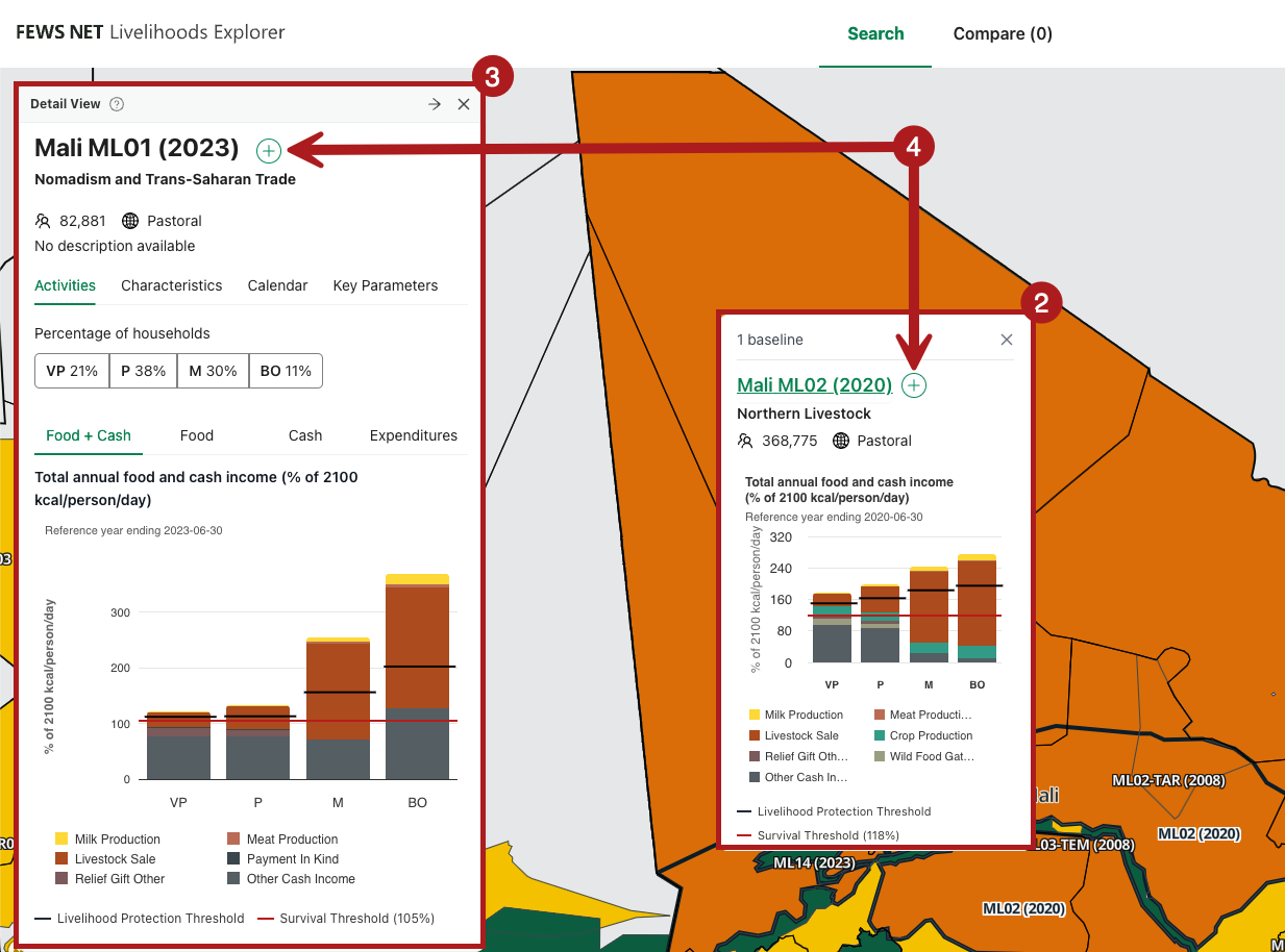
Click on a Livelihood Zone from the map to open a Quick view card for a Baseline.
-
Click on a Livelihood Zone code from the Quick view card or from the search results to open the detailed Detail view card.
-
Click the plus button next to a Baseline name to add it to the Compare screen.
You can also quickly compare two Baselines by opening a Detail view card and then opening a Quick view card for a different Baseline from the map.
How the Livelihoods Explorer calculates the values in the Search tab
Percentages
Within the Livelihoods Explorer, some percentages are calculated using total calories consumed as the denominator and some are calculated using 2100 kcals/person/day (kcals pppd) as the denominator.
These values have different purposes:
-
Comparing the percentage of total calories consumed is a simple and immediately intuitive way to understand the relative importance of a strategy or activity within a single Wealth Group.
-
Because the total number of kilocalories pppd varies across Wealth Groups, using a common absolute for the denominator (2100 kcals pppd) rather than relative unit can be useful for comparison across Wealth Groups.
When a percentage uses 2100 kcals pppd as the denominator, it will be explicit in the chart title, axis, and/or other label(s). These percentages are used in the Food and Food + Cash graphs in the Quick and Detail views. This is also the denominator for the values in the Compare view.
Example: Food graph
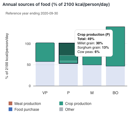
This graph shows the breakdown of how each Wealth Group in this Livelihood Zone acquired their food in the Reference Year.
In this example, 49% of the kcals pppd for the Poor Wealth Group came from households growing their own crops. This is calculated as follows:
kcals pppd consumed from all crops grown by the household ÷ 2100 kcals pppd
Example: Food + Cash graph
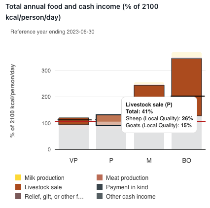
This graph shows the breakdown of how each Wealth Group in this Livelihood Zone acquired their food and cash income in the Reference Year.
In this example, 41% of Food + Cash for the Poor Wealth Group comes from Livestock sales. This is calculated as follows:
The number of calories that can be purchased with the income from the sale of livestock ÷ 2100 kcals pppd
This equation uses total kcals that can be purchased from a specific amount of income which is calculated using the Baseline’s annual kcals cost.
Baseline annual kcal cost = (Cost of the "Other food survival" basket + Cost of providing the remainder of 2100 kcals for the Poor Wealth Group by purchasing the main staple) ÷ Average household size of the Poor Wealth Group
When using the “Percentage of food” overlays available in the Search tab, the denominator is total calories actually consumed by households in a Wealth Group(s).
Example: The differences in NG04
When looking at NG04 (2022), you can see that the percentages for Crop production vary slightly when looking at the Food graph versus looking at the Percentage of food consumption from own crops overlay.
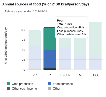
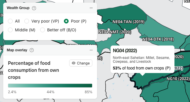
This is because the Food graph is looking at a percentage of 2100 kcals/person/day whereas the overlay is looking at a percentage of actual calories consumed.
The overlay percentages are calculated as:
kcals pppd consumed from all crops grown by the household ÷ total kcals consumed pppd
which can be checked against the numbers from the Food graph:
(kcals pppd consumed from all crops grown by the household ÷ 2100 kcals pppd = 56%) ÷ (total kcals consumed pppd ÷ 2100 kcals pppd = 106%) = 53%
In some instances, when a Wealth Group is consuming exactly, or close to, 2100 kcals/person/day, the percentages on the Food graph and the “Percentage of food” overlays will be the same.
Example: Percentages are the same
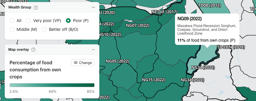
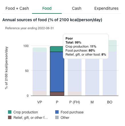
In NG09 (2022) the percentage in the Percentage of food consumption from own crops overlay and the Food graph are the same for the Poor Wealth Group because they are consuming close to 2100 kcals/person/day, and percentages are rounded to the nearest whole number.
All Wealth Groups
When choosing a strategy filter or one of the percentage overlays, a Wealth Group filter option becomes available. This filter is set to All Wealth Groups by default.
Data for All Wealth Groups is a weighted aggregation. Aggregations are weighted as follows:
-
Percentage of population is used for percentage of kcal metrics, as these represent per-capita or per-person contributions.
-
Percentage of households is used for absolute totals (kcals consumed, income and expenditure), as these represent per-household or household-level aggregates.
Generally, the formula to calculate values for All Wealth Groups is:
[Sum of (Each Wealth Group's calories or income for the selected Livelihood Strategy × the weighting factor for the Wealth Group)] ÷ [Sum of (Each Wealth Group's total calories or income × the weighting factor for the Wealth Group)]
This formula omits Wealth Groups with no data for the selected Livelihood Strategy.
Learn more about using the Wealth Group filter.
Learn more about how Wealth Groups are determined.
Example: Percentage of cash income from crop sales overlay
When looking at this overlay for NG04 (2022), you see the following values:
-
All Wealth Groups: 44%
-
Very poor: 19%
-
Poor: 24%
-
Middle: 53%
-
Better off: 49%
These values don’t average out to 44%. Instead, the 44% for all Wealth Groups is found by looking at actual income information, available in the Compare view, and weighting by percentage of households:
|
Wealth Group |
% of households |
Income from crop sales (XOF) |
Total income (XOF) |
|---|---|---|---|
|
Very poor |
22 |
63,870 |
329,470 |
|
Poor |
42 |
113,620 |
479,420 |
|
Middle |
23 |
1,014,630 |
1,929,730 |
|
Better off |
13 |
1,740,120 |
3,558,920 |
44% = The sum of each Wealth Group’s weighted income from crop sales ÷ The sum of each Wealth Group’s total weighted income = (63,870 × .22 + 113,620 × .42 + 1,014,630 × .23 + 1,740,120 × .13) ÷ (329,470 × .22 + 479,420 × .42 + 1,929,730 × .23 + 3,558,920 × .13)
Example: Percentage of food consumption from own crops
For NG04 (2022) you have the following values for this overlay:
-
All Wealth Groups: 60%
-
Very poor: 38%
-
Poor: 53%
-
Middle: 70%
-
Better off: 74%
Again, these values do not average 60%. Instead, you need to use the following kcal information, available via the Livelihoods Explorer API, and weighting by percentage of households:
|
Wealth Group |
% of households |
kcals from own crop production |
Total kcals |
|---|---|---|---|
|
Very poor |
22 |
2,004,018 |
5,315,407 |
|
Poor |
42 |
3,461,366 |
6,525,985 |
|
Middle |
23 |
6,035,698 |
8,663,728 |
|
Better off |
13 |
9,643,997 |
12,940,456 |
60% = The sum of each Wealth Group’s weighted kcals from own crops ÷ The sum of each Wealth Group’s total weighted kcals = (2,004,018 × .22 + 3,461,366 × .42 + 6,035,698 × .23 + 9,643,997 × .13) ÷ (5,315,407 × .22 + 6,525,985 × .42 + 8,663,728 × .23 + 12,940,456 × .13)
Null values
The Livelihoods Explorer uses 0 and N/A to represent different types of null values.
-
Zero is used when there is data for that livelihood strategy for at least one Wealth Group in the BSS. It could represent either a recorded 0 or empty cell. Empty cells are represented as 0 in this case because the inclusion of the item in the BSS indicates that an amount would have been recorded if it that livelihood strategy was undertaken by households in the Wealth Group.
-
N/A is used when no reconciled data was recorded for that livelihood strategy in the BSS. This might appear when comparing data across multiple BSS.