
FEWS NET uses its name in wordmark format and the U.S. Department of State logo on all formal FEWS NET branded materials. Partner logos are also used on a case-by-case basis depending on partner involvement.
Quick links
-
FEWS NET wordmark files (staff only)
FEWS NET Wordmark
The FEWS NET wordmark is used on all FEWS NET formal branded materials. These links open the most-used default wordmark files.
Standard wordmark
This is the correct variant to use in most cases.
Full name wordmark
-
Use this variant for partner reporting.
-
Use this variant when the wordmark will be a “headline” introducing FEWS NET and will be large enough for the name to be legible.
-
Do not use this variant on a FEWS NET branded document as a substitute for writing out the name of the organization in text.
Square wordmark
-
Use this variant to represent FEWS NET in circle- or square-only formats like a social media profile picture.
-
This variant is only available in standard black with a white background.
Usage
It is critical that all instances of the wordmark are consistent. Using the wordmark correctly upholds the integrity of FEWS NET products.
Acceptable variants
The FEWS NET wordmark may be rendered in black (default), white, or grayscale. The square variant may only be rendered in black with a white background.
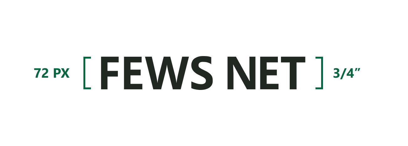
Minimum size
Set the wordmark to a minimum of 72 pixels or 3/4 inches in height.
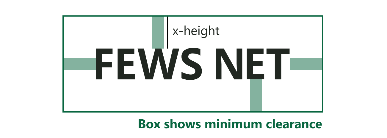
Minimum clearance
Give the wordmark breathing room and define a minimum clear space. The minimum clear space is measured by the x-height of the name in the horizontal version of the wordmark. Other graphic, image or typographic elements should not appear in that space.
Background contrast
Place the wordmark on backgrounds that provide excellent, accessible contrast. Here is an example of the type of background where the wordmark should be placed.

Don’t
Change the font or rearrange the wordmark.

Recolor, make transparent, or use a low-contrast background. Only use white or grayscale wordmark variants in cases where the wordmark appears on a colorful background that would make the black default wordmark hard to distinguish, or where the wordmark is included alongside partner logos that use one of these color profiles.

Stretch or squash the wordmark. Always use the original aspect ratio of the source file.

Add additional text or decoration to the wordmark.

Co-branding
The FEWS NET wordmark is frequently presented alongside one or more partner logos. Leave a minimum of 1/2 inch or 48px of clear visual space between the wordmark and each logo and use unaltered versions of each.
Visual balance
In general, the FEWS NET wordmark should be displayed at visually equal size and prominence as each of the other partner’s logos. When using partner logos it is important to ensure the wordmark and all logos are of visually equal weight. In general, this means that the wordmark and all logos are about the same height. However, if a logo is particularly small in width, or light in color, the logo may need to be made slightly taller than other logos. Likewise, if a logo is particularly large in width, or dark in color, the logo may need to be made slightly shorter than other logos. A good rule of thumb to follow is that your eye should be drawn to the wordmark and all logos equally and not one in particular when you look at the page.
Make sure to follow all preceding specifications for FEWS NET wordmark usage when making adjustments to the wordmark for co-branding.
U.S. Department of State logo
FEWS NET uses the U.S. Department of State flag and seal logo on its formal materials in accordance with the Department’s branding guidelines. In particular, the logo is always represented without any modifications and with visual spacing on all sides equal to or greater than the height of 3 stripes of the American flag used in the logo.
The U.S. Department of State logo and the FEWS NET wordmark should be visually balanced wherever they appear on the same materials. Ensure that the FEWS NET wordmark does not supersede the U.S. Department of State logo in visual weight and impact.
None of the wordmark and logo guidelines presented here are intended to supersede U.S. Department of State guidelines. Always check the latest Department guidelines, linked above, and follow those guidelines in any case where FEWS NET guidelines are unclear or appear to conflict.
Partner logos
Quick links
The current list of FEWS NET partners changes frequently. The following logo files are presented for quick reference and are not intended to constitute a formal listing of all FEWS NET partners. Partner logos may also become out of date, so refer to each partner’s brand resources to confirm brand compliance.
Usage
When they are used, partner logos should always appear directly adjacent to the FEWS NET wordmark. Partner logos should follow their own organization’s co-branding standards without superseding FEWS NET’s standards.
There are not set brand criteria for when partner logos are used on branded materials. Partner co-branding should be determined by USG on a case-by-case basis.
Contact us if you have an application question or recommended addition to these standards.